The Evolution of
Bowser
('s sprite)
As the headlining villain of the Mario series, Bowser's turned up in plenty of games, but not always in the best light. Who knew a horned, hulking demon king would be hard to draw? Because I am nothing if not self-indulgent, I'll be taking a look at all of Bowser's most notable appearances and giving my extremely professional and not at all monster-fucking opinion.
Just to be granular, Bowsers will be graded based on three distinct qualities:
EXPRESSIVENESS: How well does he emote? What's his breadth of animation? What's his range? This records if the guy's got more going for him than just standing there and looking scary.
CHUNKINESS: One of Bowser's top qualities is the fact he's a beefy boy. You may not like it, but the ideal Bowser is as wide as he is tall with limbs as thick as his face. Maximum chonk. Motherfucker supreme. All the memes. If he isn't the biggest bastard in the game I'll pitch a fit.
BOWSER-NESS: This is the wild card, here only to arbitrarily skew the rankings. How good does it define Bowser as... well, Bowser? Is he monstrous? Is he goofy? Does he make you sit up in your seat and go, now that's a Bowser? If it does, the number goes up. I don't make the rules, because there are none and they're vaguely defined.
sprites
Super Mario Bros.
1985
Nintendo Entertainment System
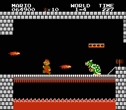
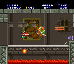
We all gotta start somewhere! Yet right from the get-go all, the major details are there. He's big, though he's more imposing when viewed next to little Mario. He's pointy -- he's got a shell full of spikes, a face full of fangs, and little studded arm bands for good measure. All he's missing is his mane, which was probably omitted for clarity's sake -- even the art on the Famicom box had it.
For the time, he's bound to have been impressive. He's imposing! He's the biggest enemy in the game, and he can't be thwarted by traditional stomping -- if you haven't come equipped with a Fire Flower, your only hope is to get past him and grab the axe.
Simple and underwhelming as it may sound, especially after years of muscle memory making it a cinch, the first
Super Mario Bros. produces some great challenge out of zoning. If you don't come in running or with a hit to spare, you'll be forced to stop, killing your momentum as you have to contend with incoming threats: Bowser's periodic fire breath, his wall of throwing hammers, and even his sheer bulk tippy-toeing back and forth. And that's before we factor in the Podoboos launching at you from beneath!

That said, his shape's just a bit noodly. You expect a lumbering bipedal dragon monster to be reared forward, but with his top-heavy gait and dumpy feet, he looks like an inflatable pool toy -- it's the only reason I can imagine him not tipping over.
To its credit, Super Mario Bros. is extremely economic with its graphics, cramming every single moving and interactive sprite -- that includes the enemies, items, projectiles, effects and environmental details like flag poles and vines -- into 4 kilobytes of data, or a 128x128 pixel canvas... or 256 tiles. Only two of which are wasted, one for a blank tile, and one dupe of an item block. These cats at Nintendo R&D know how to pack a ROM!
He serves his role as big nasty end-of-world menace, with a lot of ways to undermine his presence if you stop to think about it. Still, it gets the job done. With humble beginnings like this, who knew Bowser would become a character worth caring about?
EXPRESSIVENESS: 1/5. Mouth open, mouth closed. It's still more emoting than any other enemy in the game, but...!
CHUNKINESS: 2/5. He's the biggest sprite in the game, but tilemap limitations force him to look strangely elongated. He's big, but not lovably big.
BOWSER-NESS: 3/5? He's mean-lookin'! In a game full of cuddly looking squids and strolling chestnuts, here's the first foe to look reasonably threatening, conveying as much fang-filled fear as white pixels can muster.
The limited detail and expanse of flat green seem uncanny compared to the more 'textured' turtle foes, which is probably a point in itself. He looks off, and every time Nintendo dredge up this sprite, it only serves as a reminder of how much he's changed in the decades since. For the better, of course. I don't know anyone who earnestly loves this sprite, and I don't want to know. You keep that to yourself.
Super Mario Bros. 3
1988
Nintendo Entertainment System

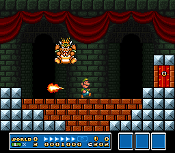
What a glow up! Bowser's looking like a genuine cartoon character now, and not just a stack of pixels held together by negative space! After clobbering his ass every four stages in the first game, you don't so much as see a peep of Bowser in
Super Mario Bros. 3 until the very end of the game, which is a nifty way of raising his mystique.
Why, he's completely out of the picture until that point, instead letting his Koopalings do all the tyranny -- he doesn't even kidnap the princess until you've already gone globe-trotting to save all the other kings, just to rub it in. Thought you could put your feet up? Think again, plumber butt!

Bowser's a bouncy boy. His moveset is a lot more telegraphed in this game, compared to the somewhat irregular flame-spitting hammer-throwing repertoire in his last brouhaha, but you still gotta keep on your toes. Duking him is how you beat him, and it's his own hubris (and his titanic ass) that ultimately do him in.
There's a million and one woeful gag comics and thinkpieces theorising why on earth Bowser in SMB1 would have the axe, the one weapon that immediately does him in, within spitting distance behind him, but his defeat in the third game is perhaps the first to intentionally play up him being a big dumb idiot. Which, as we know, is one of his finest qualities.
His range of animation is pretty simple, but paired with his movements during battle it makes him feel spry and intimidating, a far cry from his comparatively dumpy and immobile appearance last time. His chest and cheeks swelling as he breathes fire, his hair swooshing upward as he perform a ground pound... they're extraneous details that go a long way to selling him as a character, not just a generic baddie. This is Bowser, baby!

Heck, the fact he's shown from three angles is a rare luxury for an NES villain. The perspective on his three-quarters-view sprite is a little skew-whiff, a relic of the days when nobody was quite sure how the hell this bozo's anatomy worked, but the effort is appreciated. He's three-dimensional!
As the second full-body Bowser sprite in the mainline platformers, it sets a great standard. Pity there wouldn't be much competition until decades later!
EXPRESSIVENESS: 4/5? He's got expressions, he's got poses, he's got angles! You can see Bowser from all his best sides in this game, something you wouldn't expect from a humble 8-bit release.
CHUNKINESS: 4/5. He's a big and satisfyingly large sprite, about as ideal a Bowser you could hope for on the NES. I'm docking points only because the game already has a plethora of beefy boys already -- Boss Bass and Big Bertha, the Sledge Bros, the entirety of Giant Land... there's not the "oh, BIG" level of surprise as last time. On the flip side, I am thankful to the Sledge Bros. for upping the series' chunky bastard quota.
BOWSER-NESS: 4/5. That's a Bowser. A bit more acrobatic than we're used to, but Bower all the same, even if he's still a little ways to go: from the side, he looks a bit of a doofus, an adorable puffy-faced goon. From the front, he's all teeth! You could argue it's the beginning of the duality of bowser -- adorable oaf and fearsome foe.
remasters & updates
I'm going to break continuity here by addressing how this particular sprite was uniquely updated in the 35 years since its release, because it's just too buttery not to address in one tiresome lump.
So!
Super Mario Bros. 3 got revisited a bunch of times, the first notable remaster being
Super Mario All-Stars on Super Nintendo. Compared to the other games on the cart,
SMB3 was a pretty straight port, with the same graphical embellishments few and far between by comparison; no gussied-up intermissions or unique animations, they just added new backgrounds and coloured all the sprites. It's the only game in the collection to retain its black outlines for all sprites, an outlier compared to the other two's predominantly lineless look... but why mess with success, right?
SMB3's sprites are good, y'all.

Bowser's sprites are about what you'd expect by that standard -- his colour palette is quintupled and, because he was previously on a black backdrop, now has outlines drawn out, though they cover only as far as his tile canvas permits, leaving some blank spots. It's a good sprite, though SMB1's sprite perhaps outdoes it it personality. We'll get to that soon!
On the NES, because of tile limitations, Bowser's far arm during his turning sprite is partially rendered as junk -- there's residual shell and arm from his front-facing sprite, borrowed from when he looks to the side. They would've needed to spare at least two tiles to make a 'clean' variant of this, and evidently that was an allowance they could not spare.
You'd never notice it in gameplay, honestly -- it's only with the luxury of isolating individual frames that we can witness this booboo. It's an ungainly sprite anyway, with Bowser's proportions way off, looking uncannily bigger than he does at other angles. It's not just his best side, okay?


Anyway,
Super Mario All-Stars almost completely redrew his body on this frame, because the original was so misshapen. He's extra chunky for that fraction of a second! The new sprite shrinks his shell to not be so disproportionate, and renders his limbs a little slimmer. It's a good change, for how little you'll ever see it!
But... his shell is bare! There's not a spike to be found! Quite an oversight, wouldn't you say? What is Bowser without his points? A lot of other things, truthfully, but they're iconic is what I'm saying. I'm of the belief that the
SMB3 portion of
All-Stars saw the least oversight, as it's a much more straightforward presentation compared to the more gussied-up predecessors. It's an argument with very little to stand on, but I'll point at this Bowser sprite until
someone thinks I'm right.


They made up for this shocking omission 11 years later in
Super Mario Advance 4: Super Mario Bros. 3, which expanded the game to almost ludicrous extents... but only if you had the e-Reader, otherwise it's just the same damn game you've played before. This port polished up a lot of little graphical loose ends, like finally giving the brothers their white gloves back. With all the blocks they bust on the reg, their knuckles will thank them.


It's here where Bowser gets another wave of spit and polish, including completely redrawing his arms on every frame! It's only when I look at the change do I realise... boy, those armlets were totally out of line, weren't they? They change position in every frame, from his shoulder to his elbow to his wrists, and the proportions don't help much either. Like I said, Bowser was not one for competent depictions at this time, and for how briefly he appears you can overlook the inconsistencies...
... but it's nice to know someone was looking out for him. His claws are given greater definition, at the expense of looking awfully puny in some animations, and it's a little strange to see the crease of his elbow in such stark pixels. I think I prefer the puffy digits of his NES and SNES incarnations, but it's an appreciated attempt to make him that little more on-model.


Then
another decade later, the NES sprites were trotted out once again for
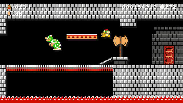
Super Mario Maker, walking back all prior fixes and adjustments and going back to the source! With no tile limitations, this finally gives him an outline all over... but that's it. The hand situation? Back to square one. His turning sprite? Still in its glitched state, with only a marginal clean-up to try and make sense of it. His shell remains disproportionately large, but maybe that's the way god intended it.
There's probably a lesson to be made here, how there should be 'master' sprites to turn to when adapting them for different palette limitations... but that's expecting anyone would be going back to these sprites five, fifteen, twenty five years later. Who knew the gaming climate would allow them to build upon assets they paid for over thirty years ago? That's an investment, buddy! Sucks to be the good folks who created these sprites and are almost assuredly not getting royalties, but that applies to almost all facets of game development, don't it.
Anyway, that's roughly five hundred more paragraphs about Bowser's messed up arm than you needed to hear. It's not too late to turn back, you know. You might have better things to do with your day then read about me getting exceptionally granular about video game graphics. Unless that's what you signed up for, in which case, boy, have you got a good thing comin'.
Super Mario World
1990
Super Nintendo

Like the last game, the Koopalings remain the main threat throughout this adventure, and you don't see a peep of Bowser until the endgame. The best glimpse you get is his Clown Car floating around on the overworld, which is a cute tease, but also totally indecipherable until you see it close-up. As a kid I thought it was a witch, and wondered what I was missing that I was never able to fight her.

I took it for granted at the time, being my first Mario game and all, but
Super Mario World really pushed the limits on what a boss fight could be, with all of them particularly unorthodox. Changing the type of arena you battle on, or even how you deal damage to them is a recurring theme, with the fortress boss Reznor perhaps most emblematic of that -- the floor crumbling beneath you as you strike the dinos from below, knocking them off their carousel platforms.
Bowser himself is a test of your prowess over picking up and throwing things, having to launch Mechakoopas onto his bonce, arcing them the right way without shredding them on the propellers. It's very inventive! A good show for creativity, that there's more to the game and just hopping and bopping.
Sadly, it make for a disappointing Bowser reveal. We only see him from the shoulders up! He's in his flying bucket the whole dang time! To be fair, he is rightfully massive, among the biggest sprites in the game, and possibly too big for Mario to even spin-jump over were they on level ground. He's mean and pointy and properly monstrous, the extended colour palette of the SNES able to define his features more. You can now see his snout, his claws, his horns in lovely pixelated detail.
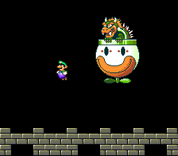
So... the Clown Car! The Clown Copter is a strange, somewhat inexplicable mode of transport that's since become a staple of Bowser's branding. Its appearance in cartoons and manga made it more prominent than it was in the games at the time, having sat out every game thereafter until
Paper Mario, before becoming a regular sight in the
New Super Mario Bros. series. Come
Super Mario Maker it's effectively the baddies' equivalent of the Lakitu's cloud
(ignore the fact Lakitu's already an enemy, okay), capable of carrying everything from Boom-Booms to Bullet Bill Blasters.
My question is: does it actually suit Bowser? It's fun for villains to have an iconic vehicle: Dr. Eggman with his Egg-o-matic, Dr. Wily with his skull-shaped Wily Machine... Bowser deserves a personal transport. Riding in a giant dopey clown face perhaps isn't how I would have envisioned it, but it's too late now, innit.
Whether we want it to be or not, it's iconic, and a good shortcut to undermining his attempts at being villainous; you can't take him too seriously when a big dumb clown face grinning at you. That, frankly, is pure Bowser. I only just wonder if it should've had his face emblazoned on it. Is that too much? Would Bowser stoop to that kind of self-aggrandising? He did have an airship shaped like himself in
Superstar Saga. This is a bad tangent.

Anyway! Bowser's only got two stinkin' sprites, basically -- one for glowering down at Mario, and another for when he's struck on the bonce. The former looks good and imposing, while the latter is our first in-game depiction of him colourfully eating shit.
It's a great little expression that really sells
Super Mario World's art design, its characterful sprites that emote their little faces out when they really need to. As much as I sometimes dislike the game's wishy-washy art design, when it needs to deliver great cartoonish expressions, it truly comes through. This is a good Bowser.
As is, it has its moments, but it's hard to appreciate given the stacks of setbacks thrown at it. Its limited animation, limited palette, limited screen presence -- his dumb car takes up more screen real estate! Given the fact you only see a portion of Bowser, the sprite was functionally useless in fan circles unless you wanted him tethered to the vehicle, which is not exactly a glamourous fate. It's got its merits, a rare glimpse at the biggest Bowser sprite of the era, but alas, we were denied. I'm salty!
EXPRESSIVENESS: 4/5? He's only got three faces, but they're all pretty boffo. His grimace is packed with sinister attitude, and that all goes out the window once you bop him on the noggin.
CHUNKINESS: 2/5. Bowser's certainly big, the biggest boss in the game and taking up a lot of the screen, his Mode7 swooping effect clearly making an impression on just how big a sprite can be... but his chunkiness is inferred. Show the goods! Don't be shy!
BOWSER-NESS: 3/5? His sprites alone are the epitome of the duality of Bowser -- mean menace and dopey doofus. The best of both worlds! But he never attacks you directly, not with his own weapons or fire breath -- he just chucks stuff out of his glove compartment. It could be anyone in that Clown Car and it'd be the same fight. For that, I have to dock a point, because this could otherwise be the makings of something impressive.
prototype sprites
In 2020 some resourceful ne'er-do-well leaked a whole bunch of Nintendo internal resources, giving us a rare insight into the development of classic games -- and for the purposes of this article, giving us some never-before-seen Bowser sprites!
Gimme gimme gimme!
So, this is neat and not so neat. What's neat is these rare artifacts preserved for all to see. But digital preservation often goes hand in hand with piracy, and piracy is something folks tend to poo-poo unless there's a level of abstraction they can find comfort in.
Almost all video game prototypes out in the wild are out there because someone stole it, basically -- a magazine reviewer walked out with a preview build, or an employee held onto their code. What's done is done, and knowing how often those assets just get destroyed when their purpose is served, you figure you're doing them a good turn by preserving them. It's like taking hotel toiletries. If the company's just going to trash it, then why not give it a forever home?
That perception changes when you realise, oh, Nintendo
did give these things a forever home -- if this leak is any suggestion, they have a shockingly robust archive of source code and raw assets dating back to at least 1990, stuff we could never have hoped to see otherwise.
It's a far cry from reports of even big-name companies like Square or SEGA, who lost or outright trashed materials to dozens, hundreds of their most iconic games. Ninty's putting them to shame, it seems! ... but they also made no efforts to publicise this in any way, releasing artbooks or behind-the-scenes exposés hungry nerds would love to hear about. Until this act of digital burglary took place, nobody truly knew the depths of Nintendo's internal archives.
And that's it: if a company is sitting on assets they have no intent of using or sharing, is it kosher to help yourself? Nothing's lost or stolen, per se -- it's all just data. But some of that data includes internal correspondence we rightfully should not have seen, and that's where it gets thorny. I've got no true stance on the rightness of wrongness of all this. I'm just saying if Nintendo's sitting on more caches of unseen sprites, those motherfuckers better hand them over right now before one of us starts making a scene.

Anyway! The artists drew some full-body Bowsers, and the first is strangely compact, not much bigger than Reznor or Blargg. Front-facing Bowser is hard to convey in pixels without turning into nightmare fuel, and indeed, he's pretty monstrous. Those fangs! That snarl! The face is tops, capturing all the best qualities of Bowser in as few colours as possible, from his mushy snout to his expressive eyes. It's a good Bowser! It's just the rest of him that's a mite underwhelming. Where's the beef?
 There
There's the beef! Bowser from the front, side and in profile, in all his glory! Its design perhaps owes some cues to the previous instalment or even
SMB1, having a similar gait to that first appearance and bearing little resemblance to his official artwork for this game.
He's smaller than he is in the Clown Car, but he looks the biz, a rare glimpse of him looking superb from all angles. Not without its quirks and foibles, being a work-in-progress scratch sprite and all -- his snout's a bit longer than we're used to, but I'm just glad to see the big boy from head to toe. It's such a darling sprite, honestly. Those giant fangs...! *swoon*
He does suffer quite noticeably from his limited palette; deep black dithering is employed for his armlets and where his body meets his shell, a rare sight in
SMW's art style. It's a challenge having only two shades of green, white and orange to work with, and the results are interesting. It's not just his belly that's orange, it extends to the inside of his arms and legs, too. It's viciously off-model, though probably an attempt to just break up the colours. With limitations like this, why not get creative?
Nintendo's early games for the Super Nintendo treated palettes in a strange way, only using 8 colours per sprite, often layering sprites on top of each other to get around this self-imposed limit --
A Link to the Past separates Link's head from his body for this reason, granting more freedom of animation.
SMW and
LTTP have distinct looks -- clearly more colourful than their NES predecessors, but boasting a 'smoothness' that seems out of sorts compared to other 16-bit releases. Even fare like
Final Fantasy IV seemed afraid to use the full extent of its colour palette, but would eventually glam it up come rereleases on new hardware.
I'm not sure if I've ever heard a true explanation for this, whether it was a technical limitation or a workaround that never quite got the best results; all Nintendo games going forward used the console's full breadth of colours. Bowser's got an unusual set of textures to fit into such limitations, and I wonder if cramming him into the Clown Car was one way of circumventing the problem. That I can almost understand, but not without some degree of hate in my heart. How dare you deprive me of seeing my boy in all his splendour.
Super Mario Kart
1992
Super Nintendo

It may not be the first Mario spin-off
(some asshole's gonna bring up Wrecking Crew and bore us all to sleep), but it
is perhaps our first true 3D turn-arounds of the iconic Mario characters, at least in pixel format. 12 frames of rotation from front to back! What a luxury! The kind of reference an artist would kill for in the days when manuals and magazines were your only hope for clean artwork from these games!
I do like the vibe of the first
Super Mario Kart, with its intensely bright colours and poppy, peppy atmosphere. To see the locales of
Super Mario World translated into flat tracks with hazards and textures galore is really cute, the sort of thing that tries its best to convey a lot with a little.
Later games did a great job making the worlds feel like vivid new extensions of the Mario universe, to the extent that I felt a bit robbed when
Double Dash!! gave us such a colourful cavalcade of courses, after
Super Mario Sunshine made us fart around on an island for the entire game. But I digress!

Of course, my beef with
Mario Kart as a whole is the characters are all a bit uniform, and
SMK's got it rough. They've all got to squeeze into the same canvas size, so Bowser can't be that much bigger than the others. I'd dare say everyone makes the transition pretty well; their shapes and colour palettes iconic enough that even a comparative nobody like the Koopa Troopa still feels recognisable. Everyone looks the part for the role they play -- as a shape at the foot of the screen to denote who you are.

It's just the more detailed characters suffer from it. Princess Peach relies on familiar colour patterns to make up for her somewhat gormless sprite, and Bowser's just a bit wobbly looking on the whole. It has to sacrifice or squeeze in detail wherever it can, but it often makes his face look like it's sporting two blank eyes, his single pixel of pupil getting lost in his snout.
His best sides are from directly behind, in front, and in perfect profile, which is probably the worst thing you could tell anyone. If I'm not looking at you in perfect 90 degree increments you're too ugly to stomach, I'm sorry.
Teething pains are a thing, and I imagine it must be a challenge to translate living characters into this format, especially a design as fussy as Bowser's. If
F-ZERO had inconsistencies in its sprite, you could live with it since it's just machines. And at the end of the day, you're not looking at any frame but their rear for very long anyway. As a sprite of Bowser's back, you probably couldn't ask for much better.
EXPRESSIVENESS: 1/5. The muddy outlines make it hard to see his eyes half the time, and his maw's always open in a cavernous gape. It might as well be a Bowser-shaped RC car.
CHUNKINESS: 3/5? Slightly underwhelming as far as big Bowsers go, though to be fair, he fills the canvas; he's as big a sprite you're gonna get within its self-imposed limitations.
BOWSER-NESS: 3/5? The game's box art does all the heavy lifting in giving its racers personality, and it's a pity the in-game sprites are so static by comparison. He does look mean, I guess. And as a computer opponent, he'll do his damnedest to fry your ass with lock-on fireballs. Does that count for something? Does anyone know the rules for this rating yet? Fill me in if you do.
Super Mario All-Stars
1993
Super Nintendo

A compilation of all four NES titles with revamped graphics, music, and overall flourish. Who knew how good we had it? It breathes a lot of new life into the first
Super Mario Bros., fleshing out its previously spartan worlds with luscious new graphics and backdrops, turning a black and white bridge into a chilly snowscape, or the levels of World 8 bringing you closer and closer to Bowser's castle. It's a fantastic presentation! Pity they fucked up the block physics, perhaps the most integral part of the playing the game. But I digress!
Bowser's good! He's got three frames of animation just for walking! That alone skyrockets him above his original sprite in quality, and that's before we address his new animation!
Something as simple as allowing him to flail his arms immediately clears up the posture issues I had with his original appearance. When his proportions are better defined and given the freedom to animate without tile constrictions, it all suddenly comes together. He's Bowser, not some rubber dinosaur! The green underbelly might suggest otherwise, but we'll allow it.
His flailing when the bridge is taken away beneath him is great, a terrific way of selling personality in a remake that's otherwise pretty strait-laced -- it, the end-of-level poses and the various Toad shenanigans after being rescued are the closest it gets to being expressive.
One could argue the overly glammed-up appearance of these remakes somewhat overshadows their cutesy, cartoony qualities, with Super Mario Bros. 3 losing its stage play aesthetic, for a start. There's pros and cons to both styles, but on the Bowser front, this is a straight improvement.

One thing I never noticed until making this article... is that this is a trace-over of his
Super Mario Bros. 3 sprite. It matches up almost exactly! There's minor tweaks, the head resized to better match his proportions, but it's shocking to see them lined up like this. I would never have known! It was only when making the early comparison to
Super Mario Advance 4's changes that I realised, I've seen those stubby little claws before...!
It makes me want to ask... is this cheating? Is it a cheap shortcut for them to just slap some new paint and adjustments on an old sprite, without making one wholecloth like everything else? But I'd say the expanded animation and fresh new look it's given help give it its own identity.
As the only 16-bit Bowser with a walking animation from this era, this was the go-to sprite for most fan projects in the early days, and admittedly sticking out like a sore thumb when stacked up against most other graphics. It's got that legacy going for it, one of the few sprites that folks rarely found an alternative for!
EXPRESSIVENESS: 3/5. His sprites are great and his new panicked animation adds so much to defeating him. Loses a point for not having multiple angles like his previous appearances. Mug for the camera while you're falling to your death, why doncha. Standing in profile is so old-hat.
CHUNKINESS: 3/5? An adequately sized Bowser given the context. Any bigger and all accuracy to the source material would fall apart!
BOWSER-NESS: 5/5. It's as Bowser as Bowser gets, without that hideous original sprite to spoil the moment! Fire breath, giant axe, getting dunked into lava. All that and he looks the part. Couldn't ask for much more! ... well, I could, but that's between me and the open window to Nintendo's offices.
Super Mario Maker
2015
Wii U
Being a sprite artist in the modern gaming industry must be a tremulous career. Handhelds like the Nintendo DS were perhaps the last bastion for them, with the likes of
Yoshi's Island DS and
Super Princess Peach showing some great art
(though not without their completely inexplicable foibles), but those were almost all third-party works -- what does mainline Nintendo want with sprites? They'll just reuse their ancient NES guff as nostalgia bait forever and ever, thank you very much.

... and then here comes
Super Mario Maker, where they bolt brand new assets into old styles, trying to match art designs from literal decades ago, alongside all-purpose retro-looking stuff for the whole gamut of amiibo costumes you can get. The cost of producing sprites is often cited as a reason we don't see many large-scale pixel-driven games, but I guess when you're just building on top of old libraries, it's a lot more feasible.
Bowser plays by a similar rulebook across all play styles: jumping, stomping, and breathing fire... but there's no working equivalent in the
Super Mario World style, as I gurned about above.
Now, in hindsight of the 2020 leaks, we realise this could've been an opportunity to dust off those old scratch pads and put them to use, cleaning them up and tinkering with them to suit their needs. Knowledge of the raw assets is what revealed they were no stranger to this practise anyway, finally putting unused effects sprites to good use. Of course, it's very likely they forgot they
were unused, but this is what fans and their love of speculating does.
It's like when the
Sonic 3 proto dropped with different music, and people were like, yo, why don't you use these tracks to get around the music licensing issue. What, you think SEGA don't know that already? It's their game and their assets, buddy! They've way more knowledge of that situation than we as fans could hope to uncover!
BUT I DIGRESS!!

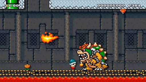
Super Mario Maker's Bowser is weird. Truthfully, Super Mario World had a strange and inconsistent style to begin with, mixing black and coloured outlines on a whim with very little cohesion between them, and to intentionally design in its style is to just throw caution at the wind and make whatever bullshit works.
The sprite nerd in me wants to grumble that Bowser uses a full 15 colours, with more coloured outlines than any other enemy sprite. His stark black outlines look strange on a sprite with this dense detail...
.... and his appearance is seriously monstrous, a far cry from the goofy and doughy looking equivalents in all the other modes. Bowser by way of
Smash Bros Melee, or even Giga Bowser! His horns are scarily big, and he's always showing more fangs than you care to see. Paired with his stooped posture and outstretched claws, it's an unexpected way of looking at the big lug.
Given the game's mission statement of creating cruel, unfair levels, it perhaps fits the theme -- of course you want Bowser to be monstrous when he exists as a tool to make people miserable! There's no fair play holding him back, he can spawn on top of you if someone wills it that way!

He's got a good breadth of animation -- again, more frames of animation than the SNES would perhaps be willing to allocate to a sprite of that size -- and it's just nice to see the guy get some sprite love again. It's not how I personally picture Bowser, and the context surrounding it gives me far too many sprite scruples to give it an unbiased shake, but a fair effort.
EXPRESSIVENESS: 2/5. He looks mean! He looks really mean! ... and not much else. If you came to see Bowser's range, you will not find it here.
CHUNKINESS: 3/5? When he's not being upscaled, the sprite is a significant downgrade in size from the original SNES version, not much bigger than a Mega Mole, but he is suitably beefy. Dude's built like a brick shithouse, only with more spikes than is permitted by OSHA standards.
You know what I'm going to dock a point for? His noodly arms. Bowser is hardly known for his killer delts, but it upsets me seeing the rest of him so rightfully massive, and then those bloody things looking so scrawny. I have no proposed solution for this without going into embarrassing detail about what Bowser's arms should look like, because believe it or not, this article has limits.
BOWSER-NESS: 3/5? If you like your Bowsers fierce and ferocious, all fang and claw and thorns, then here's your outlet. It's definitely an eye-catching representation, a rare look at him in scary sprite format, but after some of the more versatile appearance prior, it leaves me wanting. It's the year whatever-year-this-is, surely we'd have reached peak sprite Bowser by now, right????
amiibo

One of the feathers in
Mario Maker's cap of wackadoo excess is its embracing of amiibos. When so many games offered mere trinkets or pointless collectibles for scanning them in, this game went above and beyond by making each and every one of them -- and then some! -- into a playable character, courtesy of the Costume Mushrooms!
A three-paragraph tangent: maybe it's just the podcasts I listened to
(the Super Best Friendcast in particular), but it seemed like when amiibos were at the height of hype, all anyone wanted from them was for every single game to include every single amiibo as a playable character. That's not a tall order, right? It's only disrupting your development pipeline to factor in dozens of new models and animations, an unknown number to be rolled out in the future, and a tactful way of shoehorning them in.
A lot of the rationale centred around: if
Mario Kart can do it, why can't everything? And in that specific game's case you can almost understand; everyone's just a bunch of animations and statistics to denote their weight and speed. It's not like
Smash Bros. where you'd need to design unique movesets for each and every one of them... but any of that's still an endeavour.
Even as 8-bit sprites with a maximum of 23 frames, I'm shocked
Mario Maker went to the trouble to begin with, including
all the amiibos in addition to bonus characters like Dr. Kawashima, Famitsu's Necky, or even Yukio Sawada's distinct Mario from
Super Mario-Kun.
It's emblematic of gaming's love for content
(or bloat), and I don't think anyone rightfully considered the effort involved. Their line of thinking probably began and ended with: I shelled out £13 for a Richter Belmont amiibo, so I should be compensated by having him playable in every game I play. And, honestly? That's the dream. I'd shove plastic toys through the TV more often if it made Princess Peach playable in more games.
But I digress!

So: you can play as Bowser. Is this his smallest sprite...? There's only so much it can do in its limited canvas, mostly sticking close to the 16x16 boundaries of the original sprite, but we get a 3-frame running animation out of him, and even get to see him swim. It's pretty adorable.
If it were designed with Bowser's unique abilities in mind we could've gotten some real fun out of it, but as a simple skin for Mario, we'll take what we can get. Cute, but perhaps more fun in stills. I think the Donkey Kong sprite is the real masterpiece. Who knew the big ape could look good in less than 24 pixels?
3D models
Super Mario 64
1996
Nintendo 64

Not unlike
Super Mario World, every leap to new hardware for the plumber always resulted in some graphical teething pains. Everything is redesigned to accommodate the limits or merits of the system, be it palette limits or polygon count -- so much so that it can be difficult to tell if this is actually their new, canonical look, or just the result of trying their hand at 3D for the first time. There sure as heck wasn't enough artwork to judge from -- there's a thousand and one renders of Mario, but how many of even common stage enemies? Are they
really that misshapen...?!
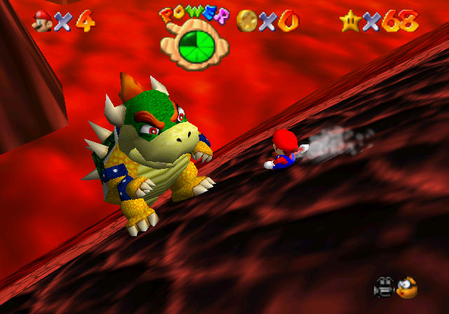
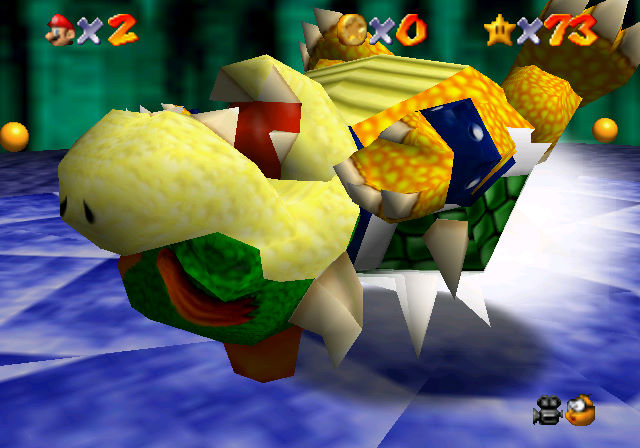
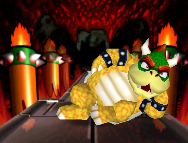
Bowser... ain't great. He looks like he belongs at the Thanksgivings Day Parade. His giant spherical head, almost as big as his entire shell and torso, is a bit ridiculous, and the low-set angle looking up at him during every battle intro only exacerbates the matter.
True to his blocky depictions in
Super Mario Bros. 1 and 3, he's not exactly a mover -- his amble is a tad pathetic, the developers struggling to make this mound of vertices move. Breathing fire is about the most natural-looking animation he's got. To be fair, Mario's the only thing that's animated with any real zest in the game. Maybe King Bob-Omb as well, but only because I cut a little slack for spherical dudes.


When you actually get a good look at him, though, the rest of his body does the job quite well. His torso and limbs all have a pleasant amount of detail, with appropriately fearsome spikes and defined digits on his claws, and even his armlets modelled separately, giving them a satisfying chunkiness.
The look leans heavily into his dragon vibe, with his stooped posture and crooked limbs, which is appropriate when he's so dang immobile -- grabbing him by his tail and getting him stuck on his back and all that.
After artists were finally depicting him with some life in promotional art at the time, it's a little disappointing to see him regress so bad, but that's graphical hurdles, babe. Give him a few years and we'll have something to hoot and holler over.
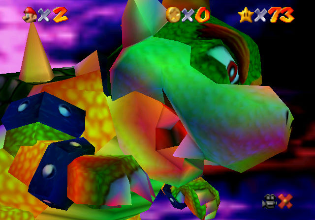
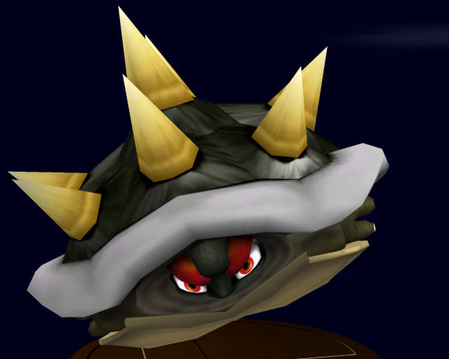
I'm not sure what to make of the texturing on him. He's scaly, sure, but the cobbled bumps across his face and skin are kind of viscerally unpleasant when you really linger on them. Man's got the mumps. It does come into its own during the final fight, where he shows up with a sinister new colouration.
I'm not sure if it's intended to be bruising from his past defeats, or the console's best attempt at mood lighting, but it's definitely unique. It gives him a sense of menace that he's not commonly depicted with, and would outright vanish for the rest of his time on N64, getting softened considerably for his spin-off appearances and becoming a loveable goof in
Paper Mario. Enjoy it while you can!
EXPRESSIVENESS: 1/5. To see the dude in 3D at all was super impressive, but he's got as much mobility as a stack of bricks. Paragraphs of taunting can't make up for stiff animation, mate.
CHUNKINESS: 4/5? He's a big boy; not quite the biggest boss in the game (that honour goes to the Whomp King), but if we're judging by cubic measurements than he's sure to win.
BOWSER-NESS: 3/5? If he were a static model, this'd look the biz; having to see him animate is just kind of sad. He makes for a unique boss fight, and his darker colouration during the final rematch is a unique turn, something no other version of him could boast (unless the Fake Bowsers from The Lost Levels count). Still, he's let down by being so dang immobile; twenty foot vertical leaps are all he's got.
Mario Party
1998
Nintendo 64

For the most part, Hudson Soft's take on the Mario cast was simply streamlining what was presented in
Super Mario 64. Mario, Peach, Toad and enemies are all composed of a similar structure of shapes, just smoothed out to accommodate for their new breadth of animation, and optimised for sharing the screen with multiple high-poly objects at a time.
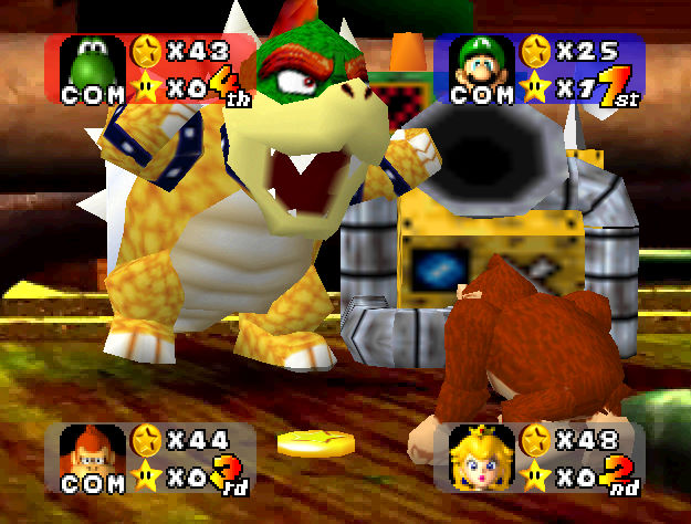
So it's no surprise that Bowser's still his bobble-headed self. His claws and shackles have been reduced to textures, but on the whole, he's a lot more charming in this visage. His scaly skin is a lot more agreeable-looking for some reason, and whatever they did to his face gives him a lot more personality -- his cartoony eyes framed beneath his bushy eyebrows, his puffy muzzle... he looks like a big ol' pug!
It's here where Bowser's reputation as the big scary bad guy began to change, now a fun-spoiling party-pants here to throw a wrench in the works, and in need of taking down a peg. He might take away all the stars, redistribute everyone's coins, or take pity on you and hand you the means to throw the game. He's a wildcard, and a presence more board games should have, honestly.


Since his role is mostly to dish out punishments or disrupt the standing of the game, he doesn't have a lot of animated presence, but his appearances are always a hoot. The first
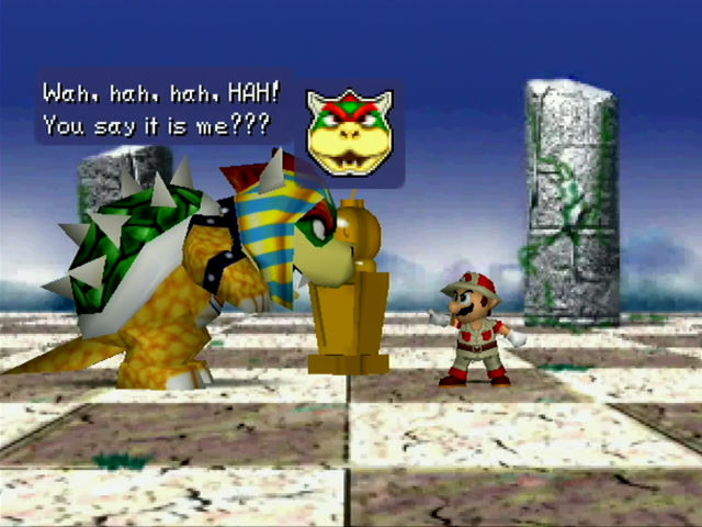
Mario Party also delighted in sticking one unlucky player in a Bowser costume, urging the others to torture them, be it bashing them with hammers or dragging them into a ravine filled with Piranha Plants. A cruel and unjust advocation for Bowser abuse, but making the most of an otherwise rarely-used asset!

The first two games would often depict Bowser as the villain of that board's premise, with Mario Party 2 dressing everyone up in thematic garb, making for a good laugh. It's also notable for introducing his Party-exclusive flunkeys, the Mini-Bowsers, giving him an infinite supply of dopey underlings to riff off of.
In a game with stacks of dialogue and setpieces, it's a welcome addition, though admittedly a strange choice. After the Goombas, Koopas and all the other enemies had been domesticated, they needed to invent an all-new toady to be his toady?
Between this, Baby Bowser, and the eventual arrival of Bowser Jr., it really felt like they were pushing for Bowser's Mini-Me to be an archetype worth caring about, which was an uphill battle until dads came in fashion again.
Definitely a distinct Bowser, though more because of the material he's got to work with. Not exactly on-model, but it does the job and makes the most of its limited articulation, having a lot of fun with what few expressions it can make.
Arguably this is the starting point of Bowser's softening image in the video games? Cartoons and manga had already done the heavy lifting years previously, but after this we'd see
Paper Mario and more make him out to be a loveable lug, which may or may not be character assassination, depending on your personal canon.
EXPRESSIVENESS: 4/5. He's still got the same limited posture and model structure as his previous incarnation, but in the context of a party game, with his dopey little hops for joy as he sucks away all your coins, it's hard not to be swayed by it. He does well with what he's got, given the limitations (and reduced expectations by no longer being the final boss).
CHUNKINESS: 4/5. Just as chunky as before, if not moreso on account of the polygon budget. Bowser's scale is all over the shop on the Nintendo 64, or in general, but he's a good size.
BOWSER-NESS: 3/5? Like I said, he looks like a pug. He's not terribly ferocious nor does he demand respect -- Mario Party games were all about making him a chump, and not always in a loveable way -- he's this close to a punching bag at times. Different qualities, is all! It's good to see him, but it's a bit like seeing a talented actor forced to take on commercials; he's only as good as the material.
Mario Golf / Mario Tennis
1999 / 2000
Nintendo 64


Who expected a Mario sports spin-off to have such boffo presentation? Visual flair has long been Camelot's bread and butter, and their N64 sports games truly excelled in making its low-poly setpieces ooze with character and panache. And they're so dang cute, to boot! Daisy, Donkey Kong Junior, Birdo... it doesn't matter who it is, they're all totes adorbs. You probably couldn't ask for better models on the N64.
Bowser's where I start nitpicking, though. He's rendered relatively well... in theory. The huge pitches and courses eat up the polygon budget, so you can forgive the mono-claws and whatnot. His snout's a bit bulldoggy, and his limbs gank from the
Mega Man Legends school of design, looking like cardboard boxes stacked on top of each other... but he looks alright, when you view his components on their own terms.
Altogether, though, and he just looks a bit off. After having a giant balloon head for his past appearances, now his head seems too small! And his limbs too big! What's going on?! To be fair, they probably needed to stretch him out to play efficiently; there's no hope in heaven or earth of
Party Bowser holding a golf club without whacking himself in the nose.


It is an expressive model, though. After nothing but the same clunky canned animations throughout the
Mario Party trilogy, it's so refreshing to see characters animating with flourish, even interacting with one another! Bowser's rambunctious displays after sinking a hole in golf are great, and his entrance in the intro of
Mario Tennis is worth it just for that smile at the end.
Honestly, it's a model that seems to work best when viewed in isolation. Taken on its own without knowledge of the other models, he looks fair enough... until you see just how good everyone else looks. Then he looks like the odd one out amongst these adorable, rounded characters. You could say the same for his limbs and other components -- the head's fine, the body's fine, the limbs are fine... but altogether, it just feels like the proportions don't come together the right way. Alternately squat and elongated, chunky and not so chunky.
It's
fine. It does the job, but the sum of its parts kinda drag it down. The game's artists clearly favour the cute stuff, with characters like Paratroopa and Shy Guy unexpectedly winning my heart. Bowser and Donkey Kong are here only because they're mainstays, but there's no one on the inside giving them as much love as Peach or Luigi. Still, if it gave us adorable models of everyone else, I can probably accept that sacrifice.
EXPRESSIVENESS: 2/5. His long limbs finally let him do things for once, like running and diving and smacking balls around, but his face is frozen in an slack-jawed drawl. It looks good from some angles, but...!
CHUNKINESS: 3/5? He's the biggest bastard in the game, so that always counts for something. Still, the funky proportions aren't to my liking, though I understand if he were any stockier you might as well be playing as a second net, he'd be too big a target.
BOWSER-NESS: 2/5? You won't mistake him for anyone else, that's for sure. Is it an endearing approximation of his character? Does it make me suddenly quintuple my love for him the way it did for Birdo? I'm gonna have to say... no. He's still pointy and monstrous though.
Luigi's Mansion
2001
GameCube

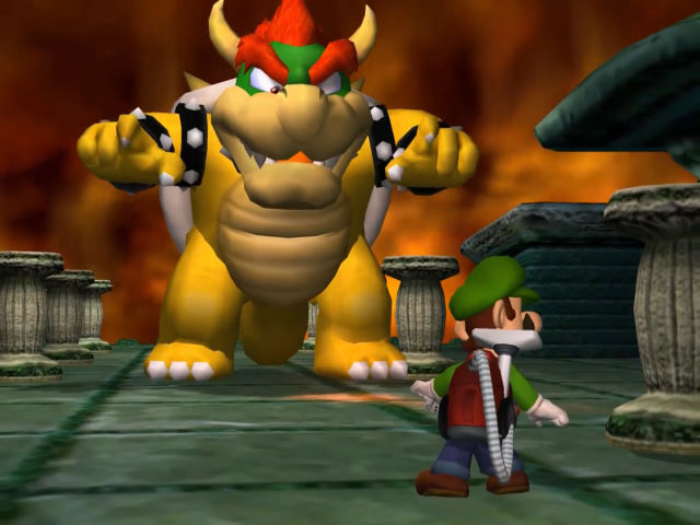
So, spoilers, Bowser's the final boss of this game... and the plot hinges around the fact he's dead? Like, D-E-D dead? Kicked the bucket, bought the farm, all the euphemisms. Motherfucker's pushing up daisies, is the game's insinuation.
Death in cutesy video games is an entire diatribe in itself; Mario games have you quite viciously squashing, exploding or disintegrating your foes, but you can at least assume, oh, those squashed Goombas just disappear for gameplay purposes -- they probably just waddle off somewhere to get popped back into shape. Most of the encounters in the first
Super Mario Bros. may have been disguised dupes, but dunking Bower into lava painted the picture of that just being the way you deal with him -- he'll walk it off.
So Bowser's dead, and the plot's about King Boo bringing him back to life somehow. The ghostly dude revives his body and possesses it during the finale, and the model is about what you'd expect from him -- his head looks either a smidge too small or a smidge too big, it's hard to tell! But that's Bowser all right, even if he's not quite in the driver's seat.

It's the animations that make him appear off-kilter. His idle and walking stances have him stooped forward with his arms flared out to the sides at head height, seemingly an attempt to recreate his posture from
Super Mario 64. Seeing the games try and 'humanise' Bowser over the years, it's uncanny to see this stilted throwback to his more dragon-y days.
He's capable of more lively animation, flexing his arms as he throws spiked balls towards Luigi, or his dramatic death fall... so it's strange to see his ordinary stance so 'off' by comparison. To be fair, you do repeatedly knock his head off and then watch him blunder around after screwing it on backwards, so this is clearly an animated corpse we're dealing with, not the real B-man himself.
It fits the spooky, off-kilter game it's in, but he'd see better presentation from here on out. The model is about the standard from this era, streamlined for similar appearances in
Sunshine, Party, Kart, and so on. Things are on model now! As such, there's very little to remark upon...
EXPRESSIVENESS: 1/5. Not a good showing, honestly! Call it a throwback to Mario 64 all you want, he's one of the least animated and least expressive foes in Luigi's Mansion, a game stuffed to the brim with wriggling, wailing, gyrating ghosts. I can't even cut him some slack because he's dead, all the other undead enemies have oodles of life in them. Even Dry Bowser had more life in his bones!
CHUNKINESS: 4/5. We've reached the ideal standard of 3D Bowsers at this point, where all they can do is tweak and fiddle with the minor details. He's the stompy boy!
BOWSER-NESS: 2/5. It's the boy... but not as we know him. He's got the look and his staple moves, but it's got all the flair of someone puppeteering a corpse. Don't Weekend at Bernie's Bowser, man. Let his kid do that instead.
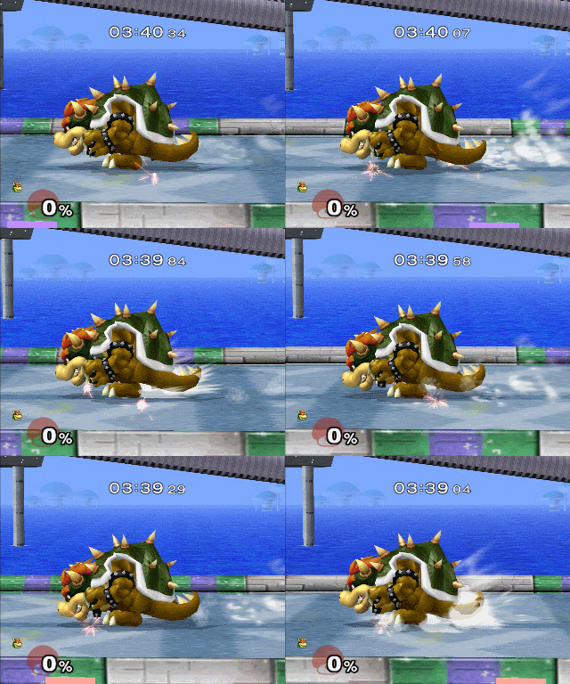
Super Smash Bros. Melee
2001
GameCube

... until
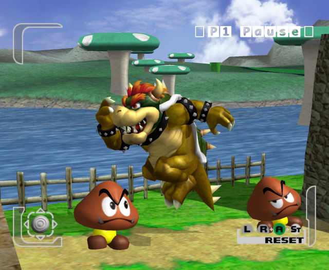
Super Smash Bros. Melee thrusts him into an all-new art style. Bowser was apparently intended to be in the N64 instalment, but missed out on account of deadlines. I wish we knew what he might have looked like. Not good, I imagine! That game's models are an acquired taste and I personally adore them. Give me the jaggiest Bowser you've got.
Every game's promotional art up until this point had reused the rig made for his glamour shots in
Super Mario 64, but Bowser's appearance in
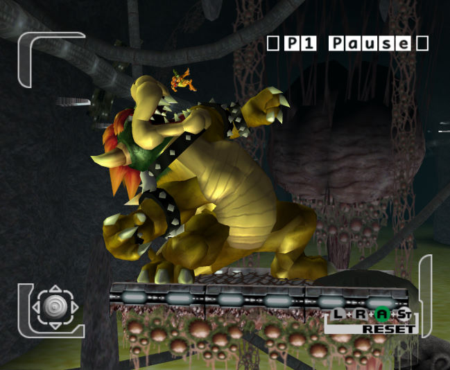
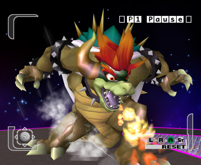
Melee is probably our first fresh take on his design that was certainly intended that way, and not just polygon limitations. Given his divergent in-game appearances the past five years, you might not have noticed, honestly. It's all there, isn't it? His mane, his fangs, his claws, his shackles... he's appropriately fearsome!


... perhaps
too fearsome? This design leans heavily on Bowser's status as a dragon, as a monster, moreso than his standing as a cartoon villain. He's got a lot of musculature, hasn't he? His legs have some absurd definition, with knees and ankles and delts and quads and whatever else. Hell, he's got arm muscles and a pair of pecs under his belly scales. It's more pronounced in the promotional renders, where it's Bowser by way of furry fitness artists.
Melee was big on reinventing its roster to some extent, giving them detail that was yet unseen -- just look at Peach's ornate dress and pronounced figure for another clue into that. It's something later instalments would perhaps tone down, at least for the Mario characters, trying to bring them closer to their on-model appearance while still accounting for their acrobatic fighting styles. Bowser was his familiar chunky self again come
Brawl, with any sign of muscles or ankles lost beneath his mascot costume physique. And I couldn't be happier.


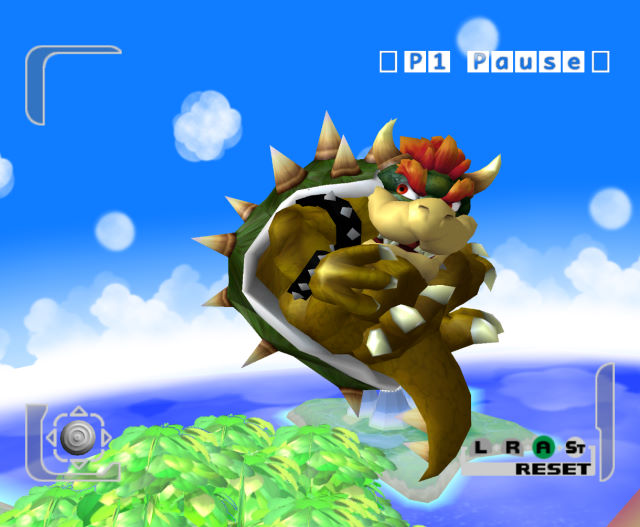
Speaking of fighting styles... this game really didn't know what to do with the man. He's got his butt stomp from
SMB3, some seriously lousy fire breath, and the rest is invented wholecloth. They're all serviceable, if decidedly clunky and low-tier, but his running animation is perhaps the strangest, depicting him ducking and 'driving' forward as if he were wearing motorised heelies.
This and his extremely stooped posture made him a hell of a clunky fighter -- not without his merits, but it all combined to make him feel that bit 'off'. It's not what we expected from Bowser, and it didn't make an ergonomic moveset either. Hefty and weighty, yet floaty and laggy... how do you work with this?
His animations would be seriously rejigged come
Super Smash Bros. for Wii U and 3DS, taking cues from his appearances in the
Mario & Luigi games, with a more upright, anthropomorphic posture and a suitably stompy run, including a very satisfying dropkick attack. He also stopped playing like shit! Again, I couldn't be happier.

 Melee
Melee was definitely treated as the forefront of Nintendo's graphical enhancements at the time, many magazines regarding its realistic slant as a sign of things to come, especially paired with that
ridiculously erroneous "Mario will grow up" quote floating around at the time. While it's definitely a unique depiction of the characters, I prefer Bowser the way is now, as a suitably chunky bastard.

It's nice to look back at this fresh take on him, though, and many of its stylings would survive in Smash's own Giga Bowser, retaining his unique moves and animations even up to Ultimate. Keeping him on as Bowser's Final Smash was perhaps an odd move, especially now that he's effectively outgrown the need for it -- the past two decades of games have enough fodder to replace it with, surely! -- but it's nice to see it's still got a home.
EXPRESSIVENESS: 2/5. He's got a good range of animation, boasting a variety of attacks and animations that are all new to the character, the animators doing their damnedest to make the dude fighting game-ready... but it's not really Bowser, is it?
If we had seen these moves performed by the familiar cartoony Bowser first, and then reimagined through the lens of Melee's shredded Bowser, that'd be nifty. But as is, it just feels like a bizarre distortion, mapping the model to whatever random attacks they could think up.
Also I'm salty he didn't appear in the N64 version, because there he would've had an adorable texture for when he got zapped. We missed out!
CHUNKINESS: 2/5. He's the biggest bastard on the roster, suitably hefty and all that, but also decidedly leaner compared to prior Bowsers. Melee really accentuated the slenderness of its character designs, often at the risk of making them unrecognisable -- Donkey Kong is particularly gangly and unpleasant, and Yoshi is at his most waifish, looking downright ghoulish! What was their logic behind that design?!
BOWSER-NESS: 3/5. Motherfucker's a monster. As one of the few modern depictions of Bowser as honest-to-goodness menace, a roaring, shambling monster, it's got that going for it. And Giga Bowser as well! If you like your Bowsers monstrous, here you stinkin' go. If you like to be reminded that there's a personality underneath all the snapping and snarling... well, that's what Super Mario Sunshine is for, I guess.
Super Mario Sunshine
2002
GameCube

The early days of the GameCube have been a strange time for Bowser, right? His posthumous appearance in
Luigi's Mansion, lookin' proper monstrous in
Melee, and now harkening back to the dawn of the 90s where he sat out the entire game, only showing up at the very end.
Whereas in
SMB3 and
World it served as a surprise factor, showing the dangerous trickery and graphical effects he was capable of... in
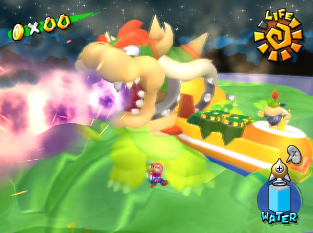
Sunshine it turns out he's just been sitting in the bath this whole time. Honestly? Big mood. The fact he can still make an entrance without getting out of the tub is a testament to the man's screen presence.
This is the part of the article where it gets stupidly granular, because this is just the default from here on out. They have the technology now, they can sculpt the perfect Bowser. He's got everything you could want and expect from him. He's a million feet tall for some reason, but he's as on-model as he's ever going to get. And, it bears repeating, he never gets out of the tub, yet his animations are as good as you'd expect for his whopping two attacks.
I could grumble up a storm about how the boss fight is a disappointment. I could gripe about how this is the one game to have voiced cutscenes, the one time Bowser is given a speaking voice... and they drop the ball by not giving us antics inspired by the
Super Mario Bros. Super Show. I've
written those rants already anyway. Speaking purely about his appearance, this is peak Bowser. You are not going to find a better Bowser without commissioning some very creative fan artists.
What I do want to ramble about, however, is how weird everything
else in this game looks. The game is notably deprived of your typical enemy staples, with Goombas and Koopas almost totally absent, instead replaced by new analogues and stand-ins. The Piranha Plants look the part, as do Bloopers and Chain Chomps, but Boos and Bob-Ombs have designs very disparate how they were last portrayed. It took me years to be convinced this game even
had Koopas, because they look so unlike every other version of the creature!

This is ostensibly an attempt to give the Isle Delfino fauna its own distinct identity, separate from the common-or-garden varieties we've seen at home in the Mushroom Kingdom. You could argue the same thing happened in
Super Mario Land as well, the Sarasa Kingdom's take on familiar foes not without their own quirks.
But it feels a bit early to go experimenting, without the appropriate bedrock to support it. We'd gone seven years without a proper 3D platformer, during which time they could barely model Bowser the same way twice. Until you see him with your own eyes, there's no promise he wouldn't be exempt from these weird redesigns. If they can fuck up a Koopa beyond recognition, what's stopping them from reinventing the big bad?!
Of course, that wasn't the case, as should have been evident by Mario, Peach, and Yoshi all making the leap relatively unscathed. But they're all a little bit different, aren't they? Paired with Luigi's more expressive design in his solo title, the GameCube could have been a time for Nintendo to shake off the dust and seriously reevaluate the integral art design of the Mario series. Instead they took that route with
The Legend of Zelda, and that went totally without complaint or uproar. Still, what could've been, eh?
We've hit peak Bowser, so to keep assessing the 3D models from here on out would just be picking nits. They've got different poly counts, different rigging, different wants and needs for their respective games, but it's all the same basic shape. Once again, there's very little to remark upon...
EXPRESSIVENESS: 4/5? We don't just see the typical fire-breathing final boss Bowser, but also the single dad Bowser, trying to find hamfisted ways of getting his kid into the princess-abducting schtick. He doesn't emote or animate to any great strengths, he's hardly pushing the animation budget, but it's just nice to see the dude bring us something fresh.
CHUNKINESS: 5/5. It's peak Bowser, baby! And he's big enough to step on a bus!
BOWSER-NESS: 5/5. You've been putting up with weird new faces this entire game, to see the big bastard himself is a reassurance. I can forgive the crap boss fight (well, no, actually, but for the sake of argument) if just for finally giving us an ideal 3D Bowser. The other games don't have to try anymore!
Super Mario 64 DS
2004
Nintendo DS

... except when he's forced to go low-poly again. The Nintendo DS is a console that seemed to peak with its 3D prowess right at launch, boasting a surprisingly lush recreation of
Super Mario 64 on a console that struggled to match up to even the earliest PlayStation games at the best of times.
I have no shortage of grievances with the game itself, from needlessly mucking up what was such a smooth and streamlined experience, new features demanding unwarranted bouts of back-and-forth, and robbing us of a co-op 3D adventure with our friends... but I will say this: the game looks the biz.
Everything looks on model now! Mario looks like Mario! Yoshi looks like Yoshi! We don't have to accept strange amalgamations of primitive shapes as fill-ins for Goombas and Koopas anymore! One could argue the game loses a bit of its charm because of his. The teething pains of a groundbreaking production often becomes its most endearing elements -- the wobbly shapes of early 3D, the hokey sets and props of TV sci-fi... I can see why cleaning them up and raising the standard is always among the first measures when restoring them, but so long as both options are there, it's fun to compare and contrast.

Bowser gets a hell of a glow-up. He finally looks like himself! And he's
animated! Compared to the frighteningly stiff Bowser of yore, this one's best quality are his wiggles. His idle stance is full of life. His walk is full of stompy goodness, as if a kaiju yukkin' it up in the city.
And all animations pertaining to his defeat are terrific, giving the impression he didn't foresee getting swung by the tail into a floating landmine. Even in defeat, rather than lying there and taking it, he flails and wobbles on his shell, trying to right himself to no avail. It's adorable and shows the kind of cartoon villain he is -- all these dastardly plans and posturing fronts, but the moment he's slightly embarrassed he'd sooner cry about it and teleport the heck outta there. It's a pity he still only appears in his boss stages, because if his animations are this charming you'd sooner see him in a more active role.

It's a pretty outstanding first showing on DS, setting a standard of quality that probably wouldn't be surpassed --
New Super Mario Bros. and
Mario Party DS look much the same. There's just one notable exception, though...
EXPRESSIVENESS: 5/5. Despite being the villain, Super Mario 64 has such a minimal role for Bowser that there's not much room for him to, like, do stuff. Yet they managed to wring the most out of his appearances; all his animations are exuberant, saying far more than his pre-fight preamble can muster. If it weren't 15 years before the trend, this shoulda been the game with a Bowser-centric DLC campaign.
CHUNKINESS: 5/5. Peak Bowser, baby! Proportions are spot-on even despite the hardware limitations. They did the DS proud.
BOWSER-NESS: 5/5. Tip to toe, this is a good Bowser. Seeing him look like himself on the itty-bitty screen is a treat. If I were being petty I'd dock it for still being the same crap stodgy fight it was before, but that's only because you wanna see him done right. Speaking of done right...
Mario Kart DS
2005
Nintendo DS
 Mario Kart DS
, on account of having large detailed tracks and eight racers on it at all times, not to mention the logistics of multi-player both offline and online to think about, it's got a tight polygon budget!
Mario Kart 64 got by with prerendered sprites for most objects, which I was none the wiser to playing it on fuzzy CRTs of the day... but that wouldn't pass muster on a DS, lacking the anti-aliasing and VRAM to pass off such an effect. It needs models!
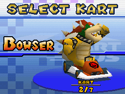
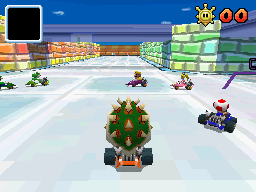
The thing about racing games is that, unless you're playing especially badly, you're only ever going to be looking at your avatar's rear end. A lot of games tend to skimp on the front-facing detail, especially in the N64/PS1 era, resulting in characters that looked like they'd been hit by a bus if you dared view them head-on. The DS resolution is small enough and Mario characters all familiar enough that you can get away with abstracts. Some yellow points and a few pink spheres, and that looks a bit like Princess Peach, right?


By that logic, Bowser looks like Bowser. He's got the shell, he's got the spikes, he's got the colours in all the right places. You should have your eyes on the road anyway, now's not the time to be counting scales. He looks fine during a race, and during the results you'll get some of his better angles anyway.
Making Bowser's face work in low-poly is bound to be tough -- a clash of smooth and sharp shapes, with his doughy snout and fangs a central part of it. He just happens to look like he's got the mumps. His face just a little too puffy, his fangs just a little too spartan...
Still, can't complain. It's recognisably Bowser! That's more than you can say for poor Donkey Kong, who doesn't even have the luxury of a defined mouth, his teeth slathered across his snout like a bumper sticker. It's perhaps the ape's least dignified appearance yet.
EXPRESSIVENESS: 2/5. He can turn his head and move his arms, which is more than his N64 incarnation could dream of doing. Nobody's going to be giving their best performances with this many jaggies.
CHUNKINESS: 3/5. Still the beefiest dude, but not really given the room to be large and in charge when everyone's in karts.
BOWSER-NESS: 2/5. From the rear he looks like a dangerous pineapple, which you kind of have to accept in these kart games. He's fine, but not unlike Mario Tennis on N64, he's not as endearing-looking as some of the other characters.


 I took it for granted at the time, being my first Mario game and all, but Super Mario World really pushed the limits on what a boss fight could be, with all of them particularly unorthodox. Changing the type of arena you battle on, or even how you deal damage to them is a recurring theme, with the fortress boss Reznor perhaps most emblematic of that -- the floor crumbling beneath you as you strike the dinos from below, knocking them off their carousel platforms.

 Anyway! Bowser's only got two stinkin' sprites, basically -- one for glowering down at Mario, and another for when he's struck on the bonce. The former looks good and imposing, while the latter is our first in-game depiction of him colourfully eating shit.


