Game & Watch Gallery 4
unused materials / early footage
![]()
This little sprite is among the tiles of the Mario's Cement Factory game. It looks very like the Super Mario World Mario sprite, but isn't used in the game.
![]()
And this appears in the tiles of the Donkey Kong game. I'm glad they changed the sprite, as this is god awful. He barely looks like Mario from that angle!
![]()
This is among the Mario Bros. tiles, and it appears to be an alternate "miss" icon, if Luigi screwed up. In the game, no matter who fails at life, Mario is blamed for it.
![]()
Among the Boxing tiles lurks this badly sprited heart. That's the only animation it has, the heart used has it bursting, but this stupid heart is just that one frame. Looks like something from A Link to the Past with that bad shading.
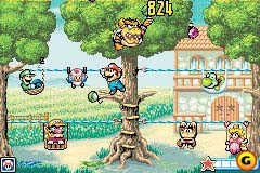
All the sprites appear to be different in some way, ignoring the colour saturation. Bowser has what looks like a uni-brow in the prerelease image, and his face is different in general. Donkey Kong Jr. isn't symmetrical there, despite him facing the screen. Peach's face is slightly different, with a slightly more cube-ish crown. Wario has shrunken, and has a grimace on his face, unlike the final, who's bigger than Mario, and looks like he's in deep fear of moon men from the planet Jupiter who are controlling our politicians, and the only way to stop them is via repelling their mind control beams with tinfoil hats. Luigi's hat has a coloured brim, and a smaller hand. Toad doesn't seem different, although Mario is significantly different, looking wider and beefy, like his old SNES era design. The final difference is that the "moon metre" is a star in the prerelease.
And yeah, I cheated and chose Super Hard instead of Easy. I ain't playing the game for hours just to get 824 points for all the characters to appear.
Nothing appears to be changed, other than the Mario sprite, which looks pretty silly in the prerelease, with the "grinnin'-like-a-fool" face and all.
The only differences I see are there are block splotches in the bricks on Luigi's side, and the parcel is slightly different.

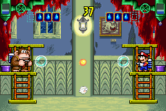
Mario and Luigi's sprites look different, with the brothers looking shorter. DK Jr. dwarves Mario here.
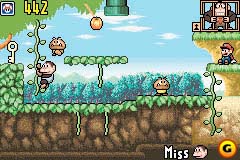
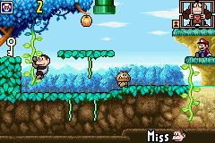
The vine's leaves are different from the final, the tree and it's leaves at the top are undetailed and green, Mario and the miss icon are a touch different, and all the greenery is bluey in the final.
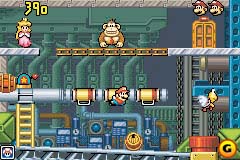
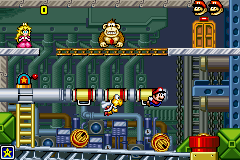
Mario's sprite is just a Super Mario World sprite, and DK's is a touch different. It's been a while since I tried 2-player, as I can't remember if your character's miss icon comes up if you're spook'diddled or fried'didda'lied, but either way, it doesn't for DK in the single player game, and DK's miss icon is totally different there. It looks like this in the final:![]()
Man, the sprites in the prerelease are barely any better or worse than the final's. Peach still looks terrible, DK hasn't had any changes between the two, and prerelease Mario looks like he'd fit right at home in an Asterix book, although whether his miss icon could is questionable. The Paratroopa is the only decent upgrade, changing from a crappy Super Mario World sprite to something good.
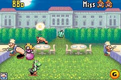
The only differences I notice are Peach is playing an animation that isn't in the final (I think), Yoshi isn't at the very bottom of the screen, there don't appear to be any clouds over the moon, and that miss icon is totally different.

This is a super-simplified of Classic Manhole. Even more simplified than the Game Boy version from Game & Watch Gallery 1!
This is the Japanese title screen. I don't know if the Japanese final's title screen is any different from this, but judging from the European final...
The hatched Yoshi egg and the Koopa are closer, the seagull is better looking, the crow is missing, and the bar at the bottom saying "©1980-2002 Nintendo" is missing.

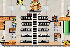
Man, this is all kinds of different. Seriously, it's different in pretty much every way possible. That's my excuse for being too lazy to compare.

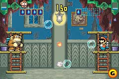
The HUD's different.
backto Oh! My God!! Why'd They Change That? |