Early Footage
All of these images were from IGN and videos from the Metal Slug Database, and scanned from the various regions' boxes and manuals. Take note that regarding the videos, I probably have the wrong videos linked to. I'm not very good at finding things; or holding onto things, for that matter.
|
Development history |
Video 1 |
Video 2 |
General screenshots |
Boxart / manuals / promotional material |
Text |
| Let's summarise! |
Development history
Metal Slug Advance is unique among the series in that it saw a fair bit of coverage during its development, and not just in obscure Japanese-only arcade news. It doesn't mean much, but what the heck, here's a quick timeline. Sources are behind the hyperlinks.
- 2002, Aug 1: The game is first announced under the working title of Metal Slug Survival Mission (メタルスラッグサバイバルミッション).
- 2003, Jul 30: Basic info is revealed, presumably from a press release. This is the source of the "more than 100 cards" claim.
- 2003, Aug 4: Only 5 missions are said to be in the game. A Winter 2003 release date is forecast.
- 2003, Aug 19: The release date is narrowed down to November 2003.
- 2003, Dec 5: Due to "project restructuring", the game is delayed until Summer 2004.
- 2004, Apr 19: The release date is now July 22 2004.
- 2004, May 12: GameSpot's pre-show report for E3 has some crazy ideas on what the game's going to include. No idea where they got that from. See Text.
- 2004, May 13: Metal Slug Advance is demoed at E3. Reports comment upon the game's sluggish pace, but SNK assures reporters it will be cleaned up for the final release.
- 2004, Sep 3: Now it's coming out in November 18 2004.
- 2004, Sep 26: A new build is shown off at the Tokyo Game Show, and it's reported to run faster with less slowdown than the E3 build in May 2004.
- 2004, Nov 18: Metal Slug Advance actually comes out when they say it will. Shock horror!


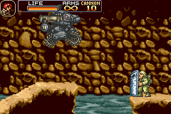
The shield grunt isn’t there, but he may have already been killed. The cave wall is also a tad different. Also, it says “Bomb”, but it should say “Cannon” since Tyra is in a vehicle. Galvatron also pointed out that not only is the font used for the numbers and BOMB text blue instead of gold, but Tyra is in a vehicle, and therefore her ARMS should be infinite, not 20.


In the video, there’s a ceiling above the troop, but in the final there isn’t. The soldier is still there in the game, I just killed him when I took the screenshot.


This is probably just the result of the video’s compression, but the Sarubia didn’t flash whenever it was shot, but it does in the game. In fact, nothing at all flashes in the video, which is odd. Also, note how the video has an orange health bar, but the game has a green one.
You can barely see it in the still image, but in the video a grenade is thrown at the Metal Slug, but it goes straight through it, obviously implying that they had invincibility on or hadn’t coded it or something.

When the Metal Slug fires it’s cannon at the Giridia-O, the body of it simply disappears instead of exploding.

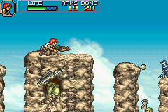
At this part, there’s a Sarubia blocking your path, along with a shield grunt pushing the Metal Slug off into the water, but in the video, the Sarubia isn’t there, and the soldier is ignoring the Metal Slug altogether.


Again, in the video there is a ceiling with a gap in it, but the game has no ceiling at all.


And no ceiling in the game here either. Another thing to point out if that Tyra just waltz past this bit, while in the game you have to wait here and fight about three or four waves of strategy-impaired soldiers before continuing.


The bazookas dropped by any soldiers do not rotate in the video, but merely stay straight as they fall downwards.

And here, there’s a gap in the floor in the video, but that gap is further along the line in the game.

This area is vaguely similar to the area unlocked by Tutor's Love, but only by the bookcases, really. Note the unlimited bullets and bombs, and lack of “Cannon” text.

Tyra is fighting the boss of Mission 1 from Metal Slug 2, but in an area not seen at all in the game! Also, she’s playing her “shooting upwards” animation, but with no bullets or effects, and is using three or four frames of animation instead of just two like in the final.

A ton of grenades hit the Metal Slug, but it takes no damage. At least the grenade explodes on the Metal Slug this time instead of simply passing through it.

A box and a prisoner are missing, along with some bats and a bazooka grunt.

The rock layout is a little different, and more importantly, Tyra is wobbling on a ledge! This animation is used in all other Metal Slug games, but they aren’t used at all in this game. Even worse is that judging from the video, it’s animation was cut up pretty horribly, just like everything else.

There doesn't appear to be any design changes here, but what's interesting if that Walter has knifed the soldier while crouching! Not only does Walter never do that when crouching (he hits them with a boxing glove instead), but the soldier's animation seems to be more fluid.

More of Tyra fighting the Metal Slug 2 boss, showing that they even included the damaged frames for it.

Tyra running through an area very similar to the beginning part of Mission 4.
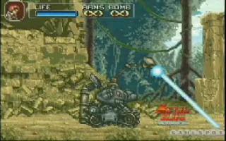
Here, the Black Hound is demonstrating it’s laser attack, a technique WE DON’T EVEN GET TO USE. I blame this for why Metal Slug Advance is so awful.

And here, the Black Hound demonstrates the technique WE DO GET TO USE in an area that is similar to the final section of Mission 1, but not exactly the same as it.

Walter stands among some Rebel soldiers and salutes in another unseen area. This looks like part of a level where the Rebels help you, like in Metal Slug 2 and 3, but I’m not definite. End video 2.
General screenshots

This area does not appear at all in the game. Paratrooper grunts don’t appear until Mission 4, and I don’t recall that background appearing anywhere in the game. Note the darker colour palette, blue life bar and unlimited ammunition and bombs, which should be “cannon”.

This is obviously in Mission 5, but this particular section isn’t seen anywhere. Plus, there’s an orange health bar, the “LIFE” text isn’t all above the meter, and a zero in the bombs section, although when it’s done to single digits it’s only one number and no 0 is there.

Orange health bar and moved-to-the-left “LIFE” text.

I don't know how I managed to say nothing about this one for so long. Aside from the usual HUD differences, the Emain Macha is actually chasing Tyra. That never happens in the game!

You can’t see it clearly, but there appears to be a ceiling at the top right corner.

Orange health bar, “LIFE” text to the left, empty bombs listed with two zeroes instead of one, and the red background is much more bolder.

The background is one solid colour, instead of a sky background, and the camera seems to be set down a bit, as you can see more of the platform you stand on. Plus, orange health and “LIFE” is to the left.


The pillar heights are different, the palette is different, and there isn’t supposed to be a helicopter, shield grunt, Heavy Machine Gun icon and rubber ring soldier there. Plus, there’s an orange health bar, “LIFE” to the left and double zeroes for empty bombs.
A similar screenshot appears on Page 9 of the UK manual. Walter has got a blue health bar, unlimited ammunition and bombs (instead of having 00 bombs), the rock pillars are different, and the ground to the left has a rocky background to the edge, while the final has the rocky background end a bit before the edge.
The manual one appears in the US manual's page 8. Cheers Enomosiki for the scan.

Orange health bar, “LIFE” at the left, unnecessary zero in the ammunition section, unknown area, and most important of all, MS5-style natives! Look at how unfitting their palettes are in that area. Terrible. And there's a proper treasure chest there instead of the one that acts like an item in the game.

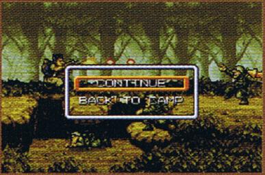
This is clearly Mission 1, but this section never appears. There are also orange health bars and a darker palette for the soldiers, and the “LIFE” is to the left.
The same screenshot appears on Page 16 of the manual. The pause menu is in all caps, the HUD is missing, and "CONTINUE" is misspelt as "CONTTNUE" again. The pause menu version also appears on page 15 of the US manual.

Andthis appears to be the beginning of Mission 2, but there are two paratrooper grunts and a Giridia-O there. In the final, there are two normal soldiers ahead, and a Metal Slug. Maybe there was more to the beginning of Mission 2, and this was actually a bit later into the level? Also, “LIFE” is to the left.

An unseen area that seems somewhat similar to the Dungeon. Also, MS5 natives, a treasure chest, unlimited ammunition and bombs, blue health bar, and both the “LIFE” and health bar are more to the left.


There’s black between the letters (the final has the blue background there), the reserved symbol is missing, the font is thicker, there’s Japanese text above the “ETAL” of “METAL”, and the copyright is different. There, it says “©PLAYMORE 2003”, but the game says “(C)SNK PLAYMORE”. A ™ and ® were also added to the logo in the final Japanese version, thanks to Enomosiki for pointing out.
Another alternate title screen appears in Page 10 of the UK manual. It's missing the ®, and it's ™ is small and black, instead of slightly larger and silver like in the final. There's also some black space between the letters.
And the US manual has another variant! It's on page 9 and exactly the same as the UK one, except darker (although that's probably the scan's fault of either one), and the ™ is white. Enomosiki supplied the scan.


An orange health bar, and blue ammunition numbers.


And the same differences here, but the explosions are using grenade ones, not vehicle explosions.


The log platforms are the same colour as the rocky background, but were changed to the ground colour; and of course, there's the HUD colour thing.

Other than the HUD's energy bar and numbers being coloured differently, no change here.

Once again, no differences other than the HUD.

The energy bar is actually coloured correctly this time; it's only the numbers that are the problem, and the lack of CANNON text instead of BOMB text.


Usual HUD difference. However, the area has slight design changes! The image has a tile on the wall that looks a bit like an S, or a snake/dragon (it's most notable underneath the pillar, on the right). The final has that tile replaced with a tile of a shocked face, or a weird doorway. Plus in the final, the pillar in the ceiling has been shortened, the walls and floor cast shadows, and there's a very, very minor differences in the bottom part of the floor near the left step.

The same ol' HUD changes, and this looks like another image where the shield grunt totally ignored the Metal Slug.
Boxart/manuals/promotional material

=CLICK FOR FULL SIZE IMAGE=
This here is the UK Metal Slug Advance boxart's back. There's four screenshots there I've already documented, but there's also some truly weird E-Cards there, with severely different art. I'm glad they changed it; Galvatron notes that it says "Collect over 100 different types of E-cards . . ." Were there going to be more than a hundred? Also note the line "Move out on foot or use your slug vehicles to traverse rugged terrain and underwater waterways to find and destroy the enemy." More proof that the Slug Mariner was going to be used.

=CLICK FOR FULL SIZE IMAGE=
And here's my badly-scanned front of the box. There's a MS5 style native there, a Slug Mariner hiding in the top left corner, the Mission 4 boss with no turrets underneath it's wings, a hut from Mission 2 with a cannon on it (never seen in the game), and Marco and Eri are there for no apparent reason, when they only appear on cards in the game.
Plus! Shoddy art. Seriously, what was wrong with the Japanese one? I thought the art in it and it's manual was pretty good.

=CLICK FOR FULL SIZE IMAGE=
On the Japanese boxart of Metal Slug Advance, there’s a small Slug Mariner near Tyra. I'd like to think they realised that the Slug Mariner was included in all promotional material yet isn't in the game, hence the anime sigh, but probably not.
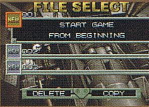
This is from Page 11 of the UK manual. There's no OPTION selection, which isn't a big miss, considering the Auto Fire is clunky and awkward anyway.


Also from Page 11, this has the "Proceed?" text in all caps, while the final has it done properly, with only the P capitalised. All the menu screens have the options (MISSION, CARD, etc.) pushed up to the "BASE CAMP" text, thus leaving a bit of space below "QUIT".
A similar screenshot appears in the US manual, page 12, with the addition of all the menu selections aligned to the left. Enomosiki supplied the scan.

Now this is odd. This image is repeated twice on the same page (Page 14); it says 01/20 at the top, while it should be at least 003/100, considering he's already got 3 cards; the card names are done using the thin font, although it should be the thick font; uncollected cards are listed as "?????" there, but are simply empty spaces in the game; and S.S.SWORD is missing it's full stops.
This appears in the US manual, page 13.

Page 14 of the manual. The list is missing the totals (003/100); Pvt. Petipase is misspelt as Peipasse there; and once again, prisoners yet to be rescued are listed as "?????", but are simply empty spaces in the game.
This appears in the US manual, page 13.

Page 14. The text is in all caps, missing the full stop after "overwritten", and is at the top, while the game version has it a bit above the centre.
This appears in the US manual, page 13.

Page 14. The text is "END GAME?", all caps, at the top left corner. The final has the text "Quit game?", and is centred.
This appears in the US manual, page 13.

Page 15. A very minor difference, but in the final the first mission is located slightly to the top left of the bare patch in the forest there, and the second mission is a bit further away from the mountain there. This screenshot has Mission 1 in the bare patch, and Mission 2 closer to the mountain. And the rest of the map is there in the manual, I just scanned it badly.
This appears in page 14 of the US manual.
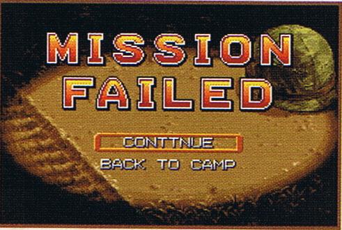
Page 16. The text is in all caps, although the game has them done properly, and "Continue" has been misspelt as "CONTTNUE".
This appears on page 15 of the US manual.
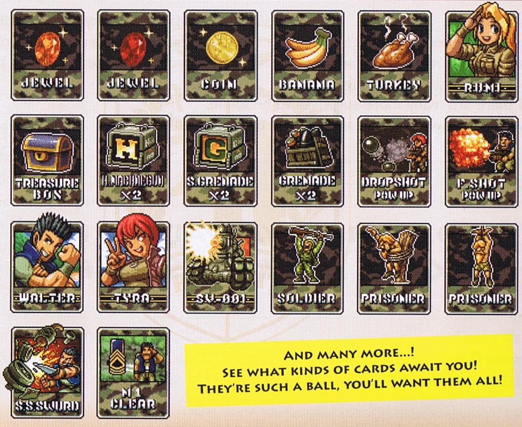
Page 21.
AMBER JEWEL - Missing "AMBER" from it's title.
RED JEWEL - Missing "RED" from it's title.
TREASURE BOX - Is blue here, but red in the game.
H.M.CLIP - Is named "H.MACHINEGUN X2" here, which looks fairly awkward, squashed
like that.
S.G.CLIP - Named "S.GRENADE X2" here.
GRENADE CLIP - Named "GRENADE X2" here, which is a better name in my opinion.
D.SHOT+ - Titled "DROPSHOT POWUP".
F.SHOT+ - Titled "F.SHOT POWUP".
METAL SLUG - Named "SV-001" here.
SOLDIER D - Titled "SOLDIER".
PRISONER F - Titled "PRISONER".
PRISONER D - Titled "PRISONER".
S.S.SWORD - Probably part of weird scanning compression, but the shades of grey
seem rather brown there.
Despite the general uselessness of most of the cards, you gotta love that tagline. "THEY'RE SUCH A BALL, YOU'LL WANT THEM ALL!" I should steal that.
On pages 18 and 19 of the US manual, cards are showcased with the same name changes here.


This was taken was page 12 of the Japanese manual, which was kindly scanned byGalvatron.
I think the menu is slightly closer to the BASE CAMP logo, and/or the background may have risen, I'm not definite.


This was scanned from page 13 of the Japanese manual by Galvatron.
The card image is different here; not only is the title on the top of the card instead of below, but the font is different.


This image was taken from page 15 of the Japanese manual, and scanned by Galvatron.
The minor differences here include the letters being spaced differently (it almost looks like it says "MIS SIO N F AIL E D"), the orange bar thing being smaller, and the text may or may not be different from the final; the quality is pretty poor, so I can barely tell.


I was unsure where to put this, but I guess this is good enough.
These were found from IGN's first preview of the game, and are quite different from the final's. The names are switched to the top with a different font, and of course, most of them have different pictures. Marco looks very manly indeed.

Galvatron popped this over to me; it's from Nintendo Official Magazine issue 132, September 2003. At quick glance, it looks the same as one already seen here, but Walter's legs are in his jumping up pose instead of jumping forward, and the background is the same as the one with two paratroopers and a tank.
And multiple paths through the levels? I laugh!


Enomosiki provides this scan of the US manual, page 10, showing the character selection. It's darker (although that is, as said before, most likely the fault of the scan), but Tyra has more colours, like her mugshot highlighted and greyscaled. The game lowers their colours when they're not highlighted.

This itty bitty screenshot of the Stealth card appears in the US manual, page 13 (and more praise to Enomosiki for the scan). The card uses the old style seen above, and it's description is in all caps.
Text
| TEXT |
SOURCE |
COMMENT |
| [Tyra's name is misspelt as "Tyler".] |
UK manual, page 4 |
lol. |
| [CARD screen is named "COLLECTION", although the screenshot still says "CARD".] |
UK manual, page 13 |
|
| [Prisoner list named as "HOSTAGE LIST",
although the screenshot still has the correct name.] |
UK manual, page 14 |
|
| Numerous cards are hidden in dungeon stages.
You clear the area by obtaining just one hidden card. The mission fails when
the life energy of the character in use is exhausted. You can freely move
between various areas of the dungeon. |
UK manual, page 15 |
Multiple dungeons? Intriguing. Considering
there are three main themes in the dungeon in the game, maybe there were at
least three, and they combined them into one to avoid having to finish them? |
| When characters die during missions (or dungeons)
[...] |
UK manual, page 16 |
More proof of multiple dungeons. |
| IRONSIDE: A missile that hugs the
earth at super-speed. |
UK manual, page 18 |
Error in translation? According to Galvatron, there's a prisoner named
Ironside. |
| However, when you do die this time around it
sends you back to base camp, where you select your missions and such. |
Nintendo Insanity,
MSA
preview |
Dying sends you back to base camp? Either
that's weird wording for choosing to continue or exit, or that preview
just sends you to the menu every time you die. |
| And you can still hop in cars and other modes
of transportation as well. |
Nintendo Insanity,
MSA
preview |
Cars? The author is either talking about a
different Metal Slug game, or has no idea what s/he's on about. |
| Things just appear to be a bit smoother and
more fluid. |
Nintendo Insanity,
MSA
preview |
HAHAHAHAHAHAHAHA |
| Classic gameplay and graphics slightly
revamped. |
Nintendo Insanity,
MSA
preview |
HAHAHAHAHAHAHAHA |
| 5 new missions, 4 minigames |
Nintendo Insanity,
MSA
preview |
Mini-games? I've a hunch the author is
talking about the dungeons, but who knows. |
| Collect over 100 different types of E-cards
[...] |
Nintendo Insanity,
MSA
preview |
There's that over 100 cards again. |
| We played through an early level of the game
and picked up familiar weapons, [...] the dual Uzis [...] |
GameSpot,
Hands-On E3 2004 |
The Dual Machine Guns appear nowhere in the
game, nor have I noticed any graphics for them among the tiles. Strange. |
| [...] we know that the game will be composed
of five missions and that you'll traverse environments with names like
subterranean dungeon, mysterious ruin, limestone cavern, lava zone, and
subterranean lake [...] |
GameSpot,
E3 2004 Preshow Impressions |
Subterranean dungeon is presumably the
Dungeon (lol duh), mysterious ruin is Mission 3, limestone cavern could be
Mission 3's last area at a stretch, but the last two absolutely stump
me. |
| [...] alternate level paths [...] |
GameSpot,
E3 2004 Preshow Impressions |
In a whopping two levels, one of them secret. |
| The most unexpected feature that Metal Slug
Advance promises is e-Reader support [...] |
GameSpot,
E3 2004 Preshow Impressions |
I think this is actually a misinterpretation
of the card name, E-Cards, but eh. |
| [...] running out of health ended the entire
mission and sent us back to base camp [...] |
GameSpot,
Hands-On |
Another reference to getting sent straight
back to the menu, instead of the choice. |
| along with a few bonus levels |
GameSpot,
Review |
Keep in mind, that this is a REVIEW. And if
this isn't a typo or mistake, I DEMAND TO KNOW WHAT VERSION THEY HAVE |
| The Game Boy Advance title will even feature
a Rescue Hostage Challenge, recording each hostage rescued during the
challenge. |
IGN,
preview 1 |
Rescue Hostage Challenge? I was unaware it
was meant to be a separate Challenge mode or whatever. |
| [...] even on the up-stream river hopping
section [...] |
IGN,
TGS 2004 |
What!? Vague
references to additional levels was bad enough, but describing something
awesome like THIS makes my blood boil! |
| [...] so you can
expect numerous showdowns with huge helicopter gunships, massive
torpedo-spewing submarines, acrobatic monster tanks and terrifying armoured
trains. |
Computer And Video Games,
Hands-On |
The "huge helicopter gunship" is presumably
the Mission 4 boss, torpedo-spewing submarines may refer to those wired ones
in Mission 2 and 5, but it may be the boss of the scrapped aquatic level.
Armoured trains may refer to the Mission 2 or 3 boss, but I've no idea.
Acrobatic tanks is self-explanatory. |
| Six huge action packed missions plus 4 mini
stages |
SNK/P USA site,
MSA
features |
Now, stating something like this in a preview
is one thing, but stating it on a site for the game, when it's meant to be
released, is something else. |
| Take on additional assignments and discover
hidden bonus missions |
SNK/P USA site,
MSA
features |
Additional assignments? Hidden bonus
missions? WE'VE BEEN GYPED |
|
The six levels
aren't designed to be endlessly huge [...] |
Computer And Video Games,
Hands-On |
More proof. |
| the game will have two new systems, the first
is [...] a hostage list [...] |
The Magic Box,
Preview |
The hostage list isn't new. EVER HEARD OF
2ND MISSION YOU DUM DUMS |
| [...] there are more than 100 Metal Slug
Cards [...] |
The Magic Box,
Preview |
There's that bloody more than a
hundred thing again. |
|
soldiers duck, roll and hide
to avoid your bullets while pummelling you with machine gun fire and
grenades [...] |
Ace Gamez,
Review |
I don't recall soldiers ever doing such a
thing as avoiding the bullets, nor firing at you with guns. |
|
weird voodoo creatures |
Ace Gamez,
Review |
Probably talking about the natives. |
| [...] collecting more than 100 cards. |
All Game Guide,
Preview |
Seriously, shut up with the extra cards
already. |
| [...] even animals that
manage to pack some caliber [...] |
Gamers.com,
Review |
The animal slugs aren't in MSA. |
| It has six huge
missions to beat, as well as bonus mini-games, hidden missions, a detailed
profiling of the hostages you rescue, and more. |
Gamers.com,
Review |
Oh, something we haven't heard before! It
mentions the popular six missions and mini-games and hidden levels, but it
also says it provides a detailed profiling of the POWs you rescue. If their
rank, name, and number are considered "detailed", well I'll be damned. |
| It uses multiple
layered backgrounds for an incredible 3D look. |
Cheat Code Central,
Review |
I can't help but find this completely and
utterly laughable. Hey, buddy, it's known asscrolling, and it's
old news. And it doesn't make the game look 3D. In other news, I'm grabbing
at straws here. =( |
| Six levels |
Nintendo.com,
Overview |
No? |
| Bonus missions |
Nintendo.com,
Overview |
No. |
| Collect more than 100 power-up cards |
Nintendo.com,
Overview |
No! |
Let's summarise!
As you may have noticed if you looked at the whole page, Metal Slug Advance's early footage is round after round of bullshit mixed in with something vaguely interesting. For those of you with no patience, here's the good stuff!

The first boss of Metal Slug 2 would've been in a forest area (Mission 2, I guess?), but it got modified into the boss of Mission 4.

The Black Hound would've given you more reason to use it by maintaining its laser.

Mock-ups are often more exciting than the real product.

The Slug Mariner would totally for certain have been in the game, with numerous text sources and unused sprites making it very clear. We would've gotten a level where you jump on logs drifting down a stream, too!

And the cards once had ugly graphics.


