some games I played in
2020
Croc 2
PC
Jul 19 ~ Jul 21
Jul 19 ~ Jul 21
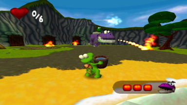
Croc is one of those games that's embedded deep in my nostalgia zone. I can hear a thousand and one criticisms of it and I'll still declare it one of those unjustifiable favourites. I say 'unjustifiable' like I haven't been making up ridiculous arguments for why all its faults are good, actually.
But it's unique! It's a clunky, intentionally old-fashioned amalgamation of 2D tropes when the 3D platformer genre was still sprouting, so by playing it safe and hewing on the side of caution, it makes for something quaint and distinct. No huge worlds, no overlapping collect-a-thon elements... just something small and compact and pleasantly bite-sized.
Well, Croc 2's been sizing up the competition and realising it's got some catching up to do. There's hub worlds! There's dialogue and objectives now! Levels are big and sprawling and not just tiny little rooms above bottomless pits!
A lot of this is Argonaut fleshing out their tech, allowing for stages to stream in new geometry without having to put arbitrary doorways in your road... but it results in levels that feel far too big and way too barren. The set dressing is nicer, but it doesn't add anything beyond giving you farther to walk.
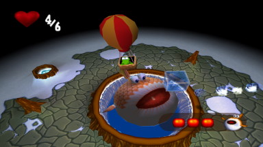
As someone so acquainted with the first game, everything about the sequel is disorientating. All of the classic iconography has been swapped around! Exit gongs are now mid-stage checkpoints; 1Up hearts are now your health metre, and crystals no longer protect you from attacks, they're now currency for buying optional items! There's a lot of new systems, including hub worlds to walk around, objectives for each stage, and even the ability to carry and throw certain objects.
It makes the game appear more fleshed out, but none of it adds anything meaningful to the game. Hub worlds are confusing to navigate and full of insipid baby-talk dialogue. While some of the objectives are interesting, more often than not they result in long-winded levels that leave you lost on where to go, or even where the entrance is so you can leave. And the ability to pick up stuff adds nothing but fiddly puzzles and obnoxious boss fights!
Even Croc himself feels strange; the game now has options for classic tank controls or full analogue movement, but his movement speed is so ramped up it feels like you're throwing him around the place. He accelerates to full speed uncomfortably fast, and jumping practically rockets him to the peak of his arc, where he hangs in midair for a second, before plummeting down just as fast.
After the more 'weighty' controls of the original, it takes some getting used to... which doesn't help that 3D space somehow feels awkward to navigate than before. The camera is positioned in such a way that it's hard to measure depth, making it easy to fall off ledges and tricky to grab onto swinging ropes, a new feature that's more stressful than it has any right to be.
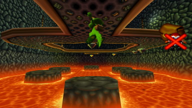
I could go on (and with the amount of notes I've written, I intend to sometime!), but every new change and addition only seems to muddy what made the original such a pleasingly concise game. Vehicle stages, talkative NPCs or an inventory system add nothing but bizarre distractions and reasons to grumble. And ultimately, its new pursuits only make it easier to draw comparisons with the competition, none of them favourable.
That said, it's a perfectly adequate 3D platformer. It looks nice, especially with the draw distance extended on PC, and even on PlayStation its large streaming levels were impressive. Argonaut's bread and butter in this era was making perfectly middling 3D platformers as licensed tie-ins, and if Croc 2 were anything else you'd probably be happy to have it. But when stacked up against the original, despite its attempts to smooth out the rough edges, it loses a lot of its identity and feels sloppy by comparison.
Sonic Generations
PC (Steam)
...? ~ Jul 27
...? ~ Jul 27
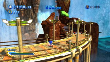
This is a game I've long tried to get on good terms with, but I've always bounced off it completely. It took this long to understand some of its idiosyncrasies and what it was going for; it's still not quite what I'm after, but at least I could play along without hitting an obtuse roadblock.
Just to get it out of the way because it's everyone's first complaint: classic Sonic feels extremely weighty, with a sense of momentum that feels suggested at best. Jumping seems to speed him up from his default sluggish state, but rolling only makes you lose speed, even going down slopes that would ostensibly make him a wrecking ball.
And his movements feel delayed? His jumping in particular felt like it took a good few frames from pressing the button before registering, making any interaction with enemies liable to an arbitrary fuck-up. The spindash is powerful -- almost too powerful! -- and a shocking contrast to the rest of his limp moveset. Sonic on Mega Drive had a unique physics engine that's a dickens to replicate in any medium, but let me go stupid fast by rolling down slopes, that's all I ask.
Modern Sonic continues my pet peeve of trying to be a million things at once, and it's up to you to make sense of it and the dozen single-purpose tools at your disposal. Sonic isn't as free-moving as in Sonic Adventure 1, 2, or even Heroes, with his turning very incremental as if geared for minute adjustments while running on straightaways. It's very forward-facing most of the time, and expects you to turn or evade with the drift and sidestep commands... yet those are available at all times, even when the game approximates omni-directional 3D platforming. They feel like strange inclusions, and that's not even mentioning the extremely useless slide move that exists just to trip you up for no reason. I don't get it.
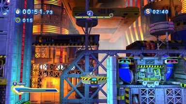
No matter what 'mode' of 3D it's in, it still feels like it's treating itself like 2D via manner of OutRun -- constantly moving into the background and all you can do is steer. Turning is incredibly slow, and in boss fights against Silver or Egg Dragoon you're actually tethered to invisible 'lanes', which you're expected to shift between with LB and RB.
Meanwhile, drifting around corners feels incredibly steep with no analogue sensitivity; it looks awkward and feels awkwarder. Am I expected to tap the drift? It doesn't look like that's the intended option, but it's either that or smashing into the inner wall...! Wouldn't a brake button cover both of these bases...?
Its 3D level design is just so weird to me. Seaside Hill throws barriers on the first curve because it would otherwise be so easy to fling yourself out of bounds, and yet every instance of it using proper 3D space it offers no training wheels whatsoever, expecting you to navigate these tiny angular platforms with Sonic's bizarre handling. Blaze's mission in Crisis City is one of the few to use proper 3D space, verticality and all, and it just doesn't platform well, feeling worse than the Adventure games or even Sonic 06.
I think that's my major frustration with the 3D gameplay -- it's so forward-focused that it struggles to do anything else besides running forward. It's a game that simply doesn't feel attuned to parsing 3D space -- the crappy non-homing homing attack was my crutch on my first run of every stage, because breaking my fall was a better way of feeling out the area than just hurling myself into the unknown.
I can kind of tune into what the game's going for when I replay levels, and I'll give it credit for forging its own path, establishing Sonic as a very unique branch of 3D platformer (quote-unquote). Its brand of reflex-testing, twitch-reaction gameplay just feels clumsy when so many of the tools... serve only to give you more tools to memorise. What is the slide's purpose, honestly?! How am I to discern what's too small for Sonic to squeeze through when he's already tiny and running five hundred miles an hour? But I digress.
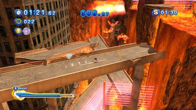
The game's progression cycle requires beating both acts of each zone, and clearing the three zones in each area will unlock missions. Beating one mission from each zone will earn you the keys necessary to unlock the boss fight, which then unlocks the next three stages.
You can play any of those three zones in any order you want... but if you beat one then you have to play the rest in order as the other Sonic. A weird quirk that had me stumped for how to access Sky Sanctuary when I picked up from where I last left off. It's a strange progression system, seemingly there just to pad out the game so you don't blaze through it.
The missions aren't half bad though, a neat way of mixing up assets to present new challenges. While some are simple time attacks on the vanilla stage against Sonic clones, others remix the environments to pose new thematic challenges. The ones that allow you to use allies as abilities all feel a tad lazy, with Blaze's fire-dousing and Rouge's "charm" serving as simple gimmicky projectiles. Others introduce all new mechanics like Sonic 3's elemental shields, which you can then unlock via the skill shop. I do like the variety the missions brings to the game... I just wish exploring the hub to access them wasn't so endlessly fiddly.
The bosses are absolutely the game's low point. Needlessly complex, needlessly drawn-out, and with different attack phases for nearly every hit. When they work, they're somewhat exciting like the Perfect Chaos fight, but Egg Dragoon was absolutely a waste of time. Trying to line yourself up with the ramps, and wading through countless ice shots just to take another stab at it if you missed... ugh. And the final boss was so stupidly cryptic, yet also posed no threat whatsoever...? I had no fucking idea what I was doing yet beat it on my second try, with an S-rank no less. Not a good sign when I don't know what I did to win the game.
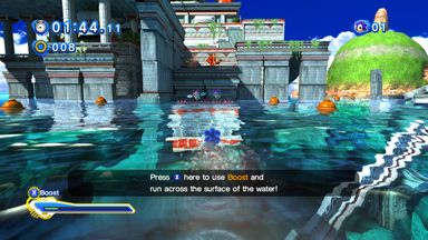
The game also has this bizarre skill customisation menu where you can equip various skills, with different sets for classic and modern Sonic. Modern's toolset mostly alters the boost properties, while classic equips new shields, and both have perks to make rings more attainable, alter speed, etc. It's... a bizarre mechanic, one that not's as helpful as I'd hoped. It didn't help it took me until the end of the game to realise you need to press Start to confirm your selection; anything else and you just leave the screen with nothing. Look, it's a weird menu and I am very dumb.
While tweaking Sonic's speed, acceleration and jumping properties sounds nifty, the execution felt more than a little gammy, as if the numbers had been tweaked a little too high. If only I could tweak them with a slider like in F-Zero GX, then we'd be in business...! Unlocking new skills from missions was a lot of fun, but actually using them never felt as rewarding. The various gimmicky abilities assigned to the Y Button just felt like weird fan-mods more than anything. You'd sooner just play as the partner characters, y'know...?
After beating the game I went back to get S-ranks on all the levels (not bosses or missions though). Getting an S-Rank doesn't seem to demand terribly good play, so long as you just don't die. Getting these after accomplishing the same on the 3DS version was weird, as it and Sonic Rush have very clear score requirements, often dictated almost entirely by the time bonus, so mastering your route and performance is key.
In this version... I futzed about, took a bunch of hits, lost the plot on numerous occasions, but so long as I restarted the stage if I fell down a pit, I was guaranteed an S on the second go-around. Obviously the real appeal is getting better times and all, but the moment I got an S-rank I was like, I've got nothing more to prove.
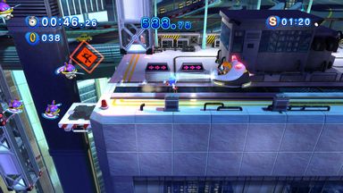
It's neat playing the game to the end, and redoing stages for S-ranks did help me better understand what it's going for, but I simply find the 3DS version much easier to parse. This game wants to look impressive first and foremost, and it does looks pretty... but I dunno, the direction of modern 3D Sonic just isn't what I'm after.
It makes so many bizarre design decisions to compensate for an alleged lack of content that the whole product feels so muddy -- it took me over a year to have the patience to really 'get' it, and for a series that likes to revel in "easy to learn, hard to master", learning how to navigate the hub and mission structure shouldn't be that big a roadblock on top of learning the strange movement commands.
I'm glad Sonic fans got what they wanted out of it, it seems. I'm just gonna be one of those pathetic sad sacks who keeps saying Sonic Adventure was the peak, no matter how worse its flaws get with every passing day. Sorry!
Croc: Legend of the Gobbos
PC
Jul 23 ~ unfinished
Jul 23 ~ unfinished
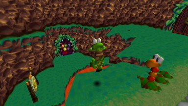
I only played an afternoon of this just to get the taste of Croc 2 out of my mouth, gunning it straight for the exit with zero attempt to explore or rescue Gobbos, but it was a much needed refresher.
After all these years I still find the game so dang cute and charming; the fact it's emblematic of this frontier age of 3D is perhaps part of it. Each 'room' might only be a free-floating or walled-in box, but they're all jammed with platforms, gems, hazards, and stuff you otherwise interact with.
The first world has you creating platforms with switches. hopping across crates, jumping down holes and all sorts of things. The first level is practically a playpen of assets, all there to help you come to terms with navigating 3D space for possibly the first time -- or at least the first time with tank controls.
That's the thing: so many of Croc's foibles are essentially a symptom of there being no established 'language' for 3D platformers yet. The PlayStation didn't have analogue control yet, so steering like a tank seemed ideal for the D-Pad. Vast, uninterrupted worlds weren't standardised either, and also a bit infeasible on the PlayStation, so room-based level design it is.
And yet because the genre moved on so fast, it feels like a key part of Croc's identity. While the competition has got free-flowing movement exploring huge worlds, here's a crocodile who steers like a truck dinking about in little polygonal toy boxes, and I love him all the more for it.
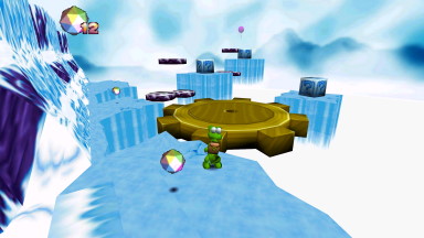
Although the game is perfectly playable as a linear experience, rushing through it does show how thoroughly exploring levels to get all the goodies is the core of the game. You want to rescue the Gobbos and collect the gems, backtracking to use all the keys and solve all the puzzles, and it's satisfying when it all comes together. Finding the Gobbos is some of the trickiest platforming in the early game, and if you ignore them it's not until a few worlds in that the difficulty takes a sudden upturn on the main routes.
Some of that difficulty is a bit cruel or unwarranted, mind. Swimming through underwater passages isn't fun, and navigating dark caverns is particularly joyless. World 4 gets just plain mean at times, especially considering its long levels: in the room after a particular nasty puzzle, it'll then expect you to survive a gauntlet of swinging axes, with no crystals to help protect you!
I admire the chutzpah of it, though.World 4 makes the most of the game's core mechanics, putting your skills to the absolute limit; it might be using mechanics in ways you didn't expect, like the block-tower puzzle, but it's just building upon Croc's block-pushing ability, it's nothing you haven't already gotten acquainted with. Better that than dodgy mini-games or vehicle stages!
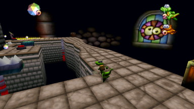
I played using crocguy0688's Definitive Edition package, which tidies up a lot of the quirks with running the CD modern computers, with new widescreen support and even the option for PlayStation or CD-quality soundtracks.
I did notice audio glitches after two hours of play where the sound effects would get 'jumbled' -- Croc's tail whip would play a different sound in every room, as would everything else. Quitting and restarting seemed to fix it. Still, it's probably the most accessible way of playing the game, even if it means missing out on the adorable loading screens.
This is another game series I've long wanted to write a big piece about, and I made stacks of notes for it this year. It remains to be seen if anything comes of it, of course, but it's nice to be reminded that the game is still a bigtime favourite of mine, no matter how old and stodgy it might appear. Being the reigning #goodcroc probably helps, mind.
Sonic Generations
Nintendo 3DS
Jul 20 ~ Jul 25
Jul 20 ~ Jul 25
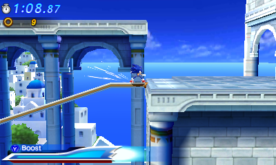
Gave this a spin after bouncing off the PC version for the umpteenth time... and found it way easier to get into. Modern Sonic's bizarre fusion of 2D and 3D is dialled down considerably; it plays on a 2D plane just like classic Sonic, only with his boost, stomp, and occasional camera shenanigans to set him apart.
The boost mechanic is very much what makes them distinct, balancing your boost via collecting rings, bashing baddies, and always maintaining the high ground. As is the norm, lower paths are basically punishments, pitting you against time-wasting traps and hazards that put a real downer on your time bonus.
Between Sonic's puny jump and the dire lack of visibility, these 'punishments' often feel not just arbitrary, but downright cruel. Radical Highway is perhaps one of the toughest levels because of it, as its bottom-rung paths subject you to some of the most dreary platforming in the game, waiting for the cylinders to slowly droop into jumping height, and then waiting around for the next one. You can bypass them if you know when to boost, but it's all too tempting to just restart the entire stage when it happens. I'd sooner fix my mistakes than subject myself to this abject misery!
Visibility is something the game struggles with, mostly because it never thinks to steer the camera forward, and not have Sonic dead centre at all times. Memorisation is key to Sonic games, but stages like Emerald Coast were obnoxious because of its blind pits, zooming the camera in so close I had no way of knowing there was a hole there unless I'd already died to it. That, and the hazards feel that bit more obnoxious; Radical Highway's cylinders, Casino Night's slot machines... they're so agonisingly slow! Go ahead and kill me, just don't hurt my time bonus!
Classic Sonic is arguably better tuned than the console version. His spindash isn't as outrageously powerful, but his acceleration and control feel much more natural. He even gains access to an aerial homing attack partway through the game, which more importantly serves as a good way of gaining acceleration from a standstill, or cutting an ascent short. You also don't have to wait around for his hurt animation to finish until you regain control, which is a small blessing.
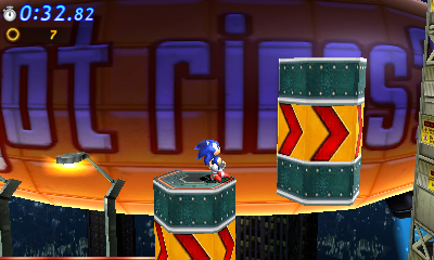
Good news: special stages make a comeback, after being MIA since Sonic Heroes! Bad news: they're the bloody awful ones from Sonic Heroes! It's cute to see them show up, they're fine challenges, but the visibility is absolutely barbaric no matter what way I turned the 3D dial, and I never felt inclined to replay them, even if they do have score rankings. Is this the first game to offer score attack on special stages? By all accounts I should be thrilled, but...!
The game's presentation is kind of spartan, with fiddly menus and incredibly slow transitions (when you're playing a fast game you really notice when it drags its feet!!). Rather than a new story, it's a straight copy-and-paste of the console's plot presented as dialogue boxes, meaning all of the comments on the world changing around them is totally lost.
Rather than be included as part of the main game, missions are relegated to a menu of their own (with more slow transitions!) with fare in the vein of Sonic Rush Adventure -- beat this stage with no rings, defeat all baddies, don't defeat enemies, time attack... they're merely adequate, but nothing I felt keen to explore. It doesn't help you seem to unlock one mission every time you turn on the game, and have to use 3DS PlayCoins to unlock the rest. It's nice that it's there, but the way it's presented almost actively encourages me to not give a shit.
It's a much more compact game than the console version, without the same level of spectacle or variety of content, but it's one I arguably had a more entertaining time with. Though not without its low points, it's short and sweet, and as always seems to be the case, going back to get better scores was more entertaining than my first runthrough of the game. Omitting optional fluff like the Red Rings might be a bummer to some folks, or the downsized scope of each level, but I found the bite-sized design on the whole that much more appealing. If Sonic Rush scared you off, this is arguably more accessible than either of those games... though playing for S-ranks isn't the same without the intense boost and trick mechanics.
Sonic Adventure 2: Battle
PC (Steam)
Aug 03 ~ Aug 04
Aug 03 ~ Aug 04
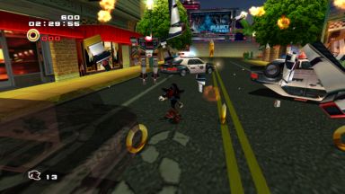
I guess I'm in a Sonic mood! Or after two doses of Generations I needed a palate cleanser! That, and I had an old Humble Bundle key to spare and I wanted to see what the mods are like. I had no shortage of excuses to play this game, let's put it that way.
I can't remember under what contexts I visited the game back in 2013, but I had a lot more fun this time around. God, it's nice to feel like I'm in control again (somewhat). After Generations' stodgy physics and very scripted approach to how you're meant to play from setpiece to setpiece, it was nice to go back to Sonic Adventure 2's more free-flowing attitude. 'Scripted' animations like the somersault remain a stumbling block, but being able to whizz up slopes of any surface and propel high into the air is still such a thrill.
It's strange starting the game afresh and not having all the moves. Stuff like the lightspeed dash and the bounce attack feel like such staples of Sonic's repertoire that playing City Escape without them was a fumbling mess. While it is strange to have to acquire abilities mid-stage, getting the slow trickle of upgrades does feel right, in that you're not bombarded with every single move at once. Generations gave you all the moves but only taught you to use them when appropriate... which only made me wonder, why even have the slide move at all? What does it contribute besides to fuck me over on totally arbitrary moments? But I digress.
I was going to say all the upgrades in this game feel 'right', in that the player will find valid use for them and not just as arbitrary stopping points... but I forgot about the Mystic Melody, didn't I. Or the Magic Hands. Or whatever other useless rubbish it had. This game throws a lot of needless guff at you in the name of hiding secrets, holy moly.
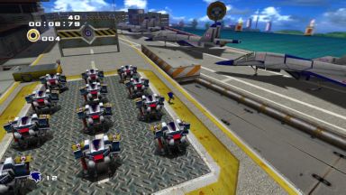
I've played SA2 a whole bunch of times and A-Ranked it back on the GameCube, but by no means would I call myself a pro; it's just familiarity more than mastery. It's perhaps a bit insulting playing City Escape for the fifty millionth time and still getting a D rank, but I like how Sonic's scoring system isn't just about going fast, it's about juggling everything else as well -- landing tricks, defeating enemies, collecting rings... it forces you to engage with all of the game's mechanics, not just speed.
It's perhaps a bit obnoxious when all you want is a grade on your time trial, but I like it more than the ranking system in Generations, which basically treats speed as the be-all end-all of scores. Which is rewarding in its own way too, but it feels like, once you learn the optimum path, why even bother replaying the stage? What's the point in exploring? SA2 kind of gets the same way, but when there's more factors to worry about, it feels worthwhile checking different avenues to see what points enemies award you, things like that.
Tails' stages aren't bad; I still hold a soft spot for them. The sound design can throw itself off a cliff, of course (WHO LIKES INCESSANT BEEPING!!!!), but I like the Panzer Dragoon style lock-on combo system. Trying to line up as many targets before the lock-on runs out is very satisfying, especially the 'pop' of all the enemies exploding in tandem. Learning how the hover jet's unique momentum works is fun, and although the actual movement is clunky, having the body rotate faster than the legs can walk in a circle is strangely satisfying.
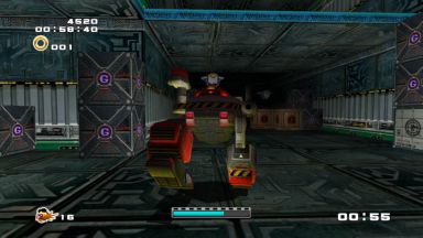
It feels like the shooter stages were really designed for Eggman, though. His first stage feels like a better introduction to its gameplay, with frequent gates that demand you master the lock-on to target them, as well as a stop-and-go pace that better segments each individual challenge.
His stages feel more varied too? Sand Ocean's slow-going platforming is a serious stinker, but the rest all feel distinct; by the time you reach Cosmic Wall, his formerly slow-paced, stop-and-go gameplay has evolved into something surprisingly intense, demanding you master scaling huge vertical chambers using low gravity while racking up huge comboes.
It's the closest the game gets to something like theming, showing him grow more bold and destructive as he gets closer and closer to achieving his goals, if you wanna look at it in that way. Tails' stages aren't bad, but by comparison feel muddied with gimmicks that just don't pay off, like the breakable doors in his pyramid stage and whatnot.
Unfortunately, it's so hard to not compare it to E-102's stages from SA1, which were so much faster and roomier -- you had much bigger stages to roam and fly around in, while these stages are explicitly designed to slow you down. It's not just the roadblocks and enemy-gates, but its sluggish acceleration and constant loss of momentum as well. While it stinks to have interruptions in Sonic's gameplay, I think there's merit in the shooter stages. They're decent challenges, and if nothing else, they're not as obtrusive as the treasure hunting levels.
Ugh, these things. It's like the air getting let out when you're dunked into a Knuckles level. He peaks early with the still-engaging Wild Canyon, which is just the perfect size for exploration. Neatly segmented into four main chambers -- left, right, centre and underground -- it's big enough for you to explore each individual facet and get acquainted with all the details, but small enough that you can circle the entire thing in under 20 seconds. In my head I tell myself I like the Knuckles gameplay, and in stages like this, I'd dare say it works perfectly. Having an excuse to become more intimate with a compact, well-designed environment is appealing, a nice change of pace from just rushing past all the scenery.
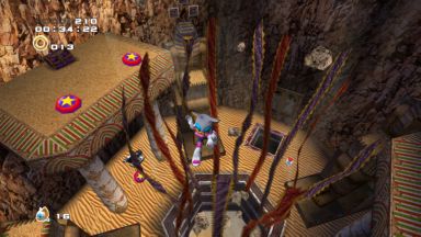
And then you enter Pumpkin Hill, and it is multitudes bigger than his last stage, with multiple towering islands to explore, and only anal clues and minuscule landmarks to point you in the right direction. There's just so much ground to cover, and although I don't think you can die in the bottomless pits, it's still daunting having to glide everywhere, without a cohesive landscape to parse.
And it only keeps getting bigger...! Aquatic Mine looks nifty at first, but the water-raising gimmick is cryptic beyond belief, and invariably solved by bashing your head against it for upwards of thirty minutes. Meteor Herd is impressively huge, the absolute biggest level in the game, yet navigation is at an all-time low, especially with the default single-emerald radar system. It take so long to scout from top to bottom, and although there's a variety of distinct 'tiers' to it, it lacks the lived-in charm that Wild Canyon had.
Rouge's stages are all perhaps more accessible than Knuckles'? Dry Lagoon isn't as compelling by virtue of being split into two areas and its clunky underwater navigation, but all of her levels feel much smaller than the Hero counterparts. Egg Quarters arguably throws a spanner in the works with the roving security scarab, but it seems so much easier to get between all of the areas, with no self-contained hidden rooms to throw you for a loop like in Knuckles' Death Chamber.
Security Hall has far too much going on given the time limit, with safes locked by switches at the top of the stage, among other hiccups that have you way too stressed for what's otherwise a pretty middling stage. Design-wise, Mad Space is about as rough as it gets, with huge vertical exploration and funky gravity that's hard to escape from, but it feels so much more self-contained than Knuckles' stage. She's not without her hiccups, but a lot of the faults with her stages are down to the gimmickry rather than just these huge, meandering levels to explore... up until Mad Space, at least.
These stages are so much bigger than anything Knuckles had in SA1, besides maybe Red Mountain, and it quickly becomes a miserable experience -- to spend so much time wading around the same environments for squirrelly tokens is depressing. Forward momentum, y'all! The puzzle focus is cute, but drastically downscaling the levels would have made such a difference. Wild Canyon, to me, is ideal: no matter where the shards are, I can still be guaranteed to finish the level in two minutes or less just through brute force and ignorance. Perhaps not the solution you want to facilitate from your explorative missions, but something compact is what you want, surely!
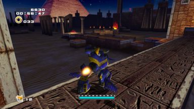
I do like how although no character revisits the same stage, the levels are designed to reuse assets to some extent. Rail Canyon is repurposed from chunks of Pumpkin Hill. Radical Highway is then pieced together to make the kart stages. It adds to the duality of the game, seeing these locales in different lights -- sometimes literally, like Tails and Eggman exploring the pyramids in day and night respectively.
If I had to grumble, SA1 had a certain something to it when Knuckles revisited the "at dawn" portion of Speed Highway identical to Sonic's, or explored the interior of Sky Deck from a different perspective. To build setpieces that were "cross-compatible", so to speak, made them feel easier to digest. Wild Canyon remains the best of Knuckles' stages because it feels like a vertical slice from a hypothetical Sonic-only level; stretch it out, add a few rails and ramps, and it'd be a perfect level for him.
There's a dumbass inside of me who thinks explorative gameplay could be done right in Sonic, but locking off progress until you find three doodads is such a miserable slog; entering a Knuckles level triggers a primal instinct to turn the game off. I do wonder if treating stages almost like Sonic R is the way -- have a proper path or circuit for a traditional level, but flesh it out in such a way that there's still stuff to explore in missions. I don't know, it sounds good in my head, but it often ain't the case in reality. Would be nice if more folks were making 3D fangames so we could experiment, eh?
The game's got a mean difficulty curve with often outrageous spikes for no reason at all. Some of this is because its demands are just a wee bit absurd -- the Knuckles/Rouge missions in Last Story are so difficult to parse, between the absolutely ginormous levels and samey art design -- but sometimes it just seems like they put in some code and made no efforts to tame it, like the completely outrageous rival battles which can descend into fireworks in no time.
Bouncing between such different playstyles is jarring. After spending so much time in Death Chamber as Knuckles before being thrust into a Sonic stage, I forgot I wasn't able to glide between platforms! The common complaint around this era was "I bought a game to play as Sonic, not his stupid friends"... but honestly, they're such a key part of the franchise to me. To have such wildly different gameplay utilise the same space was what made Sonic stand apart in 3D compared to Mario, who simply lumped you with just one plumber to play as, with some token power-ups if you were lucky. That's fine for Mario, but Sonic's cast have such wildly different powers it'd be a waste not to take advantage of them!
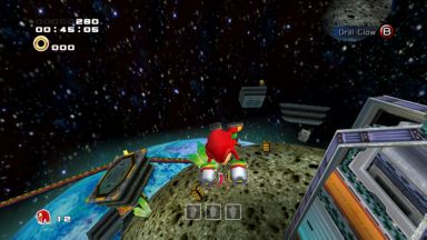
After finishing the game I tinkered about with the "Character Select Plus" mod, mostly to take Knuckles and Rouge into other characters' stages. (protip: install the Visual C++ Redistributable for the SA2Mod Manager to work, it was giving me "unidentified handler exception" errors until then) They hold up surprisingly well for the most part! You're missing out on just how 'interactive' the environments in shooting stages are, of course, unable to blow down pillars and upend parts of the path, but to engage with the environment in whole new ways is a boon too.
It obviously doesn't cater to the strengths of the gliding/climbing moveset, but it's a novelty, innit? To explore the same space as Sonic or Knuckles is so wildly different, it's something you wish the games actually explored in 3D. Sonic & Knuckles is still the only one to actually design paths for their different movesets without it feeling like the developers were just laughing at you. Sonic Advance, man. Say no more.
Speaking of developers laughing at you: the kart racing. Bloody hell, that mode is a mess. Kudos to Sonic Team for trying to make the most of that weird little addition, but it's so unbelievably jank. Even Twinkle Circuit was better than this, surely...? Maybe it's the aesthetic. The roads floating above endless ocean just look cheap. It might be better to just politely ignore how unbalanced the rest of it is.
The real replay value is arguably in the Chao Garden... but I think the moment's passed. I had buckets of fun with it as a young'un, but I just haven't got the patience for it anymore. Glad folks are still passionate about it, though. Wake me up when people start making Tripod shrine pages for their Chao collections again.
SA2 still ain't a perfect game, but I think having Generations to compare it to has me thinking, this is more my speed. It's still rife with dumbass design that exists solely to confound players of more traditional 3D platformers -- I'm still seeing streamers trip over this game something fierce. Its insistence on fast-paced parkour bullshit was probably the start of a slippery slope where they decided, forget the free-reign 3D control, this is what we should focus on, to the point where you're looking at very dynamic stuff but have very little meaningful control over any of it.
As always, the story mode is topsy-turvy at the best of times, and at the worst of times a rollercoaster of foul emotions. I do think revisiting Sonic games after the fact is when they truly warm on you; I was a little kinder to Generations once I understood what bullshit it was throwing at me, and SA2 is the same. That and we have higher crap tolerance when we're young, I guess. I like it though! There's room for improvement! Woulda been nice if they actually iterated on it even once in the past twenty years...!
Croc
Game Boy Color
Aug 04 ~ Aug 06
Aug 04 ~ Aug 06
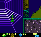
No-name dev Virtucraft bring Croc to Game Boy Color, which Nintendo magazines had to acknowledge with strained smiles after using the little guy as a punching bag during the console wars. Given the clear building blocks the classic Croc lifted from its 2D predecessors, you'd think this would be a homerun, right? All it needs is to u-turn and just directly ape what it was aping in the first place!
Well, not quite. It turns out a lot of the game's charm lies in its early-days 3D aesthetic! To explore compact rooms and manoeuvre using tank controls is a big part of what makes Croc what it is, and turning it into a generic 2D platformer... turns it into a generic 2D platformer. Whodathunk?
The graphics are cute, at least, and hearing chiptune renditions of the familiar themes is sweet. Although ostensibly a redo of the first game, it's got a number of unique elements, including stages set on an auto-moving minecart or flying carpet, and even a sequence where you have to outrun a giant drilling machine. There's even a bunch of brand new enemies: bats, snakes, spiders, polar bears... they're hardly as iconic as the Dantinis, but they're charming enough and give the game a bit of visual spice. Even then, it's just nifty seeing the old foes recreated in pixels.
It's a pity the gameplay's just so dry. Croc's movements are incredibly stodgy, with running and jumping both strangely delayed to the point of being unresponsive. Attacking foes without taking damage yourself is a total crapshoot, and you're better bouncing on enemies rather than fumbling with his crummy tail-whip.
This is perhaps why the game is strangely forgiving -- taking a hit only subtracts one to four diamonds from your total, allowing you to tank countless attacks without dying. Collecting 100 of them earns you an extra life and resets the counter to 5, but you're better off staying below the threshold; you can run through every enemy in a stage and come out unscathed with that trick.
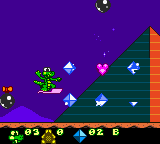
For every good turn, there's something to drag it down again. The second world introduces incredibly drawn-out ski-lift platforms you have no choice to ride on, with extremely little to do on them as you wait to reach your destination. The bosses are somehow even more brainless in 2D. And your reward for collecting all the Gobbos in a stage is... an obnoxious mini-game. To be fair, that's true to the original, but at least the PlayStation version didn't make you do sliding tile puzzles.
It's cute seeing Croc on a handheld, but it's just a bit of a joyless experience, with very little worth to take away from it. It's interesting that a lot of development is still credited to Argonaut, including level designers, artists and more -- did they design the game and leave the programming to Virtucraft? It's possible with a better engine the simple act of running and jumping could make the game more pleasurable, but I'm in no rush to perform an autopsy on it. A novelty at best, but there's better platformers on Game Boy Color, surely.
Mega Man 8
PC (Steam)
Aug 06 ~ Aug 22
Aug 06 ~ Aug 22
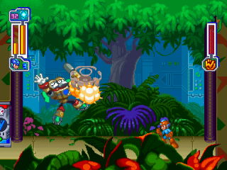
By virtue of PlayStation/Saturn emulation being dogshit at the dawn of the millennium, I never had the same familiarity with this game as I did the rest of the classic Mega Man series, and apparently my first time playing it was back in 2009, where my takeaway was seemingly "jump-jump slide-slide can go fuck itself." Pal herrDoktorat holds the game as among his favourite Mega Mans, so I figure I owe it a second chance. I can't damn the game forever based on decades-old opinions!
Classic Mega Man goes 32-bit, and just like Mega Man X4, seems to streamline the design after the increasingly complex instalments before it. Where that game simply ditched extraneous garbage like the themed Ride Armours and other obtuse gimmicks, MM8 chucks out long-held staples like E-Tanks, Rush's bevy of commands, and even passwords. In turn, it ups the scope in grand new ways, with sprawling setpiece-laden levels, quirky new upgrades, and more.
As always, anytime Mega Man ventures beyond its 8-bit aesthetic I'm instantly flummoxed, and it takes some time getting used to the slower speed or even his ability to swim underwater. After a decade of straight-forward jump-and-shoots, it's somewhat jarring to see new gameplay elements like the infamous "jump jump slide slide" auto-scroller sequences or even gimmick-laden level designs, like Astro Man's screen-wrapping maze and Sword Man's puzzle chambers.
I seem to recall fan perception of this game being extremely negative in communities in the early 2000s, citing its strange new direction and many omissions as a misstep; Mandi Paugh's comments on her Mega Man Home Page seemed to set a precedent. Again, I'd argue the lack of easy emulation for it heightened expectations in many ways (don't forget SNES emulators at the time couldn't even handle translucency! water levels in any of the SNES games were completely unplayable!), and to track the game down only to find something so different from the norm must have been disappointing.
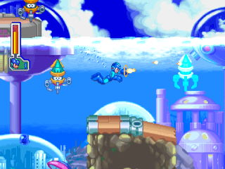
Yet I'd argue, as jarring as some of the changes are, the game tries its best to play more fair than its predecessors... for the most part. Boss patterns seem to be more telegraphed, and taking down the robot masters with just your charged shot feels a lot more feasible... yet exploiting their weakness doesn't completely undo the challenge, it's more a tool for interrupting their patterns and creating openings.
It helps that the game makes some helpful concessions. You're given the Mega Ball in the intro stage, a gimmick weapon that can be directed, bounced off walls, and even helps boost your jump if need be. Beating Tengu Man nets you the Tornado Hold, which is also dead handy for aiding with verticality. By blocking access to the second batch of stages, it employs the first set of weapons as essential to progression -- swinging on hooks with the Thunder Claw or extinguishing instant-death fires with Frost Man's power. It's far more engaging than the strictly-optional stuff in Mega Man 7, though like a lot of things, it sometimes left me stumped because this stuff feels so out of the ordinary Mega Man wheelhouse...!
There's still some bullshit in there, like the shockingly intense sub-boss in Sword Man's stage who's trickier than the robot master himself, or a variety of tricky jumps that are hard to judge with the game's wishy-washy perspective. The lack of E-Tanks has been a long-held complaint against the game, and while I don't see why they weren't included, I would attest that the game seems a lot fairer in its damage output than prior games, which smeared you against the wall in just a few bodily collisions. This has the unintended side effect of making instant-kill hazards feel even more obnoxious. Why wasn't I warned this raging tower of fire would disintegrate me?!

While the jump-jump-slide-slide stuff isn't quite my bag, it's at least an attempt to liven up the otherwise formulaic, er, formula; Wave Man's stage was the closest we came to a forced change in format, but once was enough. Rush Jet is repurposed from a way to bypass platforming and instead for short side-scrolling shoot-em-up sections, complete with upgrades and options collected from surprise balls. These sections I'm a little more partial to, if just because it's a fresh new way to engage enemies, even if most of the game's master weapons are functionally useless in them.
If I had to grumble, the game's selection of weapons are a bit crap. The Flash Bomb remains a staple if just because it's so straight-forward, as are Search Man's Homing Missiles. A lot of other weapons tend to feel extremely situational or hard to judge their true strength. If Frost Man's weapon could travel across ceilings it could have found a purpose during the vertically-scrolling segments, but as is I simply couldn't find it that useful. A lot of them go to waste in the Rush Jet segments, and it's hard to feel satisfied when wiping out a line of enemies as you can't even reap the rewards -- anything they drop just plummets off the bottom of the screen...!
That, and some of the supplementary stuff feels a little obtuse. Defeating sub-bosses nets you new Rush commands, but these are never explained in-game or even highlighted in any way; you just have to try them out for yourself, after which it can't be used again until you die or enter a new stage...! I'm still not sure what Rush Cycle is really good for besides absorbing damage and making turning an awful nuisance.
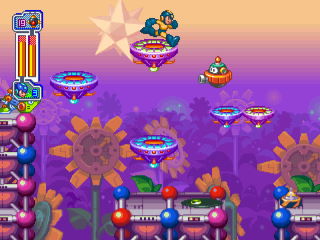
Collecting bolts is a fun extra and arguably more engaging then grinding for them in other games, and the upgrades you can buy are very nice; quicker charging, variants on your charged shot, and so on. The game tries to design itself to be a healthy challenge for even novice players, and encourages you to practise old stages and get upgrades rather than brute force it with extra 1ups or E-Tanks. The descriptions are translated a bit crap, though; I passed on some upgrades because I wasn't even sure what I was getting out of it. It's a bummer stuff like this (or the voice acting...!) weren't tidied up for the Legacy Collection, but whaddaya gonna do. If the Anniversary Collection 15 years ago didn't do it, they're hardly going to do it now.
Arguably a more ambitious move into 32-bit than Mega Man X4, intentionally changing some core design to make something a bit more fair than what the series is typically known for. It's not without its missteps, but it's cool to see the series try and branch out in some regards, squeezing in new gameplay challenges and even trying to make master weapons pull double duty by filling in for stuff like Rush Coil. I'd like to have seen them continue along this track, but I guess classic Mega Man just wasn't cutting it -- and Rockman & Forte absolutely did not take any of these lessons to heart. Make the game fairer? Balls to that. That game will rake you over the coals and make you say "thank you". I'll defend it, but that game's a tough cookie...!
Croc 2
Game Boy Color
Aug 07
Aug 07
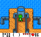
Might as well finish off the series, right? This one was actually developed by Natsume, surprisingly! Sadly not by staff with a pedigree on Harvest Moon or Wild Guns or the like, but one of the sound designers did compose for the original Castlevania, so that's gotta count for something.
Rather than a 2D platformer, this is presented in a top-down format ala Legend of Zelda (or any number of non-Zelda examples -- i'm sorry, it's just my immediate go-to!!). It follows the formula of its 3D counterpart like the previous game, recreating the hub worlds, objective-based levels and occasional use of inventory items, only from a quaint top-down perspective. Verticality feels like a bigger thing this time around; Croc often has to scale a cliff from one side of the map, then walk along the higher plane to the other side where he can reach new ground.
It's also a lot more puzzle-orientated than you might expect, often requiring you to find keys, solve mini challenges or read clues to figure out how to progress... in addition to some bog-standard block-pushing. Later stages include wrap-around "maze" screens ala Zelda's Lost Woods, simple math problems, memory games, invisible paths, and other conundrums.
They often require little more than pattern recognition or basic reading comprehension, but it's interesting to see the game add its own spin on the formula like this. It feels more compelling than most other handheld ports by virtue of bringing something original to the table, even if it does make for a bit of a roadblock at first. Navigating between all the screens can be tricky when landmarks are few and far between, and dropping from cliffs can be unexpectedly risky -- either you land on the right path or you have to backtrack all the way up there again!
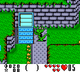
The presentation is extremely lush for Game Boy; the sprites are huge and full of character, if lacking the animation and variety of the previous game, but there's cute touches like enemies laughing at Croc when he takes damage. As lovely as the giant sprites are, they come with visibility issues: enemies love to charge at you from offscreen, and later on essential platforms are all but hidden off-screen, forcing you to take a leap of faith to proceed. It's manageable enough, but you hate to waste a life just for taking a wrong turn.
The game's got a turbulent difficulty curve, with some levels trickier than others and bosses that dial down in intensity as the game goes on (before ramping up to maximum at the end), but on the whole, Croc 2 is a pleasant surprise. I'd argue it could easily have paved the way for its new identity in a 2D landscape?
The angle the console version took felt kind of insulting, yet for some reason in this humble handheld context, a puzzle-centric top-down quest about running errands for your fuzzy neighbours just feels right. It's not a perfect game and still not something I'd recommend easily, but it uses its hardware limitations to its advantage and sets a solid groundwork where one could feasibly see improvements in its future. What could've been...!
Pac-Mania
Game Boy Advance
Aug 09
Aug 09
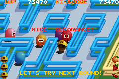
I suddenly found myself in a Pac-Man mood and I've no idea why! Am I just flashing through every short-lived hyperfixation I had as a kid this year? Mega Man, Bomberman, Banjo, Croc, Pac-Man... still waiting for the inexplicable Jackie Chan phase to kick in. Jackie Chan Extreme Stuntmaster might be good, you don't know! Unless you do in which case don't spoil the surprise for me.
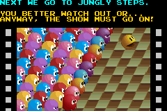
Pac-Mania's one of those games that seemed so exciting as a kid -- it's the next-generation of Pac-Man! And yet, actually playing it felt like a step down. The isometric graphics are cute, the backdrops especially, but the fact the screen has to scroll already makes it less compelling; you're not playing with a full deck, so to speak. Being able to see the entire board is what made the game such an enticing spectator sport, with friends crowding around and keeping tabs on ghosts, items and leftover pellets.
Here, the screen scrolls and you only see a sliver of the screen at a time. Maps get pretty big pretty quickly, with world 3 even wrapping around infinitely on the middle tier, so you need to learn the lay of the land before the enemies start bearing down on you. It probably didn't help that I played this on the Pac-Man Collection port on Game Boy Advance, which made zero concessions to resize the game to accommodate for the smaller screen -- it just crops a big chunk of the top and bottom. Oh well.
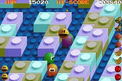
The isometric graphics also mean it's harder to tell collision detection; you can't corner nearly as sharply as in the classic game, and you need to be right up on that dot to swallow it, so you have to completely re-learn when's the right timing for savvy u-turns. While the graphics are cute, there's not really enough personality in them to make them worth it; the ugly muted colour palette isn't good either. I'm sure that's just a quirk of developing for arcade monitors, but I don't believe any of the home ports, nor this GBA version, ever attempted to fix it.
I do like how large the maps are, and they seem to be of varying shapes and sizes. The variety of locales, with different graphics and palettes between screens is appreciated; it's all aesthetic, but it feels like tangible progress compared to ye olde identical black screens.
The big new thing is the jump ability, allowing you to sail right over enemies' heads. It's a cute new addition, but rarely feels as satisfying as you'd hope. It often just means having to backpedal for pellets you jumped over, and later worlds give certain ghosts the ability to jump as well, requiring the right timing to pass them. Ghosts get faster as the levels progress, so it quickly becomes impossible to outrun them -- the only option is to turn around and jump over them.
It mixes things up, but I didn't find myself that enamoured with it. Jumping just didn't feel satisfying, y'know? Pac-Man's all about the cat and mouse game. Having to duke them through smart thinking and quick reflexes was what made the classic so compelling -- little things like having sharper turning, or the ghosts slowing down in the wrap-around tunnels, it put you both on the same level but just enough little tricks to slip ahead. Pac-Mania kind of feels like an arms race -- you've got a jump, but they've got numbers, and when they start having jumpers of their own, jumping over them just means you've landed in a whole crowd of them.
I finished the first loop and was happy leaving it there. It resets to the first stage and strips away the ghosts' jump power (for now...!), but maintains the sheer number of ghosts and relatively short power pellet time. I did use savestates so it wouldn't wipe my pellet progress upon game over; I just wanted to chill, man...!
It's nice to give the game the time of day and see what I've missed out on all this time. Pac-Man's a franchise that's kind of struggled with how to innovate without just complicating the whole thing. Jumping is neat, but feels less like a cool new ability and more an excuse to multiply your stress levels. Something to worry about, without the same satisfaction as simply mastering your manoeuvring.
I personally wonder if turning jumping into something more limited but more 'powerful' -- it can only be used so often, but it slows down ghosts and might even stun them, who knows -- might have made the design more compelling... but I'm just wading into game design talk here. Spare us all.
Pac-Man Arrangement
Game Boy Advance
Aug 10
Aug 10
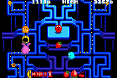
Originally released as part of that Namco arcade collection alongside reimaginings of Dig-Dug and Rally X, I think? This is a nifty 90s take on Pac-Man with a really adorable aesthetic; sprites big enough to be bursting with personality, but still enough clarity to keep tabs on everything on-screen.
The big change is the introduction of Kinky (ooer), a ghost who is vulnerable by default and effectively a roaming Power Pellet. However, if he touches another ghost he'll transform them into a powered-up version, granting them keen new powers: red can dash like a bull, pink can jump huge distances, blue can mirror himself on both sides of the map, and orange will periodically barf up pellets, forcing you to collect more to finish the stage.
This in itself is a compelling change, as you have to account for these new powers, making sure you can dodge out of red's way if he chooses to charge, and keep an eye out for orange populating the map with more pellets. While saving up pellets for a straight munch is good too, you find yourself playing lion-tamer as you constantly have to keep the reins on Kinky so he doesn't corrupt the entire roster of ghosts.
Once he transforms one, he'll reform in the ghost house and re-enter again, only disappearing for good once everyone is transformed. You can curb some of their tactics by frequently entering munch mode, chomping them to keep them in place. Getting the jump on Kinky means you can keep the pressure on them as long as you're able, serving as a respawning power pellet supply, so to speak, but the more you eat, the shorter the effect lasts.
Aside from that, other new changes are dash pads and jump pads. Dash pads boost Pac-Man forward until he hits a wall; dashing through ghosts will stun them, so this counts as an evasion tactic, though the pad will disappear after one use. Jump pads just bounce you to the respectively-coloured pad with a second of temporary invincibility -- ghosts can use these too, and a couple of later maps segment the stage into two halves that demand you use these to cross over. They're adequate twists -- hardly lifesavers unless you know what you're doing, but nice ways of adding complexity and evasion without just giving you new controls. It's better to learn the maze and know its tricks than have a new tool on-hand, y'know?
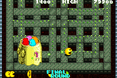
The game speeds up very quickly and gets pretty challenging; ghosts get up on your ass quickly when transformed, and I don't think you can outsteer them as easily as in classic Pac-Man, though I might've been slowed down by pellets at the time. There's temporary power-ups to speed up Pac-Man or mirror him ala the blue ghost; the game is extremely fast and frenetic, so I'll take any advantage I can get.
The game is 25 stages long and ends in a boss fight, of all things -- collect pellets to spawn a the power pellet, then grab that to damage the robot. It's a fun back-to-basics challenge with a fresh coat of paint; more a novelty than anything, but better that than dumb new last-minute mechanics. Well, dumber last-minute mechanics.
The presentation is simple but startlingly effective. Everything's got great personality and animation, and even the pellets vibe differently on each stage; gyrating, pulsing, changing colour, whatever makes them visible against the backdrop. You're not squinting to see the last pixel remaining, that's for sure. There's a variety of locales with unique tilesets, though they're relatively subdued; they're not as distinct as Pac-Mania's, though it's good that the gameplay is central above all else. It's a pity the interstitials are absent, but I like how it keeps the game moving briskly. No time for breaks, there's ghosts on the prowl!
Although fast and frantic, the game still feels welcoming with an adequate difficulty curve before it really throws you in the deep end. Keeping your mid-stage progress after continuing helps too, and having a finite number of stages makes me more inclined to replay it, though it remains to be seen if that happens.
By iterating on the core mechanics rather than making you adapt to a whole new move, it feels like a more logical extension of Pac-Man than Pac-Mania... and it's got a 2-player co-op mode on top of it all! While the simplicity and tamer speed of original Pac-Man is easier to settle into, I could see this becoming the runner-up with its bevy of features and sheer personality. The GBA port on the Pac-Man Collection is fine, but I imagine having fullscreen visibility would make it easier to cope in the frantic later stages.
Sonic Rivals
PlayStation Portable
Aug 11
Aug 11
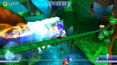
Still workin' Sonic out of my system! It's a 2.5D platformer... except the entire gimmick is every stage is a race against an opponent. I enjoy Sonic 2's race mode as much as the next person, but this is a game design that's a little hard to wrap my head around.
Levels are kind of what you'd expect from 2D gameplay in 3D environments? Lots of swooping cameras and loop-de-loop excitement, yet because you're always racing there's even less incentive to stop and think about what you're doing -- gotta go fast and all that. It's built on the same 'tier' system that modern instalments make a point of emphasising, where going high up is riskier but offers far zippier shortcuts, bypassing a lot of the tedium of going low.
The big gimmick are vault ramps that either launch you skyward with X (jump), or forward with Circle (dash). A big part of playing efficiently is knowing to react to these in time, and knowing which path you want to go. The circus stage even has barriers that bounce you back if you don't pick the correct option. It's a very fiddly mechanic; if you don't react in time you simply stumble over it, either losing your momentum or falling into a pit. To outright pause your forward movement to determine what way you want to boost seems kind of strange, though the game's pacing as a whole is kind of off-kilter.
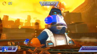
Visibility is perhaps the game's worst point. the camera is so zoomed in...! You're lucky to see anything coming that isn't broadcast by the circuit looping below you. Later stages have the camera zoom out to show a dynamic setpiece, or angle upward when the upcoming segment is particularly vertical, but the fact you've no control over it is frustrating. Get good and memorise everything, I guess...!
The bosses are perhaps where the rival mechanic is at its best, as you fight on a looping circuit while waiting for the boss to make its move, and whoever lands six hits is the winner. To confine both players into a small space means you're interacting with each other constantly, squabbling with each other and the boss's attacks to get to its weak spot first is pretty fun. The boss patterns are simple, but having another player here does spice things up a bit.
Given the nature of Sonic, you're either far ahead of your rival or far behind -- you're rarely squabbling for pole position like in traditional car sims. As such the race mechanic feels particularly unsatisfying. You can collect power-ups to use against one another; various elemental moves to paralyse each other, reducing visibility, and all-purpose projectiles, but this just makes it feel so impersonal. It's hard to treat the game even as a traditional Sonic platformer when, by pure crapshoot, the enemy can zap you while you're on a zipline and dunk you in the abyss.
Interacting in person isn't much better either, since a lot of things just feel... muddy. My character seems to lose speed arbitrarily, and I don't know if it's enforced rubber-banding, a status effect, or just my PSP's d-pad showing its age. You don't just run past each other, colliding with your rival is like hitting a wall, which really neuters the satisfaction of passing them. What is satisfying, however, is vaulting off them with a homing attack and launching yourself onto a high shortcut. That's the one time it pays off, and you're lucky to make it happen more than once.
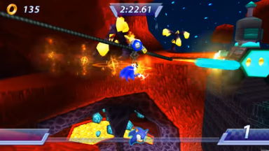
The game's difficult is pretty middling, with very little overt challenge; it's only when a stage is devoid of items towards the end that things get hairy, as there's no hope for a surprise comeback. Consider it a firm lesson to shape up! Up until the circus stage I could coast through the game without paying attention... and then after the circus stage I could go right back to doing that.
The final stage is the only one to abandon the racing mechanic, presenting it as a straightforward platformer... and unfortunately, it immediately shows that the game's got little going for it without the pressure of racing forward. People joke about Sonic being nothing but holding right, but Sonic Rivals honestly comes close to that. I'm surprised it isn't automatic! There's little incentive to turn around except maybe to take another stab at a vault I fumbled.
To its credit, the game looks quite nice, and the premise is definitely something original. with four story modes presented vaguely like a visual novel is nifty. To make Knuckles a main character after being practically irrelevant ever since Sonic Adventure is a nice gesture... not that it gives him much to do, but nice to see him allegedly on equal billing as Shadow.
In addition to story mode and versus there's also cups, a prepackaged gauntlet of stages to marathon, and challenges, where you get graded based on things like attacking the rival, tricks, rings, etc. Neither mode really fleshes out the game, and its idea of replay value is awarding you cards for every race you win. There's no text associated with them or anything, it's just promo art from the past 15 years of Sonic games. Look, when you're making a game on a budget, you gotta make content somehow.

I'm just not sure what to make of the game. Playing this after both versions of Sonic Rush and Generations probably wasn't smart, as this is a totally different line of design. Credit where it's due, Sonic Rivals is certainly an interesting change from the norm. Sonic is franchise I've forever wanted SEGA to experiment with, especially given their weird directions ever since Sonic 2006. Given my love of Sonic R, to see another Sonic game bill itself as competition-focused should be nifty... but here we are.
Were it a cheapie downloadable game, maybe it would pass muster, but as Sonic's headlining release on PSP, it pales in comparison to its DS counterpart. The comparative lack of depth and little incentive to revisit it beyond getting high scores and cards... there's nothing I want to master. Playing Sonic's story was enough, and I can't imagine any of the others will be enough to compel me. Maybe the sequel is better...?
Legend of the Mystical Ninja
Super Nintendo
Aug 13 ~ Aug 14
Aug 13 ~ Aug 14

This is just the year for inexplicable and short-lived media fixations, huh? I suddenly got Ganbare Goemon on the brain, and figured I really oughta explore the series more outside of the two games I played in 1998. Maybe one of these days I'll play the games I ripped sprites from...?
Having never played the arcade original or NES follow-ups, I get the impression this one is a funky fusion of the arcade's platforming and the Famicom's top-down overworlds. Towns serve as the hub while you figure out what your next objective is, beating up townsfolk and playing mini-games to rack up money to spend on resources.
The overworlds are charming; having a never-ending supply of townsfolk to beat up is entertaining, and although the regular houses just offer boring hints (with the occasional amusing dialogue, like someone trying to induct you into the bad guys' army), the sheer variety of 'activities' to find in buildings is charming. So many mini-games, weird variety acts, seemingly useless fortune tellers...
Admittedly the game feels a bit obtuse because of this; how much of this is actually relevant? Is there a need to enter any houses or is it just all for show? The constantly ticking time limit doesn't help either. Even the item shops are cryptic because you're given no explanation for the items you're buying. Sandals make you move faster, onigiri serves as an automatic life refill, and I think straw hats protect from certain attacks...? It's very old-school in that regard, almost shades of Kid Icarus, where it's just a matter of experimenting until you eventually work out its purpose.
There's a fun charm to the game, where something as simple as milling around town is entertaining because there's no shortage of stimuli, be it from whacking townsfolk or exploring what's indoors. The Japanese flavour is charming, as are the amusing anachronisms like the travel agent and cruise ship. It's nifty getting hands-on with classic Goemon like this, and already it's got some really fun fundamentals going on. Makes me interested to see how the other SNES titles iterate upon it... and maybe see if it has any roots in the NES instalments.
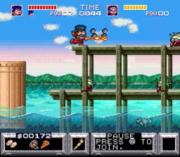
The early platforming stages are relatively mundane; clearly designed to accommodate two players on screen, with a slow trickle of enemies constantly flooding on-screen to keep you occupied more than tricky jumps. That changes come stage 4, with no shortage of intense platforming in the form of narrow platform and kooky gimmickry.
I wasn't too thrilled with the lives system, which forces you to redo the entire level or at the last checkpoint. For all the stuff you can buy, at times you still feel shortchanged. I don't know if you can even extend your maximum health bar...? The English manual is an entertaining read but in no way informative...!
I do dig just how creative the game is. It never seems to rest on its laurels, always finding new ways to impress with its platforming sequences and especially boss fights; the overworlds each have a different vibe, but are breathers by comparison. It goes to show just how inventive Konami were in this age, even for what was practically a launch-era title for the SNES.
The bosses are never short of inventive challenges, and some of the later platforming gets particularly nasty, even tougher than some of the stuff in Castlevania I'd dare say -- the minecart-ferris wheel sequence was particularly obnoxious, having to jump into the unknown based purely on crapshoots. I was always impressed by its challenges and gimmickry, like the two-tiered waterfall ascent or the weeble boss.
I say I respect the challenge, not that I was happy about how brutal they can be. Dying and getting kicked back to long-ago checkpoints is frustrating, though very much at home with classic Konami challenge. It's just a little frustrating knowing that the 2-player mode lets you respawn where you stand... though I'm sure that mode comes with its own set of challenges, like unwittingly killing your buddy by scrolling them off-screen.
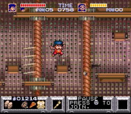
I played the game using a patch that slightly amends the translation and also adds a save function, though I just played with savestates, sometimes using them quite vigorously. The game's got a reputation for its cruel continue system and game overs that rob you of all your items... and after I beat the first boss only to die to a fish, I thought, nah, not in the mood for that. I've enough stress in my life without that kind of palaver.
Playing like a cheater does transform the game in some ways, as you might imagine. I've long heard people complain about the mountain pass and translation book roadblocks, requiring you spend nearly 1000 ryo on them just to progress to the platforming sequence. I'd busted the gambling games wide open by exploiting savestates, so at one point I had 7000 yen to throw around. It still runs out quickly thanks to my desire for armour, sandals and onigiri, but affording things was never a hassle. Getting a game over and losing all my assets would totally have changed my perception on things... and I'd still have to agree that they're pointless, stupid roadblocks.
I burned through the game in two or three sessions (because savestates, natch), and it felt quite different compared to other Konami classics. Castlevania, Contra, their other arcade games, they're built on a gradual uptick of difficulty and new challenges, where learning the tricks and patterns after long, arduous retries is key... but they're games you're intended to finish in one sitting eventually.
Goemon, meanwhile, is meant to be a journey. Still built on the same foundations of trying and trying again, but with the town sequences serving as not just continue points, but areas to power yourself up with buffs and armour and whatnot. It's like if every stage in Castlevania allowed you to step out onto the balcony and whip bats to net yourself money, upgrades, or a chance to play Gradius.
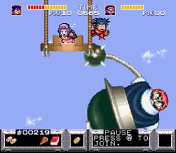
I've always liked Konami's NES output for their approach to difficulty; they're tough, but restarting with all your new knowledge and tricks felt very satisfying. Castlevania and Contra are definitely games that hinge on learning the lay of the land and knowing when and where to use resources or change weapons. It helps they're very arcade -- no fluff, it's all action.
Goemon is kind of the same way, but by virtue of its money system and town stages it gets kind of muddied. Passwords retain your items and money (so i'm told, ooer) but getting a game over strips you of it all. You could feasibly play the game without them, but if you're given the option to have increased speed, longer range and the ability to throw money as projectiles, surely you'd want them, right? But by having to grind for money to afford them instantly changes how you perceive the game, compared to how Castlevania deliberately staggers out its weapons and upgrades, often placing them in areas that demand split-second risk-reward evaluation.
I'm very glad I played the game, as it's still a knockout production from Konami; some of the inventive use of Mode7 and segmented sprites, particularly the floating mask boss, have shades of Treasure blood in it. It's not just a silly joke game, it goes above and beyond in loading itself with challenge and features... perhaps more than the game can comfortably support. Its brand of challenge kind of misses the "let's get better!" mentality I got from classic Konami; its brutal continue system has me more inclined to say "fuck this" to a poorly-cued jump or a boss that's way too hard to avoid taking damage from. Still, worth checking out in some capacity.
Sonic Rivals 2
PlayStation Portable
Aug 14 ~ Aug 15
Aug 14 ~ Aug 15
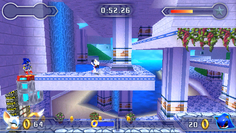
I played this because I'm predictable. This is the year for being needlessly exhaustive on things I'm not even that into. What else is there to do, right?
It's much the same game as before, but kicked up a notch in terms of presentation and scope. It's hard to pinpoint the changes, but the game design seems tweaked in such a way to better facilitate forward motion, if that makes sense? There's not nearly the sense of stop-and-go from the first game; level designs feel more optimised, you no longer lose speed after performing ground attacks or tripping over vaults...
Levels also seem to use more gimmickry: the first level has rolling barrels (which might've been in the first game, i forget), the second level introduces climbing poles and walls you have to button-mash to clamber up, and so on. They help spice the game up, using every possible item in the 2D platformer toolset to keep the races fresh, though not only are they perhaps a bit at odds with traditional Sonic gameplay, the button-mashing always throws me for a loop. In a game where you want your button presses to be precise, it throws a spanner in the works to suddenly be forced to mash the PSP's puny little buttons.
Each zone is still two races and a boss, but now there's arena-based rival battles added into the mix, most commonly Tag and Knockout, though Single Event shows there's other modes in this vein: capture the flag, king of the hill, and collecting the most rings in the time limit. They're cute, I'll give them that. The game desperately needs something to break the tedium of simply running forward, so it'll do in a pinch.
Maybe it's better against human opponents, but against the CPU it's frightfully dull. In Tag I was frequently able to find a high spot and just camp out there, while Knockout is easy to to cheese via cheatsy comboes. I give credit to the Backbone team for trying to make the most of the arenas; whether or not it's good is circumstantial when it simply counts as extra content! That first game was barebones, y'all...!
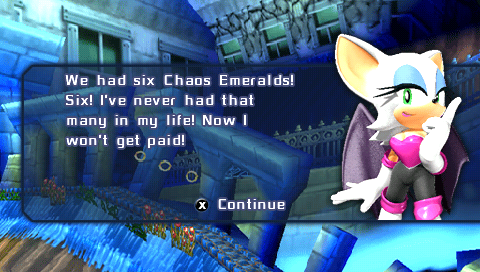
The story mode instantly looks so much nicer. The presentation is still very visual novel, and the writing's still not much to write home about, but hearing the 4Kids cast fully voice-act every line of dialogue immediately gives it a bit of punch. The sheer number of characters is compelling; there's 8 characters paired up across 4 stories, it's fun seeing how they bounce off each other, and you wanna know what plot prompted such oddball pairings.
You're brushing shoulders with Shadow and Espio, who all have their own mysterious agendas, and it seemingly has ties to Sonic 06 courtesy of its parallel dimension ruled by ancient lava monster Ifrit? That's one way to keep Silver relevant and put those Crisis City assets to use, I guess.
Each character has a unique special ability, which can be used once the metre is filled by collecting rings, an immediate improvement than getting it by chance in the item roulette like the last game. How helpful they are is questionable; Shadow's time stop is incredibly useful, while whatever Knuckles' power is did me no good at all. Some levels are particularly difficult without a good special move; I had a hard beating Frontier Canyon with Knuckles, as the last quarter of the race is devoid of items, denying me any hope of closing the distance.
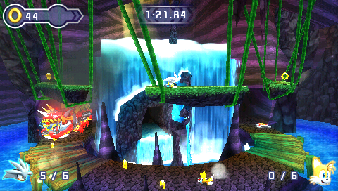
The first boss is absolutely perfect for the head-to-head setup, as you endlessly pursue the boss and squabble over each other to be the first to hit its weak spot. All the bosses thereafter are puzzle bosses, unfortunately, where you have to strike them or reveal their weak point in some obfuscated fashion.
The second one is a highlight as it can't be hit directly, forcing you to bash bats to drop bombs onto its weak spot. This totally flips the metagame, as the boss itself poses little to no threat -- it's your opponent you've got to worry about, keeping them stunned long enough to drop the bomb in time, or even dropping bombs prematurely to throw them off their game. It's the kind of thing that'd erupt into hilarious shouting matches when played with a friend... but against the CPU, it just becomes a battle of tedium and attrition.
This approach is perhaps an adequate way of spicing up the player-to-player interactions, so they're not just trampling over each other to land the next hit. It's when there's so much roadblocks towards landing a hit that these fights get real tedious. The casino boss drops numbered blocks that you touch to light up a bingo board -- get bingo and it lowers to a perfect height for clobbering. Botch the numbers somehow, and it chases you with a laser for ten seconds straight, wasting everybody's time.
Frontier Canyon is a twist on the first boss as you outrun a giant mechanical bull, waiting for it to stop by wonky scaffolding you have to climb to get in range. For whatever reason, they're the most awkward platforms in the entire game to scale, and the bull's lock-on range is shockingly tiny. If that weren't enough, window of opportunity to hit it gets shorter and shorter; I'm sure I went a solid five minutes with neither player unable to land a blow...!
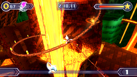
I won't lie, the first Sonic Rivals was a game I played only because I'm a hopeless Sonic nerd. It's a game I'd struggle to recommend beyond completionism. The sequel isn't without its faults, but I found myself... enjoying the game? It's a decent improvement on the first game with, like, stuff to do, y'know? The arena modes are a bizarre novelty, there's slightly more incentive to try other characters, and stuff like Free Play adds a new twist to just racing as you explore levels solo, with hidden Chao to find.
Even the card system is an immediate improvement -- no longer just random draws, they're now awarded as achievements for high scores, accomplishments, etc., so to get them all you need to actually do things, not just grind mindlessly. It's not a patch on the more technically-orientated Sonic Rush or anything, but if you're just that desperate for Sonic on PSP then it could've been a lot worse, I suppose.
It's kind of melancholy realising this is the last of many things for Sonic. The last time amigos like Espio, Rouge and Silver have even been playable outside of sports games; to see Rouge be such a smarmy pest to everyone around her is a delight. The last original title made for handhelds. Heck, the fact we've yet to get a full 3D Sonic game on handhelds. the game's environments do show their seams when you pause at inopportune moments, but they look nice and soaking them in when the camera allows shows they're nifty little biomes for what they are.
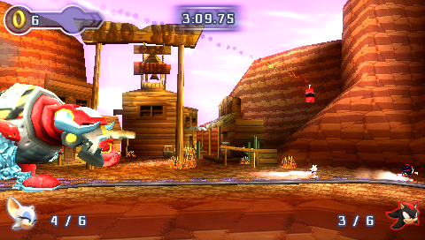
Even multi-player! This feels like the last game to offer a proper multi-player suite. It's strange to think that Sonic had beat out Mario in that regard in many games; Sonic 2 and 3 had the competition modes, Sonic Adventure 2 had its terrific if slightly unbalanced head-to-head mode. Even Sonic Heroes, Shadow and 2006 tried with their somewhat ill-fated attempts at racing, battle, and even co-op. But after that, poof. Not worth the time. understandably, given how much strife making the bloody foundations of a Sonic game had been for SEGA, never mind all the fancy stuff to make it feel like a robust package.
I don't know if the PSP would be the ideal hardware for a 3D Sonic, but having an extra dimension would immediately make the battle modes have so much more meaning, y'know? They're modes to make the most of 3D space, while in 2D they're just kind of fudgy and awkward, weird treks across the same terrain expecting to bump into each other again. to make the game in 3D would quintuple the effort required in designing stages and mechanics, probably... but gosh darn it, at this point i'm just dreaming about what could've been because no 3D fangame has progressed beyond proof-of-concept guff yet.
Bubsy in Claws Encounters of the Furred Kind
Super Nintendo
Aug 16 ~ Aug 17
Aug 16 ~ Aug 17
It's mascot mania, apparently! I figure I'm long overdue to give retro gaming's favourite punching bag a fair shake after years of making unfair comparisons to it.
It's easy to see why it gets compared to Sonic constantly. The first world feels right at home, with countless ways to build up speed and launch yourself over environments. The game even makes accommodations for its speed, pushing the camera forward so Bubsy is on the left side of the screen, giving you more forward visibility... in theory. You often move so fast that you've no time to react to hazards, which can range from innocuous things like eggs, manhole covers, ice cream cones, or even just smashing clean into a wall. You can go fast, but you don't necessarily want to go fast...!
Early on, I'd argue Bubsy's greatest asset is its dizzying verticality. Running even at mid-speed greatly increases your jump height, and bouncing off things from high up only shoots you higher and higher. Paired with his glide ability, you can cover a whole lotta ground like this! The first two worlds have great fun playing with that element, giving you drastically different challenges to explore if you stick to the ground if you dare tackling the floating platforms.
Bouncing off foes and racking up points and airtime is incredibly satisfying, and although you're fighting Bubsy's trademark momentum even in midair, I personally feel that adds a lot of personality to the game: learning how to use his glide to counteract it without overshooting your mark entirely. It's very unlike most other platformer physics, and I won't deny it's mighty finicky, but mastering it with relative success is a treat.
The Retro Pals have used Bubsy as their yardstick for 2D platformers in their Mascot Friday rankings, and it's easy to see why. The game makes a really positive first impression in its first two stages; huge worlds with lots to see and do, but also extremely rewarding to breeze through with little effort. It's like a whole new spin on the best qualities of Sonic!
And then comes the third level and suddenly things just get... fussy. The level is drenched in water that'll kill you instantly, with floating platforms that are easy to fall off of and blind drops that lead to almost-guaranteed death. You can fight an uphill battle past the entire first segment, contending with tiny platforms, hazardous slopes and all manner of death lurking beneath you... or you can enter a door a few steps from the entrance that'll skip you past it entirely, and put you right next to a checkpoint to boot.
The level design's just plain bizarre at times. For every instance of it actively welcoming Bubsy's abilities, there's putting an egg-throwing Woolie where you absolutely cannot react in time, or forcing you to jump between narrow platforms surrounded by spikes. The game yearns to dabble in precision platforming, but between Bubsy's ungainly hitbox and his fussy, slidey momentum, it feels like a lost cause. Progress can come to a standstill because of one blind jump, or forcing you to redo a teleporter maze before every attempt at a boss.
The fact the fast-paced forward-flowing gameplay is interrupted by stop-and-go retries really kills the momentum. There's no mercy for fuck-ups, unlike Sonic, which had a perfect system with its protective rings. Bubsy has nothing! One hit from anything remotely hazardous will kill him dead, dunking you back at the last checkpoint. When hazards include thrown eggs or thumb tacks, you're often left wondering "what the hell even killed me?"
All enemies you defeated and items you collected remain absent when you respawn, which is both good and bad. One of the train levels begins with a vicious volley of Woolies that I simply had to sacrifice lives to get rid of one by one, making incremental progress. Unfortunately, without the yarn balls to guide you towards key platforms or the right enemies to bounce off of, you're left having to approach the stage without your usual landmarks, putting you at a unique disadvantage. It's one thing to learn the level layout, it's another to remember all the changes you've made to it!
The first two levels are perhaps the peak of its design, with great expansive locales but also comparatively telegraphed threats and enemy placements. Even the theme park keeps up some of that, only with more airborne enemies and extremely hazardous rollercoasters (seriously! they give you zero mercy time to bail out before killing you instantly!).
The train world is incredibly stop-and-go, forcing you to navigate across oddly-shaped terrain and frequent blind drops into pits or spikes... and it has the gall to be twice as long as the prior worlds, with each level having a train and canyon segment, the latter of which are littered in -- you guessed it! -- more pits and spikes. Those cacti are not part of the backdrop, by the way, you will have to carefully jump over each and every one of them. The worlds afterward all lean heavily on verticality, as if the game's begging me to eat my words on that being among the game's high points.
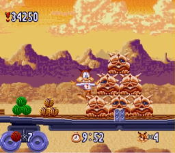
What gets my goat is that the game actively weaponises your own movements against you as it goes on. Bouncing off foes will spring you directly into the path of bullets just off the top of the screen. You're averse to ever going fast because of traps or even just banging into a wall. The vertical levels get hazardous because Bubsy's jump inches past the top of the camera, and doesn't scroll up until he lands, meaning an enemy can snipe you in that brief window of obscurity. The key path becomes so obtuse that you're given no choice but to make blind leaps, that I wonder how you're even meant to play the game by the end.
The graphics are cute and the cartoon animations for Bubsy's deaths are charming, yet the game still feels like it's lacking a certain charisma. It's got such a boring fictional universe...! There's no real brand identity here the way Mario or Sonic have immediately recognisable styles, it's just generic cartoon fluff. The Woolies are the closest it gets to a trademark villain, and they look boring as piss.
The sound design is perfect when it comes to its bouncy music and the 'pop' of picking up yarn balls, and yet there's barely any sounds for interacting with enemies -- almost all deaths occur with zero pomp or circumstance, you'll just see Bubsy smile at the camera before shattering to pieces or melting or whatever. When stuff like Looney Tunes or Tom & Jerry set the standard for high-impact slapstick sound design, it stinks to see this stuff fall so flat.
It even extends to gameplay functions. Sonic had different themes but kept the essentials recognisable -- spikes are always this big, springs are always this shape, etc. No hazards remain consistent in Bubsy! Spike hazards can range from unmissable cacti, to indistinct brambles, to tiny, barely visible thumb tacks.
The Woolies are the one enemy who appear in all stages, and yet their behaviour changes constantly; sometimes they throw eggs, marked by an egg pile next to them. Sometimes there's no eggs and they'll just shoot you anyway. There's no visual rulebook to play by, or any rulebook of any category. What's the general consensus on level design? Who frickin' knows, dude!
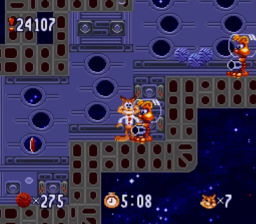
In most platformers there's the sense of showing where your strengths are, where your weakneses are, and then challenging you on both. Sonic 1 feels perfectly optimised in that regard: Green Hill Zone gives the player free-flowing environments and uninhibited speed, before slowing them down in the small, cramped Marble Zone, but both levels are relatively safe environments to learn the ropes. Once you're clued up, then it starts pitting you against challenges where speed is forced upon or taken from you, learning to control it is key.
But Bubsy... I don't know what it's really going for? The dope in me absolutely wants to see someone disect Bubsy and see what makes it tick, if there is indeed a core design in there somewhere... or if it really is just cynical guff made maximise rentals with its obscene difficulty. The two introductory levels are ideal, and although shaky, the first five levels are where the game is at its strongest. After that it just loses the plot... which isn't good when two thirds of the game is effectively a write-off in that case.
I can absolutely see the appeal in Bubsy, and feel with a second instalment to finetune the quirks, it could've done gangbusters, and not just ironically either. There's a real thrill in bouncing off dudes to ludicrous heights, and to make that the real draw over its ludicrous speeds could easily have been its new identity. Instead Bubsy 2 ditched everything and became an ugly, sluggish, maze-like mess instead. Bollocks to that.
I wish I had some kind of final remark to sum up Bubsy's worth, but it's kind of muddled in wishy-washy design and my undue fondness for dumbass animal mascots. Bouncing off stuff is neat. Gliding from high altitudes is cool. Having such varied paths to explore is nifty. But then it crosses a certain threshold and all of those things just aren't fun anymore.
For the love of god, stop me now before I try and find redemption in Bubsy 3D. I've tried before. It never ends well.
Gatchaman Crowds
Aug 18 ~ Aug 22
Aug 18 ~ Aug 22
I watched the first three episodes of this on CrunchyRoll years ago, loved it... and just fell off for whatever reason. I'd long wanted an excuse to dive back into it, and watching it with herrDoktorat was just what herr doktor ordered, har har. Shoot me.
The Gatchaman squad fight a secret war to protect humanity and rid the earth of malevolent aliens, the MESS... a crusade that quickly becomes a dud when newcomer Hajime Ichinose dares to ask why the aliens do what they do, and it turns out they're just harmless observative lifeforms.
Screw the premise, let's talk themes! Although presented like a superhero show, complete with secret base and an agenda to protect people in secret, there's very little good-vs-evil superhero-ing to be done. Instead their role is largely aiding when disaster strikes, be it something as major as a tunnel collapse, or as minor as preventing people from drinking a batch of spoiled milk.
Instead what's initially presented as their opposition is Rui, his social media service GALAX, and the mysterious CROWDS. GALAX isn't just an instant messenger, but is used to bring people together in times of need -- people with qualified skills can have their services requested during times of need or just to help people in distress. Special users are granted the power of CROWDS; the ability to transfer their consciousness to a remote construct with great strength, only for use in dire circumstances when emergency services can't act in time.
The Gatchaman are a bit sus' about all this, but it's something that addresses the standing of heroes in civilisation. When you're not saving the day from deadly foes, what do you actually bring to the table? Is it appropriate to have only a select few special individuals police the masses from the shadows? Or should the common man be given the tools to use per community demands? When they were busting MESS the Gatchaman could pride themselves on what they did, but after that agenda proved to have been misguided, they're left having to re-assess their standing in world peace.
And this is where Hajime Ichinose shines. She's the spunky newcomer who defies all Gatchaman convention, and likes to know the reason behind things beyond "that's just the way it is," which frustrates her by-the-book superiors to no end. She is such a fun character; ostensibly portrayed as some quirky weirdo girl there to push against the grain, but she's observant, intelligent, and most importantly, curious.
That simple pushing of boundaries opens up the lives of people around her, and where everyone else on the team is somewhat walled-off from the world around them, Hajime embraces it all. Community has as much a place as one's individual world-view, and one of my favourite scenes in the series is Hajime spending time with her collage group. It's such a charming slice of life among people who needed a sense of community in trying times, with folks of all ages and walks of life brought together to enjoy each others' company. To help people simply by reaching out to them is as important as saving the day from evil.

So the big running theme is handpicked heroes versus the good of the people, and both are shown to have their faults: Rui has to ween out who can access CROWDS for fear of power going to their heads... but the only reason he can gift this power is because of Berg Katze, a former Gatchaman who takes pleasure in pulling the threads of society until it tears itself apart. He's the closest thing to a villain, a cackling, self-aggrandising drama queen whose entertainment comes above all else; what's the point in being an arsehole if you don't have fun with it?
It's a schtick that's easy to compare to the Joker, as sorry as I am to say, but he makes for an entertaining baddie, especially when Hajime's on the case. She practically sits out most of the climax to pick Katze's brains about why he does the thing. There's only so much to be understood about an interstellar terrorist who's already laid waste to multiple planets, but her earnest attempt to reach out to him and share a mutual understanding, even at the risk of her own life, is the kind of sappy goodie-two-shoes stuff I want to see in more fiction.
I love the series' bright, peppy art style, and I love how aggressively modern the show's theme is, so to speak. There's the feeling among 'legacy' franchises that it can only be one thing forever, and to change the foundations in any way is sacrilege; look how Kamen Rider oldbies reacted to Fourze's star sporting a pompadour. I've no familiarity with vintage Gatchaman, but Crowds is upfront about its identity. Yeah, it's the 21st century. No, we're not wearing spandex and capes. We're queer as hell. Deal with it.
I can see why folks might be put off by the series; for its intense redesigns and heavy emphasis on style, it's a far more thoughtful series than one would expect. There's very little action in the conventional superhero sense, and the biggest setpieces are given to the ordinary citizens fighting for the greater good. What looks like a lead-up to a big fight scene almost inevitably cuts away to something else, either not showing the events, or straight-up stating the character bailed like a coward.
Instead it's commentary on the very concept of superheroes. Do we even need heroes, or should we instead fight for the betterment of society? It's a complex and heady topic, and Rui, who carries the weight of Japan on his shoulders by policing GALAX to prevent dissent among its users, is constantly buckling under the pressure. It still presents an uncertain future ahead for Japan despite its happy ending, with CROWDS now an ordinary part of life that hinges entirely on the gamified goodwill of the people.
Still, it's fun to see something so optimistic when superhero media tends to be so dour and grungy these days. So much stuff focuses on the ugly side of humanity, or depict heroes as protectors of capital and property more often than champions of the people... so to have a hero like Hajime is such a breath of fresh air. That and her fashion sense is totes adorbs. It's hard not to hold the rest of the cast or all other anime heroes to her standards, honestly.
I already liked Gatchaman Crowds from what little I sampled years ago, and its delightful combination of style, characters and thought-provoking themes had me well and truly compelled. It's perhaps not the show you'd expect it to be, hence why this is a big dumb tirade about themes more than anything else, and I can't attest how well that holds up on a rewatch... but it made a hell of a splash on this first-time viewer. I might have a new addition to my list of favourite anime!
Mystical Ninja Starring Goemon
Game Boy
Aug ~ unfinished
Aug ~ unfinished
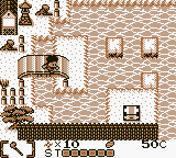
I was still in a Goemon mood but wasn't quite ready to tackle any of the bigger games. I think I must've last played this in 2011 in an ill-fated attempt to complete it, before realising my time was worth more than this. Well, time means nothing this year. To spend two days trying to find merit in a garbage Game Boy title is absolutely the kind of distraction I'd happily dive into!
Ganbare Goemon has historically been a mixture of top-down overworld sections and side-scrolling platformer stages, but this game is unique in it going all-in on the top-down guff. I personally found that kind of appealing; wandering the towns is where a lot of the franchise's trademark flavour is found, and by adding jumping, you'd think it might become something more engaging! To hope it'll be like Link's Awakening is expecting too much, but one can dream, right?
It's quite telling right away that it's missing something vital. The jumping is in stark arcs with next to no midair control... which sucks when even jumping to a platform only 2 tiles away is life-or-death. Falling in the drink warps you to the entrance of the area, which is unpleasant when every locale, be it a town or a cave or an evil hideout, is built like a labyrinth.
Even something as simple as combat is lousy, as your range is limited to only one tile in front of you, with an option to fire a limited supply of shurikens. Enemies have cute patterns and move smoothly across the screen, but there's zero reward for killing them, not even to replenish items or recover health... so why bother?
The goal of each world is to find the person who holds the key item, complete their mini-game, and then use it to progress to the boss. There's people to talk to, sometimes with dialogue that's almost faintly amusing ("The Black Ship gang come from a black ship!"), but it's almost entirely fluff. You find money in chests to buy health refills and shuriken from shops, and that's about all the luxuries you get. There's no fun stuff to spend your money on, nor any attractions to get lost in... the game's just strung together from the bare minimum of features, with no love or depth put into any of them.
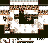
And that stinks, honestly. From the word go you can see how much the game design is lacking, and something as simple as enemies dropping items would instantly add more incentive to engage with it. There's weapon upgrades later on, but no power-ups of any kind, something even Link's Awakening had -- an oddity for a Zelda game but an addition that made the moment-to-moment action that more rewarding, y'know?
I played the game hoping there'd be something to make it click -- maybe the boss fights are good? Maybe the mini-games in later worlds are worth a damn? But... no. What you see is what you get, and the judgment you make based on the first five minutes is good enough to indict the whole game.
What a waste. For a late-era monochrome Game Boy release it looks really old-fashioned (to have a 256kb ROM in 1998 feels real stingy!), though it's possible the devs just weren't acquainted with the Game Boy; KCEN's Castlevania Legends also looked and played a bit of a dog, and yet Azure Dreams and their later licensed work are that much more appealing.
It's a perfectly functional game by its own low standards, but it's such a disappointment, y'know? To buy this after the cracker N64 game was a blow, and even looking at the manual now, it's got such lovely characterful artwork... and yet the game itself looks so bland and joyless. It stinks to acknowledge a game in a franchise you're invested in is just a cheap cash-grab, but outside of observing what not to do, I can't find any merit in this game.
Turbo: A Power Rangers Movie
Aug 28
Aug 28

Boy, what a pile. I heard it was bad, but after unexpectedly enjoying Power Rangers in Space and rewatching the Mighty Morphin' movie, I figured surely there's gotta be merit in it, right?
The movie had under half the budget of the first film, and it shows. It still has decent lighting and locations and whatnot, but nothing actually happens to make this feel cinematic. Look at the first movie: loud and bombastic setpieces, often with lots of choreography, just to show frivolous things like the heroes having a good time. A brand new villain taking the spotlight, with even unique new suits and Zords exclusive to the movie. Continuity be damned, it expressly wants to be a cinematic experience.
Turbo just feels like a TV two-parter padded out to feature length, and I do mean padded. So fucking little happens in the movie! Divatox is after weird little hobbit dudes who can open a portal to a volcano where she can resurrect some big bad guy to marry. The Rangers perform their own search to find their captive friends. There's a whole lotta looking for answers that it forgets to make us compelled by any of the alleged mystery.
The first fight scene isn't until 40 minutes in, and it's 50 minutes before they even first suit up. It is extraordinarily slow. And unlike the MMPR movie, which flung you into multiple sub-plots and setpieces every few minutes... this movie doesn't. It will frequently cut back to Divatox and her lackeys, easily the most entertaining part of the film, who bicker among themselves while accomplishing nothing. The PR team undergo a labouriously slow search for answers... or something, I don't know!
Hearing stories from production of the first movie shows it was a real hamstring operation, throwing stuff together at the last minute with little preparation, but as far as I'm concerned it stuck the landing. Turbo perhaps sticks closer to the format of the TV show, but as a feature length story it well and truly suffers. Nothing happens! They spend like 20 minutes on a boat for some reason? There's an inexplicable fight with turtle monsters that accomplishes nothing? I'm not sure why Bulk and Skull or the non-ranger members are included...?
It just feels like bad priorities. They figure, with this budget we can do some nifty location shooting and extensive underwater sequences... but what kid asks for that in a Power Rangers movie? There's shockingly little PR iconography throughout; the villains are all new, Zordon and Alpha are sidelined quickly, and this weird puppet man is the story's macguffin, basically. It introduces crap new car-Zords and then proceeds to ignore them for huge chunks of the running time. If it were a TV movie it'd look impressive, but it seems to forget it's a show about superheroes. Where's the big dumb fight scenes? Did they run out of choreographers? What's the situation here?
To be fair, I'm a grown man watching a film intended for six year olds. I'm definitely holding it to the wrong standards. But also: what a waste. Absolutely fucking miserable. I was actively forgetting the movie as I watched it. It's a good thing I watched Congo immediately after, because that's a film that makes damn sure you don't forget it.