some games I played in
2020
Turok 2: Seeds of Evil
PC (Steam)
Jan 16 ~ Feb 06
Jan 16 ~ Feb 06
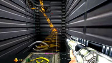
With Dinosaur Hunter Diaries a go, I had to get a move on with whatever Turok media I hadn't experienced... and would you believe it, I've barely played Turok 2. At least, not without using the level warp and infinite ammo to just blow everything to smithereens. I barely even knew what the game was supposed to play like in normal circumstances! ... and it turns out I don't really enjoy Turok 2!
The game is bigger and badder than before, with larger and more complex environments, meaner enemies and a nastier arsenal. Rather than the simple key-hunting of the last game, however, it goes head-to-head with Goldeneye and foists objectives into all of the stages, be it rescuing captives, triggering beacons, or sabotaging enemy installations.
That is what sinks the game in my opinion. The best levels are built relatively linear, thrusting you into one combat setpiece after another as you engage enemies in tunnels, on rooftops, across walkways, and all manner of interesting locales... but that's not the point. If you reach the end but didn't clear the objectives, it kicks you back to the start to do it all over again. Never mind the fact you got all the keys and can progress to the next stage -- you're not going home 'til you bomb those supply sites, buddy.
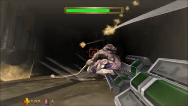
Nightdive's remaster does try to circumvent this a little, with indicators that pop up on proximity to objectives, and the ability to travel between any and all warp points, even across levels, cutting down on backtracking. Back on N64, you couldn't even leave the stage 'til you found everything, and that sounds totally miserable as far as I'm concerned.
While this spares you the hours of bashing your head against Lair of the Blind Ones ad infinitum, it does make the game's structure a little more uneven: because I could ditch levels whenever I pleased, I went the entire game without any boss battles until the very end, when I looked up a guide for the single incomplete objectives in each stage. Not a huge loss, mind you -- the bosses are among the game's weak points, boasting elaborate animations and multi-phase tactics over, y'know, being fun boss battles.
Turok 2's got ambition out the wazoo, though admittedly it's easier to appreciate it on N64 when the competition was weaker, and seeing the poor console struggle to run at a double-digit frame rate made it look all the more impressive. After the fact, it's just a bit of a slog. None of its innovations are anything I wanted, and hunting for trivial objectives ends up far, far overshadowing its better elements like the gunplay and breadth of exploration. Maybe next time I'll just use cheats to turn off the objectives.
The Turok reviews for this article are going to be a little perfunctory because there's a lot of 'em! I've got heaps upon heaps of notes for their eventual blog entries, hopefully due sometime next year, and I've no idea how much of these sentiments I'll be parroting. I'll sing the praises of Turok 2 from a historical and developmental viewpoint, I can say that with certainty. As a game to play for my own amusement? Give me Dinosaur Hunter again, honestly.
E.X. Troopers
PlayStation 3 / Nintendo 3DS
Jan 17 ~ Apr 28 (PS3)
May 07 ~ May 13 (3DS)
Jan 17 ~ Apr 28 (PS3)
May 07 ~ May 13 (3DS)
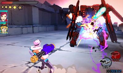
I finally, finally, finally sat down and played the game through to the end...! I fell off around chapter 2 last year, and I think the sheer fussiness of my PlayStation 3 was the reason. I was enjoying the game! I just had no patience for the load times courtesy of my knackered disc lens...!
It's easy to sum up the game as "Lost Planet goes anime", yet the similarities aren't entirely there? It ditches the emphasis on 3D space, robot-piloting and weighty animations, and instead leans on usingyour boost ability, for traversing large arenas, evading shots, or delivering mean roundhouse kicks is key.
If Lost Planet's on-foot gameplay needed a kick in the teeth, this provides it. Weaving around foes and learning to stun, juggle and knock down human foes is vital to keeping them off your back is an intensely satisfying mechanic, and adapting the quirks of your various sidearms to your playstyle is the cherry on top. It takes a little while to come together as you're drip-fed new weapons throughout the story, but by the third chapter I'd gotten a loadout I was happy with.
The game's almost entirely in Japanese, but it's not too difficult to come to terms with despite the language barrier. A bit of trial and error will get you through most of the menus, and the most basic acquaintance with katakana or simple kanji is all you need to understand the weapon upgrade screens.
The only tutorial I had trouble understanding was the "counter" mechanic: what you do is boost out harm's way at the last second, which displays action lines on success, and grants you a limited window to fire guard-breaking super shot at the target. Once you start facing Akrid with bullet-hell projectiles, this is essential to give yourself an opening. It's the one ability that's extremely context-sensitive; everything else you an intuit from just trying all the buttons, but you can revisit the tutorials anytime between missions via the pause menu.

The game is comprised of relatively bite-sized missions, and that's where it shines: it's so easy to pick up and play! In addition to the main campaign, there's VR missions you can play solo or online, presenting straightforward gauntlets of enemies or the occasional mission like protecting the data posts from enemies. With only one primary weapon, one sub-weapon and a special attack (available once you max out your gauge by collecting T-ENG), mixing up your moveset can totally change how you approach combat, especially when you factor in your two AI partners, who only have access to one sub-weapon. Lost Planet 2's very diverse selection of weapons was a draw, and arguably some of the sub-weapons in EX Troopers aren't as immediately useful (I don't think I found a use for the stun grenades...!), but in theory it's all about playing as a team. It's a good formula!
Obviously I couldn't follow the story the first time around, but the presentation and breezy atmosphere is such a breath of fresh air. The characters and their personalities are the stars! So much of Lost Planet is about endless feuds between factions, so it's nice to see EDN III presented in a more friendly light with its cadet school setting. The manga-style cutscenes are a treat, and even without following the plot they're a darn sight nicer than just talky back-and-forths between military dudes in dropships.
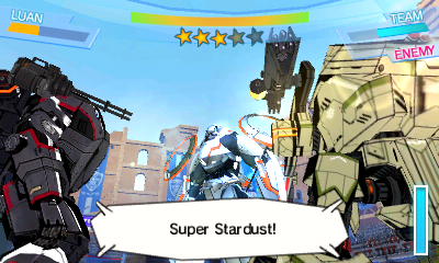
If there's one grievance, the in-depth mecha gameplay of Lost Planet is reduced to baby food. Bren pilots the Gingira, a very anime style hominid mech that's used not just in ground-based mech-on-mech combat, but also a couple of Star Fox-esque shooting gallery sequences. It controls nigh-identically to the humans, boasting a greater string of melee comboes, but it lacks the real meaty power of the Vital Suits in the other games. It's obviously not the focus, especially given there's no additional challenges built for it outside of a time attack.
It's perhaps a bit jarring for old-school Lost Planet fans, but EX Troopers is such a more compelling twist on the formula than Lost Planet 3. The story might be anime fluff, but the kinetic energy of its gameplay and sheer replayability easily trumps that game's sluggish plodding a thousand-fold. That the game never saw an official English release is a crying shame, as its pick-up-and-play nature would've been ideal for the 3DS market...!
3DS version: After a slow start I polished off the PS3 version in just a few days in April, and then in May I played it all over again on the 3DS. I simply couldn't get enough of the game!
Performance-wise, I feel like the 3DS version is better...? With the 3D disabled it appears to run at 60FPS, or at least something smoother than what's on the PS3. The game also gives you two save files to play with, while on PS3 you're forced to exit and swap profiles if you want a separate save file.
The game evidently supports the Circle Pad Pro (which the New 3DS has built-in), allowing you to steer the camera with the second thumbstick and fire off EX-T specials using ZL or ZR. While it's nice to have, they're non-essential and using the D-Pad or touchscreen for either command should suffice. The game gives plenty of concessions with its camera and lock-on that you rarely need to steer the camera in the thick of action.
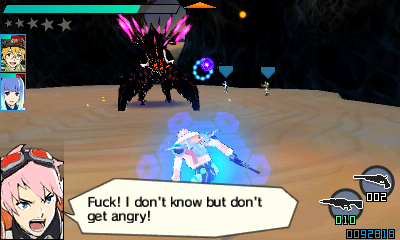
I played this version using rd2k3's translation patch, which I livetweeted about. It's a hefty two gigabytes -- I had to order a new Micro SD card to fit it on! This is because it doesn't just translate all the in-game text, it re-encodes all the pre-rendered cutscenes to have baked-in subtitles. A noble gesture that's probably far easier to do in a pinch than embed brand new subtitling code, and one I'm told has gotten hackers exploring the possibilities of editing 3DS FMVs...
... but the text is still machine translated. The entire game script has been run through Google Translate with minimal proofing, and that's what got pasted on top of the movie scenes. The dialogue? The story? The stuff I was most interested in experiencing after playing the game blind the first time around? Often indecipherable. The script mangles names constantly, completely misinterprets kanji fragments, the works.
If all you're after is to play the game, then the tutorials are nicely cleaned up and perfectly readable, and it even translates the digital manual that offers a decent quick-start guide. Navigating menus and understanding mechanics is no longer an obstacle. It's just a bummer to see a game that's so rich with attitude and personality rendered almost totally incomprehensible. You can get the gist of things if you squint and have had experience with deciphering Google Translate garbage... but it hurts to see the story and characters done dirty like this.
On the bright side, if someone who proclaims to have no experience in coding or translating could pull this off, then it can't be too hard a feat, surely? It's an appreciated gesture to just show it's possible and help folks understand the basic pretense of the game. Hopefully it'll pave the way for someone to do the script justice.
Bomberman 64: The Second Attack!
Nintendo 64
Feb 07 ~ Feb 10
Feb 07 ~ Feb 10

The sequel to Bomberman 64, the game that got me into the franchise and one I was obsessed about through magazine previews alone and long spent pining for a sequel... only for this game to pass me by. It skipped a European release entirely! I've tried playing this so many times through emulation, but its myriad of glitches and slow, slow opening were hard to slog through. I could only put it off for so long...!
Although a direct sequel to 64, it's very much its own beast; the vast, explorative landscapes have been condensed into Zelda-like 'dungeons', sectioned off into self-contained screens or rooms. That game took "open-ended" to the absolute extreme, allowing you to begin on any world you wanted, giving you little to no hint on where to go or what to do, and teaching you essential mechanics only in optional dialogue.
The Second Attack! does away with a lot of that. The game's intro stage isn't just boring to play and boring to look at, it's constantly interrupted by Pommy explaining every boring facet of gameplay to the player. Even the freedom of worlds to visit is limited, allowing you a choice of only two at a time, with an unspoken 'intended' option; you can bash your head against Bulzeeb's world all you want, but you'd be wasting you time if you hadn't beaten Zoniha first to get her time-stop bombs!
Yup, this one introduces upgrades in the form of elemental bombs, each with unique properties. Planet Horizon nets you the Wind Bombs, which make for fun puzzles wherein you use their air currents to blast Bomberman across gaps. The original game already dabbled in puzzles through using bombs as stepping stones or blunt instruments, but now it leans on more traditional elemental properties. The Wind Bombs and Ice Bombs lend themselves to some memorable puzzles, though just like the first game, it's extremely fiddly and barely streamlined; creating platforms with the Ice Bomb is dangerous, needlessly precise, and time-sensitive on top of it all!
There's an appeal to the relatively straight-forward levels, and they feel like a logical attempt to condense what were once dauntingly huge landscapes. By downplaying the grander sense of freedom, it instead focuses on more immediate short-term goals: activating switches or gathering keys to access new areas of the world, or revisiting old areas with new power-ups.
But it comes with its own gripes: some rooms demand you kill all the enemies before the exits open, and will do this every single time you re-enter. This is obnoxious on its own, and even more obnoxious on Molok's stage, where the junction point between five possible doors requires you kill dudes every single time you need to look someplace else. Screw this!

Enemies don't just have health bars, but elemental weaknesses as well; hitting an enemy with the incorrect bomb will merely stun them, and anything but its weakness will usually do piddly damage. Some bomb blasts last way longer than usual, allowing you to score multiple hits in one explosion... though it admittedly drags things out as you wait 'til the coast is clear. There's no shortcuts this time, be it stunning foes and throwing them aside, or squashing them under pumped bombs -- bombing them's your only hope!
Even the bosses aren't terribly satisfying; the entire game you're just fighting the Bomberman-sized Astral Knights, all of whom boast devastating special moves, some of which can kill you in one hit. What's most obnoxious about these battles is how they only seem to take damage when they want to -- they have an outrageous amount of invincibility time during and after their special attacks, often giving you the most narrow of windows to land a blow -- which isn't easy when they disable your remote bombs!
While the bosses of the last game could be exploited easily, they were short, sweet, and intense challenges. These ones are just kind of unfair. There's not even exciting screen-filling bosses to look forward to either -- every boss is simply another Astral Knight, and it's only the final boss that gives you something modestly larger than Bomberman. After the last game had six huge exciting nasties to contend with, you want a bit of that excitement again, y'know?
That, and there's only one checkpoint in each world: after you defeat the boss. Until then, every death dunks you right back at the start of the world. All your progress is intact, but retreading old ground just to catch up to the part that gave me trouble got old real fast. Was respawning at the nearest door too much trouble...?
And then there's the issue of losing your power ups not just upon death, but because of special enemy attacks as well! Vital abilities like the Power Glove and Bomb Kick aren't part of your default repertoire, and have to be acquired from items like any other power-up. So many encounters are needlessly risky without the ability to stun foes, and one of the Gravity Generator rooms required me to backtrack for a Power Glove before I could even finish it.

Every addition feels like an example of one step forward, two steps back. The streamlined levels would be a boon if they weren't marred in unnecessary roadblocks. The elemental bombs give the game a unique spice, but also fussy puzzles and drawn-out battles. And introducing a life metre just gives the game carte blanche to be a dickhead with the amount of damage it throws at you.
It's frustrating, because it's in such a bitter tug-of-war between polishing up the original's flaws and these bizarre, obnoxious additions... there's a good design in here somewhere, it just takes some weeding to see it through. (Just like the original!)
The game feels slower and not as refined as the first one in some ways; it lacks the sense of 'weight' the original had, and paired with its smaller scope and uneven 3D designs, it feels like a step down at times. But it's just doing its own thing. It's making something arguably more conventional, and I think for late-era N64, that's what people were after. As much as I love and respect Bomberman 64, it's very much a product of its time, and hard to defend if I hadn't bucket loads of nostalgia for it. Also this one has asymmetrical co-op in the form of Pommy! That's gotta count for something!
The stages get more complex as the game goes on, and I'll be frank, by world 4 or 5 I wasn't really enjoying it. Enemies become impractical meat shields; dying to a bullshit puzzle will throw you back to the start of the world... stuff just begins to drag. That, and the puzzles have some really wackadoo solutions. Re-enter the same room multiple times until the offscreen clock strikes 12?! WHAT WERE THEY THINKING
I was glad to see it through to the end, though. Having finished the game, I can see why it made such an impression on fandom with its extensive cutscenes and dialogue. It's so rare for a Bomberman game to have a story worth providing closure to, and to see it address his sense of justice, to so speak: he has no personal beef with the Knights, and they ultimately off themselves because of warrior's honour, or do themselves in via their own hubris... except for Zoniha, who Bulzeeb dunks in a black hole because he's a petty bitch.
But even then, it's one of the rare games with a truly happy ending, with all the major players coming out better and more fulfilled by the end of it... just don't think about all the grunts and monsters you killed along the way. I think I talk about this more in a blog entry, though it's possible I just used it as an excuse to dunk on the plots of other games, I can't remember.

It was satisfying to see The Second Attack! in full 20 years after its release (oh my god), but it's a tricky game to recommend. Its core design is arguably more approachable than the overly ambitious shenanigans in 64, but it's rife with so many fucking awful hurdles that just make play a chore; the lack of checkpoints, slow gameplay, frequent backtracking, the obtuse puzzles...
It's annoying, because I feel like all of its foibles could be easily remedied; it's not like 64 where you have an entire game design to upheave. It requires a lot less playtime than 64's absurd Gold Card hunt, which is a blessing, but that game had a lot more going on moment-to-moment, thanks to its varied challenges and bosses. I can see why The Second Attack! made a splash among fans, and as one of the vanishing few 3D adventures in the series, it's interesting to see the choices it made. I can't see myself replaying it for fun, though. Maybe the battle game's worth exploring...?
Turok 3: Shadow of Oblivion
Nintendo 64
Feb 13 ~ Feb 14
Feb 13 ~ Feb 14
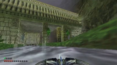
For whatever reason, this entry passed me by at the time. Could I not find it in stores? Did the previews not interest me? Did the lack of dinosaurs put me off? Whatever the case, I've gotta make up for lost time!
Turok 3's a bit of an odd duck among the classic N64 series, as you so rarely hear its virtues extolled the same way the first two are. That's because it's almost nothing like its predecessors -- the fast-paced Quake-like maps and movement have been ditched entirely for something slightly more methodical, clearly inspired by the new giant of PC FPS games: Half-Life!
Levels feel designed to convey a proper-ass narrative, the first one perhaps the most distinctive as you traverse the overrun city, contending first with a violent police force, before mutants, monsters and other abominations become the major threat. All the while there's just enough little environmental details, be it the rooms you explore or NPCs you overhear, to make the level feel like one long setpiece, and not just a map populated with enemies and objectives.
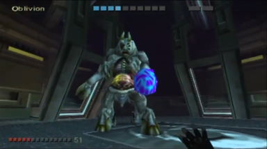
This does mean there's very little Turok about it, mind. There's, like, two dinosaurs in the whole game! There are some cute throwbacks, with classic weapons returning and even an entire world revisiting the iconic jungles of the first game. Although the fast-paced running-and-gunning is slightly downplayed, I'd argue it's a more accessible game than its predecessors.
Its game design feeling much more 'modern', without the frighteningly archaic and obtuse key-hunting that dictated the other two. That can be taken as both a good and a bad thing. I say it's good because I could enjoy it without having to chant "pretend it's 1998, pretend it's 1998" to myself.
Again, the fact this stuff was running on N64 hardware is part of the appeal -- not just the large interactive worlds, but seeing fully voice-acted cutscenes with animated lipsync and facial expressions! The moment it's ported it'll no doubt look a bit naff, but it would be nice to see it get a second lease on life -- as a late-era N64 title, it didn't get the love it might've hoped. Perhaps a tricky one to shill since it's so far diverged from the Turok "brand", but I look forward to returning to it.
Turok: Escape From Lost Valley
PC (Steam)
Feb 15
Feb 15
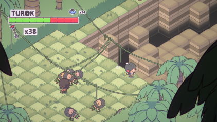
It's that one Turok game that's an easy target for unwarranted abuse! I'm gonna try to defend this game something fierce when the time comes -- not because it's outstanding or anything, but because it's trying something different, god damn it. Turok doesn't always have to be '90s ultraviolence! Read some classic Son of Stone, you philistines!
Anyway, Escape From Lost Valley came to be via an indie jam revolving around Universal Studios' IPs; that's why that inexplicable Voltron puzzle game was also a thing. Although you have free reign over where to travel on the level's map, the game plays out like a series of setpieces wherein you battle violent cavemen and honkers.
Combat leans heavily on timing and spacing, waiting for an opening to lay into them with your knife, or sniping with your bow if you're feeling ballsy. It's tempting to make a hackneyed comparison to Dark Souls, but it's just top-down combat with punishing timing, basically. And evasive rolls. Lots and lots of evasive rolls.
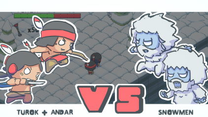
There's just enough pretense that it doesn't just feel like a string of combat encounters; encounters with cavemen often end with you aiding them in some way or exploring an area they warned you about, and some levels encourage exploration to find upgrades, be it limited-use poison arrows or new 'armour' for Turok to wear. The armour changes his movement and attack properties, excelling at different playstyles; one's good for hit-and-run, while another is all about brawling. It's a cute gesture and it means you get to dress Turok up like a teddy bear.
Unfortunately something about the game just feels a bit lacking. The "bide your time" style of combat has merit, but never feels truly satisfying, and it's hard to tell whether that's down to the controls, the enemy patterns, or even something as petty as the sound design.
Even with nifty setpieces like outrunning pteranodons across a narrow clifftop, I just didn't find myself all that invested. I finished the game in around 2 hours, and although there's a harder difficulty, I'm not inclined to try. I got the game on sale so I can't be too bitter, but I certainly would be if I paid the shockingly steep $15 retail price.
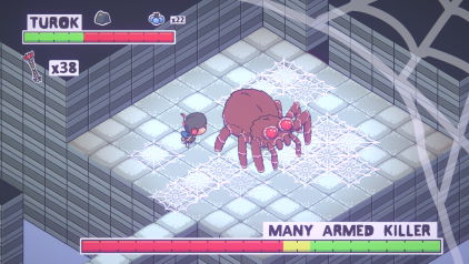
That said, it's so nice to see a fresh take on a series otherwise only loved by FPS nerds and old comics fans. That the developers looked to the vintage Son of Stone comics for inspiration gives it such a unique identity compared to all the other Turok games.
As an indie contest entry the cutesy super-deformed aesthetic helps it stand out from the crowd, but as a retail product it's left with the unfortunate question of "who asked for this?" I've nothing but respect for it, but presentation aside, there's just something missing to tie it all together.
As of this writing there's apparently a major update on the horizon that's said to give the game a massive do-over... after the devs said they were ending support for it. Has it changed hands? Beats me. It remains to be seen how it turns out, but I'd like to think it may give the game a second chance to shape up. It's got an uphill battle ahead of it, but I want it to do well!
Turok: Evolution
Game Boy Advance
Feb 17
Feb 17

This is one of those games I've long wanted to enjoy -- it's a Turok meets Contra! That's everything I could've wanted! However, it is not accommodating to casual players in any way -- if you want to make progress, you gotta want it. Who knew doing a serialised blog feature could inspire such dedication in me?
It really is just Contra, or Metal Slug, or whatever 2D jump-'n'-shoot you wanna draw comparisons to. Run to the right and shoot everything that moves! Or just survive, that's good too. The game has a somewhat ludicrous arsenal, ranging from machine guns to flame throwers to rocket launchers, and even 'alien' variants of every weapon with different destructive properties.
Yet despite all that, your default melee weapon is perhaps the most versatile of all; it's quick, it's powerful, and often the stunlock is long enough for you to simply run past them. Djunn's weapon in particular is a lot of fun, not unlike the boomerang-shield from Rygar -- it even doubles as a grappling hook, allowing you to propel yourself like crazy across ceilings!
Every boss stage plays out like a shooting gallery in the vein of Wild Guns or Cabal; enemies come in from above and it's your job to gun them down before they get on your tier. Bosses are huge arena-filling monstrosities... with also teeny tiny hitboxes. Trying to land shots as they constantly move is the greatest difficulty of all, and surviving long enough to do it is even trickier given the sheer volume of projectiles and enemies.
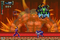
The game is extremely tough. Enemies are punchy and ready to inflict carnage the moment they appear on-screen, and only select stages have mid-level checkpoints; if you die, you just have to redo it all from the start. When every encounter is so deadly, it feels like a memorisation game -- jump this first wave, use the flamethrower on these dudes, but save the your ammo for later, these guys just deserve the axe.
And ultimately, that's the game's downfall. By presenting enemies that are such bullet sponges and so strenuous to take down... it's often way easier to simply run past them. It's a platform-shooter where engaging with the enemy should only be a last resort. You could argue it harkens to classic Turok ethos: why slay a foe who poses no danger? But it basically means to see most of the game, you have to run past 70% of it.
It's a pity, because the game looks absolutely cracking. The spritework is incredible, and its briefing sequences use completely original illustrations that, as far as I'm aware, have never been reprinted anywhere else. The basic framework of the game is solid, but between limited resources and overpowered baddies, it feels like you have to cheese the game just to progress. When I feel like I'm cheating just by making it to the next level, there's either something wrong with the game, or with my conscious. A game I want to love, but I don't think it loves me back...!
The Golden Palace
Feb 18 ~ Apr 11
Feb 18 ~ Apr 11
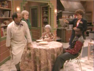
Let's put the remaining girls in a hotel for some reason! That makes sense! Like AfterMASH, you so rarely hear discussion of this show except as an entry in "top 10 dodgy TV spin-offs" listicles or whatever, but after watching The Golden Girls over the course of two years and its finale left us wanting, I figured this was worth checking this out.
The girls buy a hotel and find themselves partnered with young straight-arrow owner Roland and sassy chef Chuy as they're forced to keep up with customer demands, conventions, bookings, and all those sitcom hotel foibles. It sounds like a somewhat strained way of continuing the premise, but honestly, keeping up with the girls even under new circumstances was satisfying.
It's a very different dynamic without Dorothy as the all-purpose straight woman and condescension dispenser, but by forcing Rose and Blanche to juggle the authorative positions with Roland and Chuy to bring out the sensible and silly sides of them, it works well in my book. Again, I'm no doubt biased towards the characters, but it's a darn sight better than AfterMASH. We've only lost one lead! We're not left with the table scraps! No harm to Klinger, Mulcahy and Potter, of course, but that show struggled hard to assemble something with what it had. Read all about it.
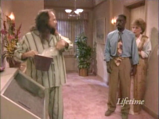
While at times the hotel premise clashes with the free-flowing lifestyles they led in the prior show, it makes for something more fast-paced and occasionally manic. More excuses for drama and farce, and easier to work in characters to drive the plot without a forced introduction to a friend or co-worker we've never seen before.
The Golden Girls was no stranger to silliness, but this single season has some bizarre circumstances and especially dream sequences, including one where everyone gets pregnant, even the men, with Chuy having a baby bump on his ass. It's... more than a little absurd, and possibly immersion breaking, but if it's lasted this long then I think it's entitled to go off the deep end when it wants.
Without Dorothy to serve as her chew toy, Sophia's left playing the wild-card more than usual, sometimes to the point of becoming a caricature. likewise, Blanche's promiscuity is dialed down now that she's got an all-day job, but it still works in the old gags. Everyone's still good, and I got attached to the new gang as well. Roland's a bit dry at first, but his straight-edge attitude makes him a fun character to see put through the wringer, and being played by a young Don Cheadle is a bonus too.
Chuy's my favourite, a wild-card in his own right who bounces between carefree apathy and begrudgingly doing the right thing. As my introduction to Cheech Marin it's got me keen to see what else he's been in... which is a bummer, as I think this was his only recurring TV role. God, I hope Cheech and Chong hits my funny bone, because it's either that or checking out his voice over roles.

It's still set in Miami so the old cast aren't far away; Dorothy gets a two-parter where she rescues Sophia from returning to Shady Pines, and acknowledges how her friends have grown in her absence. It's nice to see her back, but it unfortunately leaves Roland and Chuy as third wheels for the whole episode.
Stan and Miles get episodes to themselves, and not in the best light, sadly. Stan fakes his death for tax evasion, only revealing his ruse to Sophia, leading the others to think she's in denial. It's a very Stan thing to do, but its ending is unexpectedly melancholy, Sophia left in tears at the knowledge that her only remaining family, as detested as he might be, has left her and seemingly won't be returning. You love to see Stan show up and get called a bonehead, and it's nice to see the two address some earnest feelings for one another, but to see the old gal quietly sobbing is such a heartbreaker.
Likewise, Miles returns to somewhat hamfistedly put an end to the relationship between him and Rose; Rose ends it after believing he's been seeing other women, and then he returns to have his wedding at the hotel. After everything the pair have gone through, to end it over something so seemingly petty feels a tad callous. The wedding episode tries to paint it as healthy closure between the two, but you'd sooner have seen it handled with more grace.
Particular highlight episodes include "Promotional Considerations", where Bobcat Goldthwiate plays a client who the gang are convinced is a murderer out on parole, and "Tad", where Blanche comes to terms with her developmentally-impaired brother.
The former's just a funny ep, while the latter, perhaps a bit heavy on the schmaltz, is a nice earnest depiction of overcoming the shame associated with hiding a family member with a handicap... which I hope is something we've left in the '90s.

The tone's a bit all over the place, especially when they're still finding their footing partway throughout -- Roland's adopted son Oliver shows up in a few episodes, often as a vehicle for Sophia or Chuy's schemes, and sometimes a depository for emotional moments from the parent figures. It's an interesting dynamic, but arguably not the show to be exploring it on, so he gets an episode where he's returned to his fresh-from-rehab mother. It's a fun ep for him and Sophia, and better to see him get addressed with a hopefully happy ending than just vanish into the ether.
It's a different show than The Golden Girls, and its attempts to acknowledge the old format are perhaps a bit strained, but honestly, this remained as entertaining a watch. While it's sad seeing the three occasionally struggle to keep up with the new dynamic, the fresh setting and characters are a lot of fun, and I would have enjoyed at least another season of this.
The fact AfterMASH got a second season and not this is a bummer... though to be fair, I can see where they figured AfterMASH was a show in need of tinkering, whereas The Golden Palace settled into its niche quickly and comfortably. To have a second season would just be more of the same, for better or for worse.
Apparently the old cast weren't thrilled with the changes; is it better to invite comparisons to classic material by just replacing Dorothy, or does changing the entire premise give it that bit of distinction? I'd argue in the latter's favour, at least in this case. Probably not a must-watch show if you're not intimate with the original, but personally, I had a blast with it.
Kid Icarus
NES / Nintendo 3DS
Mar 10 ~ Mar 20
Mar 10 ~ Mar 20
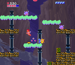
Kid Icarus is one of those early-days Nintendo franchises that, for the longest time, stood out for never quite becoming a 'thing'. It got two games and a foothold in nerd culture thanks to Captain N, but never really rose from there. The 3DS game and Smash Bros. seemed to give it new life... but it's still kind of stuck in limbo. Sakurai's clearly carrying a torch for it, but Nintendo have made no moves to take it anywhere.
Even then, it's a game I hear very little reverence for. It's one of those NES games that folks know has some degree of complexity and place in history, but little interest in exploring it. They scale a few floors, fall down a pit or get clobbered by the reaper, and then give up once they realise there's no checkpoints.
Stick with it, and it's an interesting romp, like a strange fusion of Zelda and Super Mario Bros. 2. The immediate impression you get is that it's a rarely-seen vertically-scrolling platformer, which is a big part of its appeal. By forcing you to ascend and allowing you to wrap around the sides, it's able to construct some interesting platforming that's unlike what you commonly find in Mario.
The screen-wrapping means you can go off the other side, reaching platforms that are seemingly too far away... but it also forces you into tight passages while enemies leap at you from below or soar in arcs above your head, which is an invigorating challenge to overcome. It's a nifty mixture of spacing and crowd control, so to speak, that gives it a different vibe from even the likes of Metroid's vertical passages.
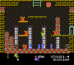
But the game continues to transform! The boss stages are akin to Zelda's dungeons, a series of single-screen rooms all connected by doors on the top, bottom or sides, and it's your job to find the boss and defeat them. There are shops and secrets to find, as well as Eggplant Wizards to become afflicted by, requiring medical attention (vegetative attention...?).
I confess I tried the dungeon 5 or 6 times before consulting Alys' maps; the true path often lies in a nooky exit that's easy to bungle, forcing you to backtrack until you reach the sweet spot again, and it's easy to get lost. There's an in-game map you can find, but getting all of its components is a three-step process. I was hopelessly lost! Still, it's an interesting dynamic, one that further changes the kinds of environments you're interacting with.
Collecting the harp turns enemies into mallets, which you can equip in the boss dungeons to free fellow centurions, who appear as options during the boss fight. It's an interesting idea, but ultimately a waste of time; they have better range than Pit, but die in one hit and haven't the same rapid-fire as him. It's far easier to just get up close with Pit and let 'er rip. Still, I dig the idea. I wish you could employ the options during the actual dungeon: it would make contending with snakes and wrigglesome foes that much easier.
The second world is then entirely side-scrolling, ditching the verticality for long stretches of bumps in the road and platforms over pits and barbs. It's exciting to see the game reinvent itself multiple times through its playthrough, similar yet different to Super Mario Bros. 2's free-flowing mix of horizontal and vertical screens... but these stages aren't that great. It's neat to use Pit's wings to soar far distances across platforms, but the challenge simply isn't as compelling as the vertical stuff.

Much of the game's challenge revolves in its doors and multitudes of items, which are so cryptic to anyone without a manual. Alongside typical shops, you can also survive gauntlets in "harsh training" rooms or defeat enough enemies to 'activate' the otherwise empty Zeus chambers, giving you temporary power-ups or permanent strength increases. Amassing points also extends your health metre after each stage.
There's elements of growth, but also stuff that can be taken away; certain enemies apparently steal your special weapon if shot...? I'll be honest, I bought or earned multiple weapon power-ups but never noticed their effect. I read the manual, and never noticed a change in arrow range or fireballs. The Zeus stuff is noticeable because Pit changes colour, but everything else? A mystery!
There's something to be said for Kid Icarus' "transformative" gameplay -- what begins as a vertical platformer then turns into a dungeon explorer and a side-scroller, and finally a short-lived shoot-em-up! The concept is nifty and innovative for NES, though it takes such a time for these changes to occur that most players probably never notice it evolves beyond just hiking up shafts for eternity.
That, and the changes aren't that great, sadly -- the game is at its most challenging in the vertical sections. The dungeons need a proper map to be tolerable; the sudden swerve in pacing is a bit of a killjoy. The side-scrolling stages are cute, but practically a prolonged breather compared to the tough vertical worlds. And the final shmup stage, one I was looking forward to, simply isn't that compelling. I accidentally discovered the safe spot from Medusa almost instantly! Mind you, beating the microgame recreation of it in WarioWare Gold 100 times probably didn't help.

I do confess it takes some time to warm up; the vertical stages are the hardest, and just by its nature the game throws you in the deep end from the beginning. Use a walkthrough for the first dungeon, and hopefully after that things will fall into place. By having the side-scrolling sections more as lulls to study the design, you get a better idea of the systems in play, and can then apply those to the 'real' stages when you're trying not to die a death.
Still, I'm very glad I played Kid Icarus. It's a NES game I see little discussion or acknowledgment of, and I'm fascinated by its game design. Not just the unique vertical exploration and use of enemies, but even its extremely offbeat style. Nintendo games of the era tended to have offbeat vibes -- look at Mario, for goodness sake! -- but Kid Icarus feels like it really flaunts its aesthetic of cutesy Greek-flavoured anime and weirdo monsters. Reskinning the same enemy patterns with at least three different graphic sets, its constant mixing up of the gameplay formula... it's shockingly ambitious for this era of NES.
The core of the game revolving around entering mysterious chambers is strange to acknowledge, but adds a certain mystique and incentive to better your play; you can't get Zeus' stuff if you don't fight hard, and you won't have a safety net if you don't stock up on money, etc. It's hard to explain, but it's a game that demands you engage with all of its cryptic mechanics, otherwise you're missing out on half the fun. It would be nice to see the game revived in some way to make this stuff less obtuse, but that's part of its identity...!
3DS Classics vs. NES: I first played this via the 3DS Classics version, which is partially based on the Famicom Disk System version with a handy built-in save function. It also introduces new backdrops for each stage, lending a bit of colour to a game that's otherwise set against blackness from start to finish. It makes the worlds stand out and helped me appreciate the small changes in tileset! And of course, the 3DS digital manual is a boon for quickly identifying items in the shop. It comes with its own series of quirks, though, enough that playing the original NES version felt like a very different experience. I address some of the major changes on the blog.
The 3DS version has the option for tighter controls, a more colourful presentation that makes it more accessible, and the digital manual makes a handy reference to better understand the game's eccentricities. Not having to remember stupidly long passwords is neat, too. A fair bit of challenge is diluted through nerfed enemy patterns, though, and not being able to revisit stages via passwords is a crime, honestly. I'd argue there's merit in both -- the NES is the core game with extra challenge and access to passwords, while the 3DS is good to take on the go, with a slightly different experience courtesy of its new controls and quirks.
Yooka-Laylee
PC (Steam)
Mar 11 ~ Mar 25
Mar 11 ~ Mar 25
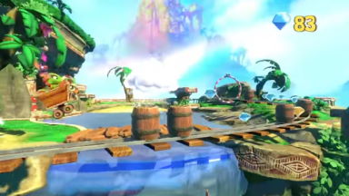
RQ87 gifted this to me a while back! It's that one Banjo-Kazooie spiritual successor by the original team, but, like, modern, I guess. That means massive, absolutely stupidly huge worlds with tiers upon tiers of terrain, all hiding characters to help, objectives to clear, and puzzles to solve all in the name of getting Pagies, the new Jiggy-like collectible.
The game looks the biz, at least. The graphics are up there with Nuts & Bolts in terms of scope and detail. Everything's got that off-kilter vibe to it, the slightly smarmy tongue-in-cheek atmosphere to it, though some stuff is admittedly so detailed it's disgusting. Kartos the talking minecart and the weird asteroid man you accidentally kill in the final world are on the verge of the uncanny valley that they look like they belong in different games entirely.
The game controls well and feels like a decades-later evolution of how BK is framed in your young brain � worlds that were so immeasurably huge and packed with so much stuff, how would you ever see it all? Replaying those games years later does indeed show the boundaries quite clearly, which makes them all that more charming... but Yooka-Laylee doesn't get the memo. These worlds are bloody huge. Multitudes bigger than even the worlds in Nuts & Bolts � and that game was built for traversal via vehicle! Here, you're meant to plod around on foot without even Banjo-Tooie's warp pads to cut out the legwork!

One of the bizarre new elements is 'expanding' a world � it's not enough to unlock it, you need to make a second Pagie transaction to then add layers onto the map, unlocking its full breadth of challenges. Presumably a means of gatekeeping challenges that require abilities from later in the game, or simply making the world feel 'digestible' without dropping everything on you at once... but Galleon Galaxy, the final world, has practically nothing to do when first opened, requiring another instalment of 15 Pagies to get the whole thing.
The game has only five worlds, a bit less than all prior Rare games, but the scale of them easily eclipses everything in Banjo-Kazooie combined, and then some.
Yet for all that impressive real estate, you wonder what's being done with it. Finding identifiable landmarks is a nightmare, and there's next to no railroaded path through a stage. I would typically enter a new world and try to find Trowzer to get the newest moves as quickly as possible... but despite being situated close to the entrance, it wasn't until two hours into the casino level that I finally saw him... right next to the entrance.
The game does give almost unparalleled freedom to explore; many quills and collectibles are hidden literally on the borders of levels, on top of craggy walls and slopes that you'd expect to be behind invisible walls if this were an older game.
While having complete, unbridled freedom has its perks, it does contribute to the feeling of aimlessness at times, where the intended outcome is unclear. Do you come back with an upgrade, or is fudging your way up by clipping on seams really the intended method of getting up this hill? This feeling does lessen as the game goes on and you get new abilities, including one to outright fly at anytime... admittedly nulling most previous abilities like the tongue-grapple and the high jump, but still.
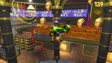
Abilities consume a stamina gauge, likely an attempt to lessen the number of collectible 'energy' items, and to tone down the abuse of the roll move, the equivalent of Kazooie's Talon Trot. You can touch butterflies to replenish stamina, or just wait a while for it to recharge automatically. This is fine for the most part, but becomes tricky in boss battles, especially the final one, where you have such a limited window of time for the stamina to refill before an incoming homing projectile is guaranteed to hit you.
The bosses are a weak point, to be perfectly honest, though that's not unexpected; they were rarely a high point in Banjo-Kazooie either. They use the various mechanics in interesting ways, but they're not exactly a great deal of fun.
There's an almost surprising number of mechanics: Yooka and Laylee have their own moveset which expands as you visit Trowzer, and Mumbo Jumbo's transformations are carried over, albeit a little limited in use across the massive, sprawling worlds. On top of that, you can lick plants to gain access to limited-time projectiles, or even change Yooka's properties, allowing him to stick to steep slopes or run through fire undeterred.
It's all very inventive, if a bit difficult to keep track of... especially when the gamut of missions remain so 'stock'. Your basic fetch quests, getting from A to B, literally jumping through hoops... it's stuff we've accepted as par for the course from 3D platformers, but I think I'm just too dang aware of it now. It's easy to say "make better missions!", but even I'd be hard-pressed to think how to gussy it up.
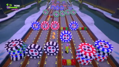
I honestly don't know where I stand on the game. I got some entertainment out of it? The snarky dialogue is fun and some of its gags did gave me cackling, if just for how inappropriate they are ("Go and cast your rod out!" "Yooka's better with his tongue, actually.")... but the game itself? I can applaud individual elements like the controls and certain engaging challenges, but on the whole it feels like a harsh reminder that maybe 3D collect-a-thons just aren't for me anymore?
At least, not at this magnitude. The levels are too dang big to find anything in, and even the hub, with its abundance of detail and horrendous loading times... the absurd scale of everything is kind of a turn-off. It certainly tries, but it only makes me ponder the ramifications of designing via Kickstarter: the stretch goals all do make the game feel that bit fuller, but I'd be hard-pressed to say any of them are fun, entertaining additions. Is it better to forge ahead with these crummy mini-games rather than reallocate resources because folks already demanded it? Who's to say!
It was neat to finally get hands-on with the game, but despite the wordage, it didn't make that big of an impression on me. I think nostalgia and the imagination of youth is what makes these games look so vivid, and without that it just feels like busywork. Maybe The Impossible Lair is a bit more digestible...?
The Long Way to a Small, Angry Planet
Mar 15 ~ Jul 16
Mar 15 ~ Jul 16

A woman escaping the mess of her father's life joins up with a crew who punch holes in space, creating networks for faster-than-light travel, or something like that. In between acquainting herself with the melting pot of crewmates and proving her worth, they come face-first with the restless political landscape of outer space, where what's a routine job to them might be an affront to war for the residing cultures.
I must've bookmarked this from a list of book recommendations on Tumblr who knows how long ago, so I'd long since forgot what to expect. It's written so nicely; for its heady space-age concepts, it never forgets the inherent humanity in the universe.
Its nuanced look at the various customs of the races and cultures they encounter felt so vivid, expressing the cultural changes and exchanges that take place so humans can even interact with cultures and biologies so unlike their own. The way races express love or even simple communication, and the concessions that are made to maintain interspecies relations... I found it beautiful and mesmerising. (though that might be the monster-fucker in me talking)
I really enjoyed the characters and life aboard the ship; everyone's got their quirks but nobody felt like an outright cartoon, and I found myself thinking about them even months after I'd finished the book.
It's only the first in the Wayfarers series; I admit there's a perpetual grouch in me that's uppity when every book I read isn't a perfectly satisfying one-and-done, though that's perhaps more emblematic of how hard it is to get me to pick up a book. This one's good though! I'll definitely be pursuing the rest when I can; there's threads left hanging, but even as a one-off it felt like a perfectly satisfying place to leave things if I felt so inclined.
I'm only proving I'm crap at writing book reviews, but I wanted to acknowledge the one novel I read this year that wasn't proofreading, fanfiction or for work. I'm just glad I can think back on it fondly. There's some years where all I read are stinkers, and for the sake of argument there's nothing more demoralising than that.
Kid Icarus: Of Myths and Monsters
Game Boy
Mar 22
Mar 22
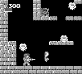
It's the same formula, only on handheld! Travel upwards, shoot enemies, enter doors for shops and challenges, and increase your power via the same old means. I had tried this in the early days of my Kid Icarus obsession, but bounced off it completely; its cramped screen and reliance on horizontal-scrolling threw me off, but I figured after beating the NES game three times, I was hungry enough for more Pit to muscle through it.
The big changes include the omission of death pits entirely; you can fall down as far as you've climbed, and your only punishment is having to climb back up again. I admit this was one of my first gripes -- it takes away the immediate peril of punishing you for your slip-ups, that death is always false leap away... but it does incentivise exploration, especially in levels with very winding paths that are difficult to circumvent.
The levels are still only as wide as the NES levels and retain the screen-wrapping, but with the zoomed-in camera, it gives the impression they loop endlessly. It's a bit confusing at first, but given the circumstances it works fine, even if I do prefer having the full visibility of what's on-screen. This change does make the side-scrolling stages that bit more compelling, hiding passageways and goodies out of sight on high ledges. The cramped screen prevents them from having the same daring leaps as the NES version, but being forced to explore more for secrets is a point in their favour.
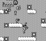
Pit can now float by mashing the A Button; it doesn't slow his descent as much as I'd like, but it's a nice gesture. You can also equip collectible hammers at any time, not just inside dungeon; they're in limited supply, but they do 5 pips of damage to a foe, and can break blocks to reveal items, hidden passages, or surprise enemies. There are new hint chambers that offer pointers on where to find secrets in the current stage; I never felt inclined to explore, but since you're free to backtrack, you've got time to reconsider if looking for that hidden hot springs is worth your while.
The same basic enemy patterns return, with a few new ones. The dungeons feature slimes that leap from floor to ceiling, leaping spiders, fireballs that track your position, and guards with spears. The specknose pattern has been replaced with enemies that fly in zig-zag motions and wrap around the screen, which sadly aren't as tricky as their predecesors. It's similar to the last game, but not a total retread; there's enough new patterns to keep you happy.
Dungeons remain unchanged, only your power-ups remain in effect and you no longer rescue centurions; those statues just contain health refills, enemies, or goodies like the map. By virtue of having a scrolling camera the stages feel more immersive, as you have to look around for where the exit from a room might be.
The bosses are a true step-up, and can be extremely difficult. Set in tall, narrow chambers, they've got more involved patterns than the NES game's bosses and can be particularly deadly, with huge arcs of projectiles or great balls of fire. I had a lot of trouble with the first boss (I don't think my arrow strength was higher than level 3), and I only beat it by standing up close and using auto-fire to fire a million shots a second. The others I had more resoruces at my disposal, but they are a tad intense. They're definitely far more engaging than the lousy NES bosses, but they perhaps went a bit too far...?
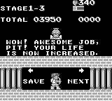
The final stage drops the shmup aspect but still gives you all the gear, allowing you to fly through a craggy palace and fight enemy centurions, still able to enter doors and find secrets. What it lacks in novelty compared to the NES finale, it makes up for in being a more engaging challenge. The new abilities feel like a true endgame power-up and not just a genre shift. Orcos in particular is a tough and engaging boss; Medusa was short and sweet, but Orcos feels like a proper test of skill.
The game's greater incentive to explore and more 'compact' levels does give it a unique vibe, perhaps one that makes it a little easier to get to grips with. There's elements of its design that improve on the original, and bits of the NES game that still come out on top.
If you can cope with the cramped screen, I want to argue this is perhaps a smoother experience than the NES version... but there's something about the original that's hard to beat. Seeing the design get ported to Game Boy is really nifty, and I wish there were another 2D instalment so it could iterate further...!
Super Puzzle Platformer Deluxe
PC (Steam)
Mar 25 ~ Mar 27
Mar 25 ~ Mar 27

I needed something quaint to unwind with after Yooka-Laylee, and figured this was finally worth giving a spin.
A falling-blocks puzzle game where rather than controlling their path, you take command of a dude who's trying not to get crushed by them. Destroying blocks of the same colour awards points and stars � stars increase your level, which increases your firepower and score bonus, and destroying bigger chains of blocks gives more points and stars. You can figure it out from there! Stages run on a pattern of intermittent blocks, lines of blocks that fall at once, and then three to four 'hazards', among them spikes, cannons, or even roaming goons; destroying the blocks they're attached to will get rid of them.
It takes a little while to warm up as your default firepower is so piddly, but it eases into a nice flow once the stage really gets going. It's very rewarding to let huge chains of blocks build up, then destroying it all with only a small foothold to keep you from plunging into the pit. It's got an almost Wario's Woods vibe, the challenge of interacting with this changeable landscape, working out how to navigate it as cleanly as possible without disrupting your chain comboes.
The presentation is all platformer � there's no "next block" preview or anything like that, you just have to know the flow or what stage-specific traps to expect. While the traps do change the longer it goes on, there's not much in the way of escalation beyond simply maintaining your fully levelled power-ups; getting crushed by a block won't kill you, but instead reduce to a lower power level... unless you're at level 0, in which case you're toast.
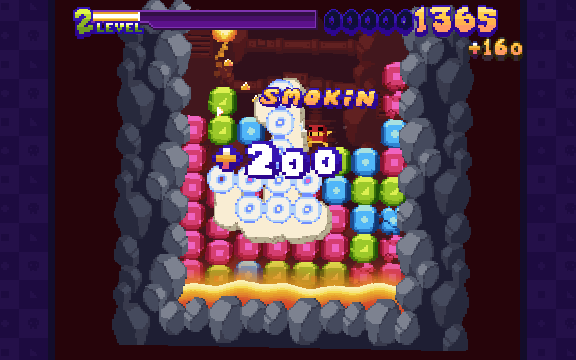
In my opinion, where it falls apart is how easy it is to die. Collision detection has no allowances; if you overlap something even by a single pixel, you're dead meat and die instantly. Paired with the lack of visibility for incoming blocks, and the often blinding amount of debris and camera-shaking after a huge combo, it's very easy to die to a sudden spike trap falling onto screen, or a cannon firing a split second before you destroy a block chain.
It lacks the 'panic' sensation so essential to puzzle games when you know you're on your last legs. When the screen gets full of blocks in Tetris and Wario Woods and you're scrambling to clear the way, or fighting for space again the ever-encroaching ceiling in Puchi Carat... 9 times out of 10 you'll be playing an intense game and then it suddenly ends with a wet fart because you scraped your knee against a chainsaw.
It plays into that 'hardcore platformer' vibe that Super Meat Boy ushered in, where death comes quickly and without fanfare...but here it makes you feel robbed of closure. There's no sensation of "I fought to the end, I did the best I could...!" Instead it just ends abruptly, and you'd rather just pick up where you left off. It's like a DVD skipping and stalling. You don't figure, welp, let's leave it there � you want closure! You wanna finish the dang movie!!
I feel like if taking damage simply dropped your power level and increased the speed or intensity of block drops, that'd be a more engaging conclusion. Puzzle games are at their best when you're fighting to regain control over chaos, and Super Puzzle Platformer has a hard job combating that once you're adequately leveled and acquainted with the world's hazards. All it can do is puncture your pride by ending the game with little warning.
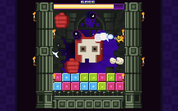
The game also has a challenge mode, where you simply have to survive the time limit against various hazards; cannons, falling spike blocks, even a unique final boss of sorts. They're cute, but not the dynamic I'm here for; they could fit in any other Super Meat Boy clone, but it's the puzzle game dynamic that keeps me coming back.
A very engaging little game while it lasts, a game that's incredibly easy to pick up and play, with enough stages, characters and extras to make it worth revisiting to mix up your playstyle. I do wish the end state were different; ending the game with minimal impetus just plain stinks, when a Puchi Carat style 'danger' state would spice up the game so much in my book � is it worth playing it safe, or should you take damage, weaken yourself and risk a game over just to get more blocks on the board? Something to consider if I ever get the notion of designing my own puzzle game...! (like that'll ever happen)
Mega Man Legends 2
PlayStation
Mar 28 ~ Apr 11
Mar 28 ~ Apr 11
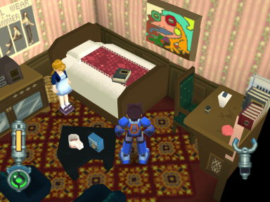
Mega Man Legends 2 is one of those many games I bought, played for a short while, but literally never made progress beyond the introductory portion of the game. I simply never found my way beyond Yosyonke Town for whatever reason! It's a game I found myself lost in almost instantly, and there wasn't even the concession of a whole island with dungeons to explore in the interim. I figured I'd finally see what I was missing out on.
I always forget how beautiful the Mega Man Legends games are. Capcom were at the top of their game in this era, presentation-wise. Their arcade titles were bristling with still-unmatched pixel art, and even their 3D titles looked the biz, making the most of the hardware limitations; Resident Evil creating iconic setpieces though its fixed cameras and Mega Man Legends building an iconic aesthetic out of its chunky low-poly models and sharp, anime-style textures.
Even the environments, for their blocky, grid-based simplicity, are bursting with personality. While the first game only has a single island to explore, this game is a globe-trotting adventure, taking you to various facsimiles of foreign countries, like the snowy, remote Calinca; the Arabian desert and city; the jungle wildlands; and a city built on an ocean platform.
They're all distinct, and seeing the various living quarters of their townsfolk is always incredibly charming, full of decorations, details and furniture, or even just a fun comparison for how the other folk live; Yosyonke is very indoors and cosy, while others are more spartan where the weather's good. They're unfortunately all a bit spartan compared to the first game's Apple Market; there's no bustling cities or marketplaces, areas so full of colour and characters like that game had.
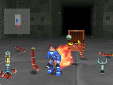
Despite having "Mega Man" in the title, I keep forgetting how Legends is very much its own thing, more of a 3D dungeon crawler than the familiar stage-based master-weapon malarkey. It's been so long since I played the original (2009 wasn't exactly yesterday anymore...!) I don't know what the exact improvements are. It's fun for what it is, creating something more explorative, atmospheric and dangerous than the 2D stuff, with a fun feedback loop of finding treasure, then returning later with all the new kit you could afford or build from it.
At least, it's fun when you actually get your first sub-weapon -- I somehow went the first four hours with nothing but my crummy buster...! I think that's the problem: it's cool getting fat stacks of cash and finding parts, but you know you'll be missing an essential component that's buried in an unimportant detail in an NPC's house... and that's what building sub-weapons relies on. You might have stacks upon stacks of cash, but money can't buy those parts, and you're lucky if it'll even net you an armour upgrade. What looks like a sweet haul turns out to be small buttons in the grand scheme of things.
Combat's the same as ever -- that is, circle-strafing all the way. You can pick up dudes and throw them at each other, a trick I only learnt late in the game; it's a cute new dynamic, but extremely fiddly and not at all intuitive when the game sitll employs collision damage. You can still only carry one special weapon at a time, which is a huge disincentive to using anything but the homing missile. Bosses and enemies quickly become outrageous bullet sponges later in the game, even with the Buster's power maxed out.
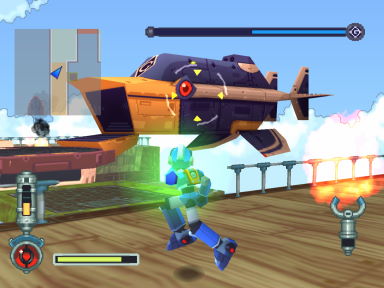
While the game offers setpieces more often in the form of new locales and a distinct boss fight in every town, there's shockingly little story for almost the entire game. The game begins with an absolute bucket-load of lore, from Roll's mother attacking on the back of a robot dragon, causing a ship to crash-land in the forbidden island where many strange people, not all of them apparently human, have been frozen in ice.
Then you spend the next eight hours collecting keys with, like, no new developments. The pirate Bola's carefree attitude is amusing, and there's a funny scene early on of Tron impersonating Roll, but on the whole there's not a lot of story to absorb in the interim.
Until the finale harkens back to MegaMan's origins as an emissary from the creators of the human race or some cobblers, and all the characters we've been following until now are shunted off to the side so we can get an expodump. This results in a boring dungeon, four boss rehashes, and a two-stage final boss that's just stupidly difficult, seemingly with no real tactics beyond stocking up on life refills. It's absolutely miserable. I got it down to a quarter of life before dying, and figured that was close enough to justify using cheats.
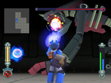
For years I've known about the ending where Mega Man's stranded on the moon, and figured it was going to be something well and truly heartbreaking, a melancholy moment of sacrifice for the greater good. Instead... it's just kind of dropped into dialogue at the last minute with little pomp or circumstance. The after-credits scene is at least cute, showing the Bonnes working with the heroes to build a rocket to retrieve him, but I so would've preferred some melodrama from the characters I know, not Mega Man showing sympathy to a bullshit boss that I game over'd to six times already.
My final time was 10:40, though I'd wager it was really around 14 or 15 hours counting game overs and retries. I admit I'm not sure if I was actually enjoying myself or not; it was mostly an excuse to get away from the computer. It's a lovely game to just soak in the visuals and idle exploration, but it also feels its design is hampered by hardware limitations. I respect the game, but I think my time for truly appreciating it has passed. It would've been nice to have seen MML3 come out and try to iterate on the gameplay with over a decade's worth of advancements, but that ain't happening, is it.
Turok: Battle of the Bionosaurs
Game Boy
Mar 29 ~ Mar 30
Mar 29 ~ Mar 30
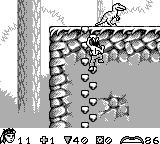
I wasn't looking forward to this one. My prior attempts to play it had me lost, confused, and in no way gelling with the game... but it has to be done. I have to play Turok on Game Boy. My dumbass completionism demands it.
And you know what? It's actually kind of nifty. The game goes above and beyond to try and replicate the feel of Dinosaur Hunter on N64. You travel between stages via the hub gates, collecting keys and amassing weapons as you explore their expansive worlds, and even fight all the same bosses. Darn near every weapon makes it in, even if their dynamic, explosive projectiles are invariably represented by differently-sized balls.
Of course, that's not to say this is perhaps a bit much for the little Game Boy to handle. There's very little visibility, and you're expected to hang down from ledges so you don't make a fatal plunge... and sometimes it just expects blind leaps anyway.
This is made worse by the limited checkpoint system, where you're put right back to the start of a world if you hadn't crossed one already. This is a great way to skip backtracking, but if you still had plenty of world to explore, it can be a right pain finding your way back.
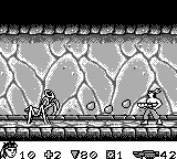
Combat is not the game's strong suit, and it's more stressful than challenging -- enemies love banging headfirst into you, and entering and exiting from rooms often puts you right in the path of a roaming enemy. This is not a welcoming game by any stretch. I admittedly played the game with savestates, and it made for a far more tolerable experience. Retaining your lives and your ammo after foolishly retreading old ground takes the edge off a little.
Battle of the Bionosaurs has chutzpah. It puts on a solid presentation for a monochrome Game Boy game, with Joshua's slick animations reason enough to keep going. Navigating across its huge worlds with no map to speak of is crazy daunting, yet it's very satisfying to see everything eventually click into place. A tough game to get into, and arguably one I'm intrigued more by its ambition and concepts than its actual execution, but I gotta give the little guy some respect.
Turok 2: Seeds of Evil
Game Boy Color
Mar 30
Mar 30
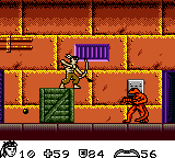
Built on top of the last game's engine, this ditches the nonlinear exploration and key-collecting for something a lot more straightforward. For the most part all you do is forge forward, shoot dudes, and do a modest amount of switch-activating to open doorways and portals. It's not 100% linear, but it's a far more guided tour than the sprawling debacle the last game was.
In place of its missing ambition are various gimmick stages, riding a pteranodon or velociraptor across auto-scrolling shoot-em-up-esque stages; they're cute changes of pace, but nothing remarkable.
The most bizarre inclusion of all is the prologue, where you play as a totally unarmed Joshua Fireseed, wading through crowded streets to find your Light Burden, which allows you to see which of the humans are dinosoids in disguise. It's an interesting way of tying the comic's lore into interactive gameplay, but it's also a remarkably obtuse way of kicking off an action game.
I arguably got more immediate entertainment out of this game than Battle of the Bionosaurs or even its N64 counterpart... but it's also wildly forgettable. So much so I forgot to include it in my tier list! It's nowhere near as adventurous as its predecessor, but sometimes a game you can finish in two hours is all you want.
Turok: Rage Wars
Game Boy Color
Mar 31
Mar 31
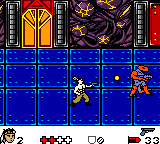
Now boasting the power of the Game Boy Color, the 2D platforming malarkey is dropped in favour of a top-down shooter. Why, you'd think Turok should be right at home in a genre like this!
Ooh, I wish. Now with full 8-directional movement, levels come across as way more sprawling than before, with visibility issues at their absolute height. Any hopes of running and gunning are done in not just by the incredibly zippy enemies, but the total lack of concessions for gunplay.
Lock-on? Strafing? Evasive manoeuvres? Get out of town, buddy. This isn't trying to be Ikari Warriors. If you want to shoot a dude, you have to line yourself up just right, while they can aim perfectly in your direction with every shot. Nobody said war was fair, pal.
The game is dripping in bizarre new gimmicks, among them auto-scrolling stages, undercover stealth missions, a complex shield system to make up for only having four hitpoints, and even the ability to upgrade or combine your weapons using toolkits... but none of it really matters. The game boils down to slowly inching forward, opening fire the moment an enemy appears, and invariably dying by some means or another. It is so easy to die. My god. Who knew?
As a big dumb Turok fan there's a few elements worth lauding for big dumb Turok reasons, but as someone who likes to play games that are fun, this wasn't a good time.
Turok 3: Shadow of Oblivion
Game Boy Color
Apr 1
Apr 1
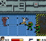
Turok's final outing on Game Boy, and still trying to make the top-down stuff work. It tries its best to tighten it up; the free-roaming stages have been dropped entirely in favour of vehicular hubs, wherein you track down and assault enemy bases -- that is, running through corridors, planting bombs, hitting switches, breaking boxes, and other activities that qualify as base-assaulting.
Some of the bases are still unfortunately complex, full of nigh-identical chambers and plenty of back-and-forth as you figure out which switch opens what. Still, it's a lot more accessible than the last game; Joshua has a sizable health bar, eschewing the need for the fiddly shield system, and enemies are no longer as oppressive thanks to their speed being toned way down.
There's not the same level of gimmicks as before either; the vehicles serve only for navigating the hubs, and are otherwise used only in one level and one boss fight. The game is otherwise exclusively exploration and shooting, save for a fun challenge late in the game where you have to guide a 'running bomb' to the enemy base; if it gets shot or stuck behind scenery, kablooie.
By cutting the crap, it's perhaps the most accessible of the handheld Turok games to get into... but it's perhaps the least memorable for that very reason. There's not the same level of design choices that have you pondering what the reasoning was; they simply refined it to something that's just "fine". Turok nuts might be intrigued by its unique storyline distinct from the N64 game and even the comics, but otherwise? It's fine.
Turok
mobile phone (J2ME)
Apr 2
Apr 2
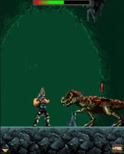
Aaaaaand I capped off my playthrough of all the Turok games with this: the mobile phone adaptation. My expectations weren't high, lemme tell ya! My placeholder text for this in my notes when I started Dinosaur Hunter Diaries was "it probably isn't good". What was there to expect from a mobile phone game?
Well, you know what? It's not half bad. Perhaps because of those lessened expectations, I enjoyed it more than some of the other Turoks! The fact it didn't take 15 hours to complete was a blessing, too. Lookin' at you, Seeds of Evil.
This is a distilled adaptation of the 2008 game on Xbox 360 and PS3 (played last year), but presents it from a side-on perspective not unlike ye olde Prince of Persia. It's not exactly a platformer -- Turok's jump has a preset distance and he bites it if he falls more than six feet, so it's more about navigating the treacherous jungles and caves as safely as possible. This entails climbing cliffs to avoid enemy encounters, or even using a modest bit of stealth to get the jump on soldiers, executing them silently before they sound the alarm.
Failing that, you can go in guns-blazing too; once you've been spotted, the hide command is used to evade shots, meaning you pick and choose your moments to fire back. There are also setpieces wherein raptors flood in from all corners, and you have to blast them before they get too close. They're a nice change of pace from the more methodical gameplay, providing a quick burst of something more arcade-like.
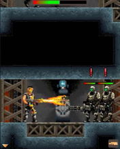
It's a game that would look primitive on the contemporary handheld consoles, but as a Java phone game, its simple structure comes across as smart design. For such a limited framework it gives you a pleasing amount of control, and its challenges are easily registered but satisfying to conquer -- something its console counterpart had trouble with. Again, perhaps not what folks would want from Turok, but who knew a Prince of Persia clone would work out so well? It might just be the bias talking. Seriously, I had no reason to think this would be good...!
It was cathartic to finally see the whole gamut of Turok video games... but it was also a little depressing knowing I had no more of them to look forward to. Nightdive has teased the possibility of making a new instalment of their own, and there's been at least two fangame attempts that never progressed beyond the asset creation stage... I just wanna see the man done justice! Now I know how comic fans feel 90% of the time, especially Superman fans. That dude still hasn't gotten a decent game, has he...?
Riddled Corpses
PC (Steam)
Apr 19 ~ unfinished
Apr 19 ~ unfinished
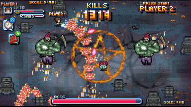
I wanted something breezy to play, and figured surely that's what twin-stick shooters are about, right? It's a genre that's never quite gelled with me, yet I thought it'd be neat to play one to get a handle on what people want and expect from the genre.
This was a bad one to play.
It's as basic as basic gets. Shoot zombies for a minute per wave, then slooooooowly scroll for another minute to a new location, which might have a landmark if you're lucky, and repeat. Sometimes enemies and objects drop health refills and shields. You can pick up and deploy screen-clearing bombs or time-stops if the game's being generous. Aside from that, there's nothing more to the game than walking and shooting!
The game's philosophy seems to be built entirely around the grind. You start with the weakest, shittiest projectile imaginable, and there are no in-game power-ups. Killing foes drops gold, which you then spend on the upgrade screen to beef up your firepower or unlock new characters. Different characters have different perks, like extra health, attracting gold, etc., but they're also bloody expensive. Each new firepower upgrade increases in price, so the game expects you to die, spend your earnings on upgrades, make it a little further, and repeat.
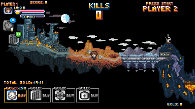
I can see how this would appeal to some folks: the slow power creep, making incremental progress, seeing numbers tick up. That's why RPGs are so addicting, right...? But it makes for wearisome gameplay. There's very little drive to your actions. You can't speed up how long each wave lasts, nor the long trek between them. Aside from random item drops, there's no complexity to your moveset; no fighting for upgrades or even fancy movement or counter systems. All you do is walk and shoot.
The game takes its sweet time showing you what it's made of, too. The first level is composed entirely of enemies who slowly shamble at you, with no projectiles and only varying degrees of bullet-sponginess. It takes until the boss for it to spring proper bullet-hell patterns on you, and suddenly the game has a bit of life to it. Would've been nice if we saw it sooner though! Or if that one stage weren't 10 fucking minutes long!
Even with only walking and shooting at your disposal, progress often feels arbitrary. The screen is cluttered with enemies and debris, and when you take damage it can be hard to tell what from. The HUD is enormous and often obscures the action; you can turn it off, but the game only tells you the controls when you boot the game up, no joke. Better turn the game off if you want a refresher!
The twin-stick stuff is adequate, but doesn't really excite me; without access to different weapons, it's just an ugly puke stream of bullets that literally look more and more puke-like the more you upgrade. I thought playing with mouse and keyboard would be more satisfying, but then the game adds an absolutely fucking gigantic crosshair to wherever you're firing. Your mouse is already on-screen! You don't need to highlight it! The crosshair is so obnoxiously large, so comically obtrusive, it makes it even harder to see what's going on, and there's no option to disable it. It's a fucking terrible feature.
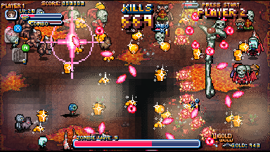
I've sunk two hours into the game and still haven't gotten past level 2, even after upgrading the default character to maximum firepower. I'd be hard-pressed to say I actually enjoyed much in that time. Using a bomb to wipe out a screen full of baddies and then navigate their fire to reap the rewards does have its charms, and the Survival Mode is more engaging if just for having lower stakes; a single fuck-up isn't denying you the chance to see the next level.
I keep wanting to play the game to get further and see if it gets any good, but I really do wonder if the bosses are the only decent challenge? The rest of the stage is just the most joyless of slogs, and the slow trickle of gold and exorbitant upgrade fees just stringing you along. I'm lucky to make 300 gold from a session of Survival Mode, which is more than completing a 10 minute level. To get a character with double health you need 25,000 gold. Balls to that.
The pixel aesthetic is cute and the minuscule file size is a boon, but I just don't get this. I want to understand the genre, but this was a lousy way of going about it.
Assault Android Cactus
PC (Steam)
Apr 20
Apr 20
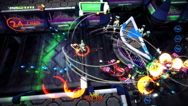
After Riddled Corpses left such a foul impression I ended up playing and finshing this in a single sitting. God, this is such a better twin-stick shooter. Having the player always front and centre on camera makes such a difference, as does pressing a button to fire, not just puking up bullets everywhere I look.
What truly impressed me was how dynamic the game is. Levels are largely set in single-screen arenas, but the terrain constantly morphs with each wave, transforming and reshaping itself to create new barriers and foundations. Hazards and obstacles populate the arena as much as enemies do. It's such a dynamic game, complete with distinctive baddies all with their own attack patterns and gimmicks. This review's gonna just be slamming on Riddled Corpses the whole time, I'm afraid, but this was such a breath of fresh air in comparison...!
You upgrade your gun by collecting pellets from dead enemies, as well as power-ups to increase speed and firepower, or even an area-of-effect that stuns all enemies. Each character has a unique primary and secondary weapon, which you swap between in a somersault that can be used to phase through projectiles and attacks momentarily. It's such a simple but efficient way of including evasive manoeuvres, complete with a baked-in system to make you cherish it -- if you overheat your secondary weapon, you can't dodge until it's cooled. So efficient!
There's plenty of characters all with their own unique loadouts. Finding a good galance is tricky; some are extremely gimmicky and unlike what you'd expect from the genre, though they all look to have their perks. I'm partial to Peanut for her dashing drill move; it's very satisfying to butter up the foes with her flamethrower before demolishing them all in one clean sweep. There's a play style for everyone, I'm sure, though some of the fancier ones are way outside my wheelhouse. If there aren't fifteen explosions immediately after I press the fire button then it's too heady for me.
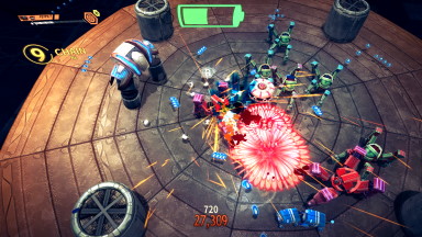
Best of all, levels are short and sweet, and death isn't an instant game over. You're given multiple chances to revive, albeit with a few dropped power-ups and a reduced score; the game incentivises you to replay for maximum points, and rushing headfirst into missiles isn't conducive to that. It's what I wanted I wanted this whole time...!
The first world is easy enough, but it quickly ramps up with some devilish stages and bosses. I don't think there's a difficulty select, but learning the lay of the land and experimenting with different characters was enough to get me though. If that's not enough, there's an unlockable Campaign+ which is even stupider hard, though I don't think I've got what it takes just yet.
I don't keep up with twin-stick shooters so I've sincerely no idea what the standard is these days. Whether this is ahead of the curve or old-hat, it was a genuine breath of fresh air and a terrific re-introduction to the genre. Holy moly. Good game. Very recommended.
Bumblebee
Apr 22
Apr 22

Finally, some decent freakin' Transformers. A good, humble story starring a gentler Bumblebee who's not as much of a rampaging murder bot, and a human character whose heart and moral core feel earnest and integral. This feels like the human-meets-alien story the first film wanted to be; two people who feel lost and disillusioned by the world around them, but form a caring, encouraging relationship as they both overcome their own damage.
The direction makes such a difference. One of the reasons Michael Bay's stuff tends to flow in one ear and out the other is: there's no downtime. Everything's shot for maximum scale and awe, be it robots laying waste to Chicago or puerile sophomore hijinks. Everything's bombastic! By giving the film time to unwind, to catch its breath, for the characters to enjoy themselves without the threat of war breathing down their neck every second, is so refreshing.
Some fans regard Bumblebee as less of a character when he's mute, but his interactions with Charlie mean so much when he's the central character, and not warring for screentime with a dozen other nobodies. Still a bit hard to mesh cutesy best friend Bumblebee with nuke-a-bitch-at-point-blank-range Bumblebee, but at least he's not pulling people's spines out. The Bay films sure worked hard to make the cutesy kid appeal characters into ruthless murderers, huh.
Honestly, the fact it has tangible characters who leave an impression is a facet worth celebrating. Shatter is a fun villain; Angela Bassett does an absolutely incredible job showing her as this charming manipulator, but also plenty capable of throwing down with the best of them. She carries a stronger presence than Megatron in any of the prior movies, though it helps there aren't a dozen unnamed underlings to keep track of as well.
Charlie's endearing, trying her best to put up with a crummy life and a lousy family, and the fact she's not burdened with playing diplomat between Autobots and humanity is more reason to be invested in her -- she's just some kid!
The fact her family never truly apologise for their shit-ass behaviour is a bummer, and you wish for her to escape somewhere, anywhere -- room up with the kindly old garage owner! Go on the road with Bee! Anything! But it's better her story ends here, rather than ending up on a bizarre road like Sam did in the previous flicks.
I admit I passed on this in cinemas because I figured, why bother if there's not as many explosions as last time? I'll be the first to tell you that was a stupid reason to skip it. The G1 homages are cute, and it might be a chance to give the movie universe a clean slate... but I admit I'm partial to the completely bonkers continuity the Bay movies had built for themselves. As revolting as those films may be at times, they're home to some truly unique concepts, and I'd love to see them done justice in some capacity.
Bumblebee is good because it stands on its own. It's not overwhelming with its incomprehensible CGI fights, nor overbearing with its misogynistic macho attitude... it's just a girl-meets-robot film that's got a lot of heart, and we're long overdue for something that simple. The fact it took over a decade for us to get even that does make me angry, mind.
Bot Vice
PC (Steam)
Apr 22 ~ May 04
Apr 22 ~ May 04
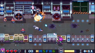
After acing both versions of Wild Guns I wanted something similar but different to sink my teeth into, and this looked like it'd plug the gap. It's very much its own beast though, and while not without merit, I probably approached it with something specific in mind rather than ready to accept what it was delivering.
Although very much a gallery shooter, it's not quite a crosshair shooter the way Wild Guns was -- you always have control of your character's movement, but your aiming is limited to firing straight forwards or at the nearest lock-on target. Enemies tend to fly around willy-nilly, so you're expected to keep up with some zippy firing and manoeuvring of your own. Action is fast and frantic, with incoming enemies abounds and oodles of destructible, explosive terrain to help you in your cause.
Shooting small droids will items, among them health refills and five types of weapons that you can cycle between with the left triggers, but it's difficult to make strategic use of them. The action's too fast for you to pick the right one in the heat of the moment, and their ammo burns away so quickly you have to specifically use short, controlled burst to preserve them... and the game doesn't exactly promote that kind of behaviour. I typically used the machine gun and spread shot on clusters of grunts, dumped the rest on the boss, and tried not to think about how uselessly situational the flame shot is.
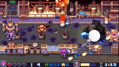
There's a bunch of defensive manoeuvres as well, including a dive roll, a sword for attacking close-range enemies and erasing projectiles, and holding Up to hunker under bunkers. The sword's range is wider than it looks compared to the sprite, but its use feels limited. Only late in the game does erasing bullets feel more tactical than simply rolling through them, and enemies are rarely within range for its offensive properties to feel satisfying.
Ducking, meanwhile, is a feature I'd almost always forget, and I don't know what use it has...? Later levels love firing volleys of slow-moving projectiles in different directions that make rolling tricky, but it feels like one mechanic too many. Enemies can destroy parts of the bunker, depriving you of cover, but the few times I thought, maybe cover will help me more than rolling, I took damage anyway. Oh well!
The 25 stages are all short and fast-paced, lasting only a minute tops, and as such the lack of checkpoints isn't much to worry about. It'll often take a life or two to acknowledge all the threats you'll be facing in one level -- an unexpected fast-moving attacker is enough to ruin your first run! -- but it's satisfying to play through and never felt too frustrating. Levels aren't marathon gauntlets, which is appreciated.
The presentation is slick, boasting cute chubby little sprites and a terrific palette. Everything's very readable, if a bit too fast-paced for my ailing eyes. If I had to grumble, the story is just a bit of a bore. Lots of Mega Man X-style pontificating over the legitimacy of robotic life and separation between man and machine, all told through tiresome voiced dialogue between the snarky pop culture referencing heroine and the slimy bestial villains. It's part of the developer's brand, but it never did much to engage me. Less is more, dude!
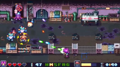
In addition to the main campaign there's another 25 bonus missions after the fact, so there's a good bit of content to keep you going. It's a fair enough shooter, but just a little unfocused for my liking. There's one or two mechanics too many to be in control of, and they're often not as satisfying as the game hopes; the slash and cover moves just lack the oompth of a good roll.
Perhaps what gets me is the lack of score mechanic. There's no points of any kind, only grades for how much health you retained and how fast you cleared... and I never got less than an A. Again, maybe this is because I'd sooner act foolishly and die multiple times than play cautiously and beat a stage first try... but it stinks knowing aside from doing a no-hit run, there's no score mechanics to come back and master. The short, bite-sized format is appealing, but there's something to be said for the challenge of Wild Guns, having only a few lives to get you through a gauntlet of stages.
Perhaps not the level of replay value I'd like, but it did its job of keeping me occupied while I waited for a game to install on my PS3, so mission accomplished. I'd like to give the bonus stages a bash and see what I'm missing, but it's hard not to forever draw comparisons to Wild Guns. That game set a high standard!
Mortal Kombat: Annihilation
Apr 23
Apr 23
Pal herrDoktorat and I had begun watching movies together during quarantine, starting with Final Fantasy: Advent Children, Sonic the Hedgehog and Bumblebee, before moving on to one of his personal favourites: er, this. It's a film I've only seen in bits and pieces as a young'un, and bless him, as a fan of the movie, Dok was the first person to willingly subject themselves to it to help sate my curiosity.
So Shao Kahn showed up at the end of the last movie to say "fuck that" to the rules, he's back, he's killed Johnny Cage, and he's kidnapping Kitana as part of some dodgy scheme to fuse Outworld and Earthrealm into one continuous hellscape for him to rule over... or something. I'm pretty sure that's just conjecture. Plot really wasn't at the top of the movie's priorities.
The film was released in the wake of Mortal Kombat 3 so characters are thrown around like confetti. Here's the new, good guy sub-Zero! But forget about him because he only has one fight scene and disappears forever! Here's Nightwolf! You might think he's going to be a main character, but no, he also clears off after his one inconsequential scene! Even major baddies, who you'd expect to at least participate in a decent fight scene like Sheeva, are completely written out with barely any pomp and circumstance. To be fair, the film moves so fast you tend not to notice until after the fact, when it's too late to realise you were robbed.
It's a bizarre lineup of characters, honestly. Liu Kang, formerly an ideal leading man with great charm and fighting talent, spends most of the movie on some dumb solo voyage where he does nothing but ask questions. With Johnny dead, Sonya is left to babysit Jax, her special forces partner who's fitted with cyborg ams and a tiresome macho attitude. Kitana straddles the line between character and non-character, while Raiden finally gets a chance to kick ass -- but it's questionable what that brings to the table besides him dressing like Vanilla Ice. And that's before we even address the villains' shocking lack of presence...!

Where the focus lies is on the eye candy. No longer stuck on one island, this film is a globe-trotting adventure across realms and dungeons, all cast in extreme mood lighting. The whole movie is just one gigantic flex from the effects team, with gonzo spectacle like giant hamster balls to carry them along caverns, or a variety of bizarre CGI monsters that show up to pad out fight scenes or inexplicably kill off major players (sad to see you go, Jade...!). It's very hit or miss, natch, but the film has such confidence in it that it's hard not to be swayed by it.
That's a thing: the film's pacing is all over the shop. The first film wasn't good either, but this one builds some great energy in the middle, and yet somehow it completely fizzles out before the end. Fights frequently feel half-baked, utilising so many setpieces but rarely making the most of them. Even though the finale has four duels going on at once, one of them involving a centaur dude, it's completely devoid of 'wow' factor. Maybe they put all the good fights in the wrong places. Maybe it's the fact they killed off all the fun characters. Whatever the case, the film just kind of sputters out long before the credits have run.
Special shout-outs to Sindel, who I'm sure does nothing key or vital to the plot (what plot?), but goddamn does the actress ham it up bigtime. She is a queen. In the wake of all this mystical plot bullshit that nobody cares about, amidst all these stock-serious macho power fantasies, this scare-queen diva swans on screen and is beaming from ear to ear. More franchises need a character who epitomises "fuck the lore, I'm just here to have a good time."
Less-than-special shout-outs to Sheeva, whose actress absolutely rocks the look, but gets nothing to do beyond look menacing in the background before getting flattened with a cage. Fuck that. I demand a reshoot.
I think I liked Annihilation more than the first one...? It helped that watching with Dok was a treat, being able to bounce banter back and forth rather than unanimously dunking on it. It doubles down on the worst faults of the original, with wham-bam pacing launching you from dumb plot into dumb action with zero warning... but it's also got waaaaay more variety. More characters, more locations, more setpieces!
But because of that, it comes with soooo much wasted potential. So many characters that do nothing, a staggering number of fights against nameless nobodies, and a shocking lack of decent martial arts? After the highs of the original's Reptile fight, you feel that should be the bar set by this one, but I can only imagine production was so breakneck there was no time for decent choreography.
So long as a movie makes an impression I'm reluctant to consider it "bad", but I'm in no rush to recommend Mortal Kombat Annihilation, to put it politely. It's got a whole lotta scope and ambition, and I love how shameless it is in simply throwing everything its got at the screen, no matter how terrible, like that woeful Animality battle... but I can't help but imagine what it could've been like if it used every part of the buffalo. Like, meaningfully, not just splattered on a film reel. That's a bad analogy.