Titular images of titularity
I'll be blunt; this was just made to fill up the main page after I made General Writings extra big. And then I ditched that design. Then again, it's more stuff for you to read on a rainy day! (fun fact: it is raining while I write this)
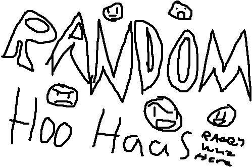
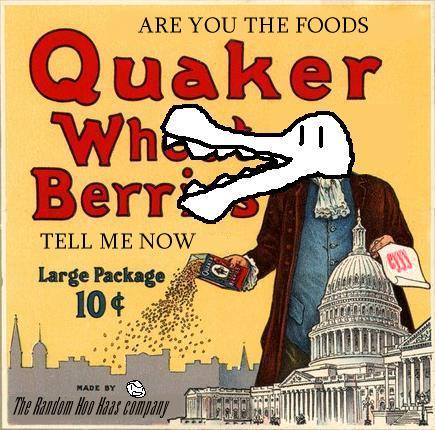
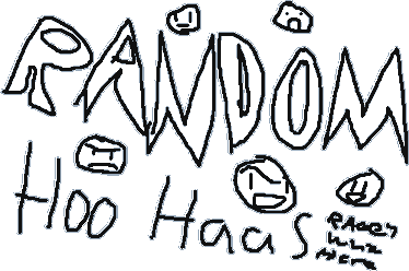
The very first with the site. Made in like ten minutes, if that. Most of it on the text, as my writing sucks.
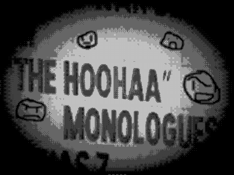
Flying Omelette informed me of a news story involving The Vagina Monologues being rechristened with a new name to be less offensive to the easily offended. I had to take advantage of it.
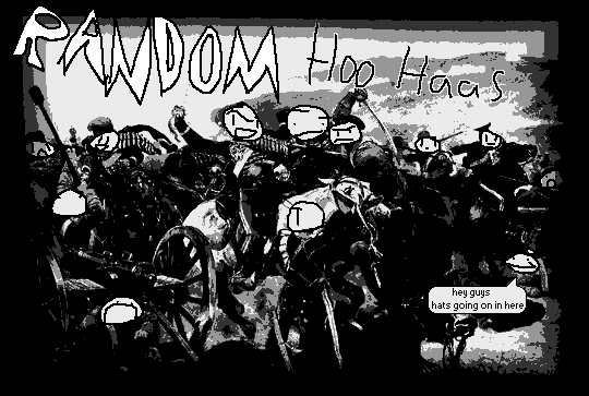
Charge of the Light Brigade with grinning faces abound. No idea why I made it so, but I guess I just like failure. Reminds me a lot of myself.
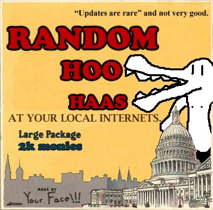
Bum chum Blaze did this for me. I thank him ever so much and give him Skittles.
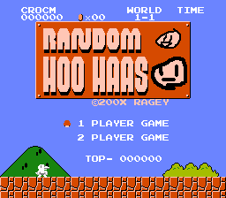
Then I had a shot at it. My image editing skills are not quite as profound.
It was inevitable.
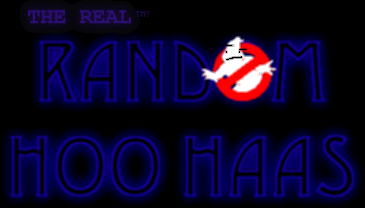
Would you believe this one took the longest? It took me forever to find a font that looked right and also to make a glowy effect that didn't look like major ass. But I think I did good.
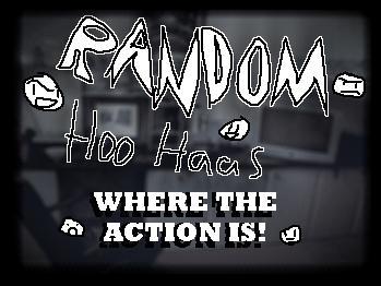
You can barely tell, but that's my desk beneath the giant words. It was better in concept.

I never actually used this one. I wonder why!
And currently I'm using a scaled down version of the first title, because, seriously, the others aren't exactly iconic. But the original is friggin' huge, and if you've been paying attention to every website ever, their logos usually don't take up half the screen.
Buttons! Everyone loves buttons, right? Actually I think shirts with buttons are pretty awkward. I spent an hour in a changing room trying on a whole bunch of shirts and button-up trousers and honest to god, my hands were friggin' raw afterwards. Friggin' raw. Clicky buttons that are used for the purpose of achieving things aren't quite as bad, mind you. Since I love being visual, I wanted Random Hoo Haas to be very visual with image buttons and whatnot, but it was just kinda awkward.


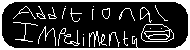
Shrunk to half the size because jeez, I must be size-blind or something. Of course, at full size they take up the whole goddamned screen. 1024x768 resolutions wouldn't be quite so bad, but if you were at a 800x600 resolution? THEY FILL THE WHOLE SCREEN. Jeeeeez. It is, as usual, another great demonstration of my horrible handwriting, and I can hardly imagine anyone foreign even recognising this as functional English. If anything, the faces on the Movies and Additional Impedimenta buttons are awesome. I think this look only lasted for, like, ten hours, as I put it up before I went to bed, woke up going "holy shit, what have I done" and promptly replaced it with the usual look. I probably lost a whole bunch of fans who majored in graphic design because of this monstrosity. Yes, it was only up for about ten hours, but ten hours is a million internet years.
I then attempted to downscale the idea, but that only shows how much I hated the pencil tool back then. See, Random Hoo Haas doesn't really have much of a design, per se - it's just black backgrounds, white text, and MS Paint for buttons. I wanted the buttons to look pretty and stylish, but it's hard to do that when I've self-imposed a really crappy look to the site. Oh well!
I'm not even sure if these buttons were used at all. Either that or, again, it was for a very brief stint. Once again, I regret the loss of the General Writings and Additional Impedimenta faces, but I think until the end of time, Random Hoo Haas is going to be strictly black, white and crap looking, and no thing such as "style" and "presentation" is going to change that for me.
You guys better keep check of how long that lasts, because I'll inevitably deny all mention of that statement!
![]()